This page shows all 56 website design examples from six industries, with the full annotations for each in the six linked articles.
Most inspiration pages stop at a screenshot. Every example in the six articles linked below is a fictional product made for the article and labeled illustrative. Each is scored on numbered marks, so you can copy a decision instead of a look. I read all six articles and the homepage before writing this page, and I counted the 56 examples myself. If you are shortlisting firms rather than layouts, start with our ranked list of web design agencies.
Website Design Examples at a Glance
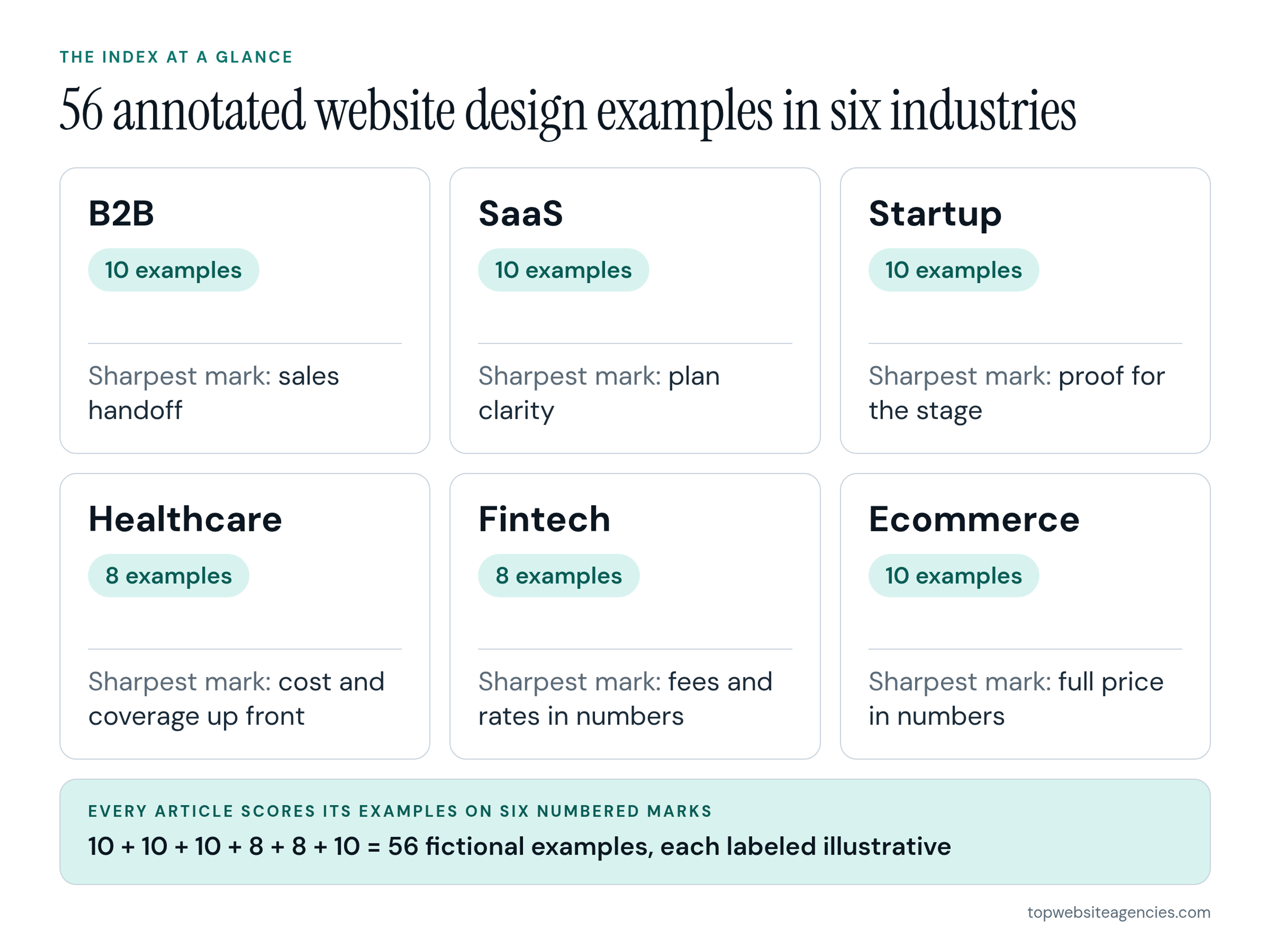
- B2B: 10 examples. The handoff, meaning who replies, how fast and what the buyer gets back, is the mark the B2B article flags as weakest.
- SaaS: 10 examples. Plan clarity is the weak spot, because a buyer who cannot predict next year's bill from the plans page stalls or books a call they did not want.
- Startup: 10 examples. Proof has to match the funding stage, and the team mark shows up on all three pre-seed examples.
- Healthcare: 8 examples. Six of the eight show a price, a range or accepted insurance on the page.
- Fintech: 8 examples. Five of the eight put a fee, a rate or a worked example on the first screen.
- Ecommerce: 10 examples. Five of the ten put delivery and returns next to the buy button.
How This Index Is Organized
The six articles share one format. Each has a six-mark rubric, a short "how to read" section, the annotated examples, a summary of what they have in common, advice on using them with your designer, and an FAQ. Every example is a fictional product built for its article. That means nobody is critiqued, and nothing depends on a third-party screenshot that could change next month.
Each article scores its examples on six numbered marks. The labels change by industry, but the discipline is the same: a mark is either met on the page or it is not.
I start from industry because the buyer's question changes with it. A procurement team checking a supplier and a patient looking for a clinician are asking different things before they trust a page. Page type comes second because the page decides the visit. A visitor who lands on a pricing page needs different things from one who lands on a homepage.
Galleries are still useful for website design inspiration, and I would not tell anyone to skip them. On Awwwards' winning-sites gallery I saw a grid of cards with the site name, the credited designer or agency, award badges and a promoted slot. I saw no written reason a layout works. Each of our six articles makes the same point from the other side: galleries mostly show homepages, while inner pages carry the decisions.
Website Design Examples by Industry
Each section below says what the article covers, which marks it uses and who it suits. It shows one example large with its marks, then a grid of every example in that industry, numbered as in the article. The full annotations stay in the linked articles.
B2B
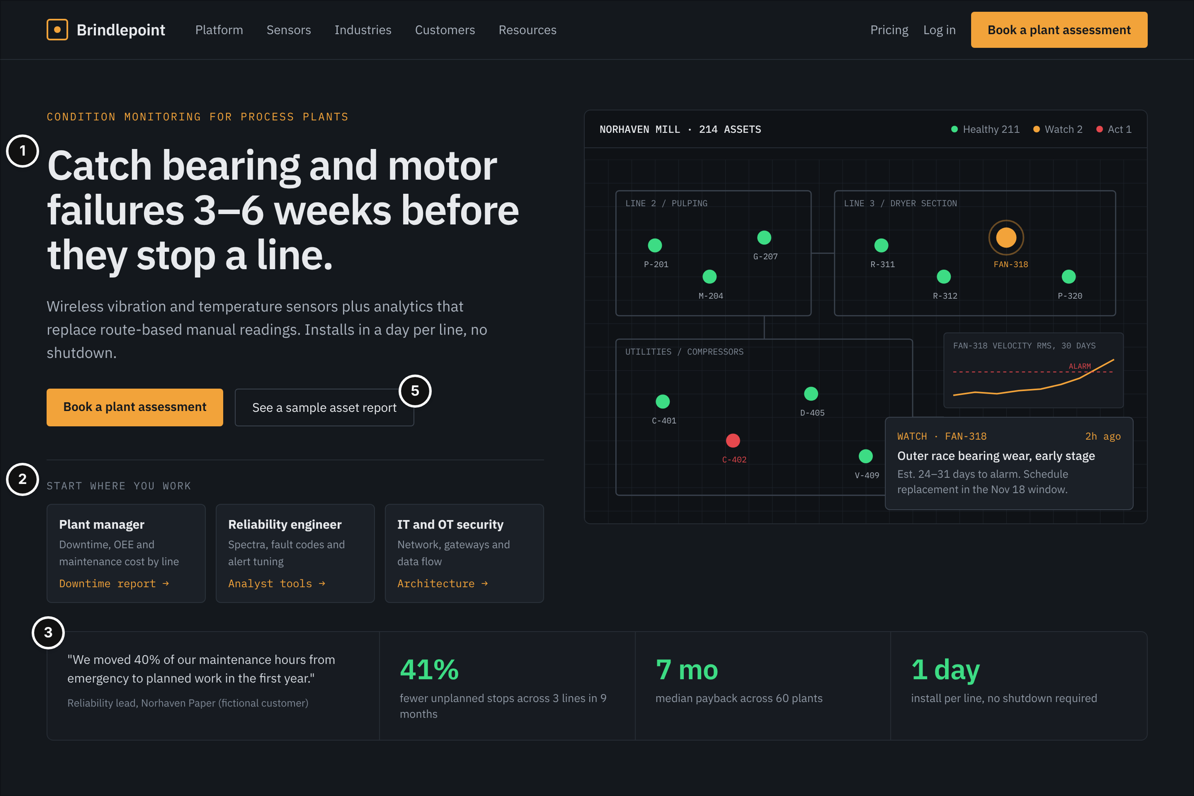
When a purchase involves several people and several visits, the page that matters is rarely the homepage. Seven of the ten fictional examples are inner pages: solutions, plans, RFQ, case study, docs, security and product spec. The six marks are positioning, buyer routes, proof, evaluation assets, next step per stage and sales handoff. The article flags the handoff as the weakest mark across its examples, and the grid below shows the full set.
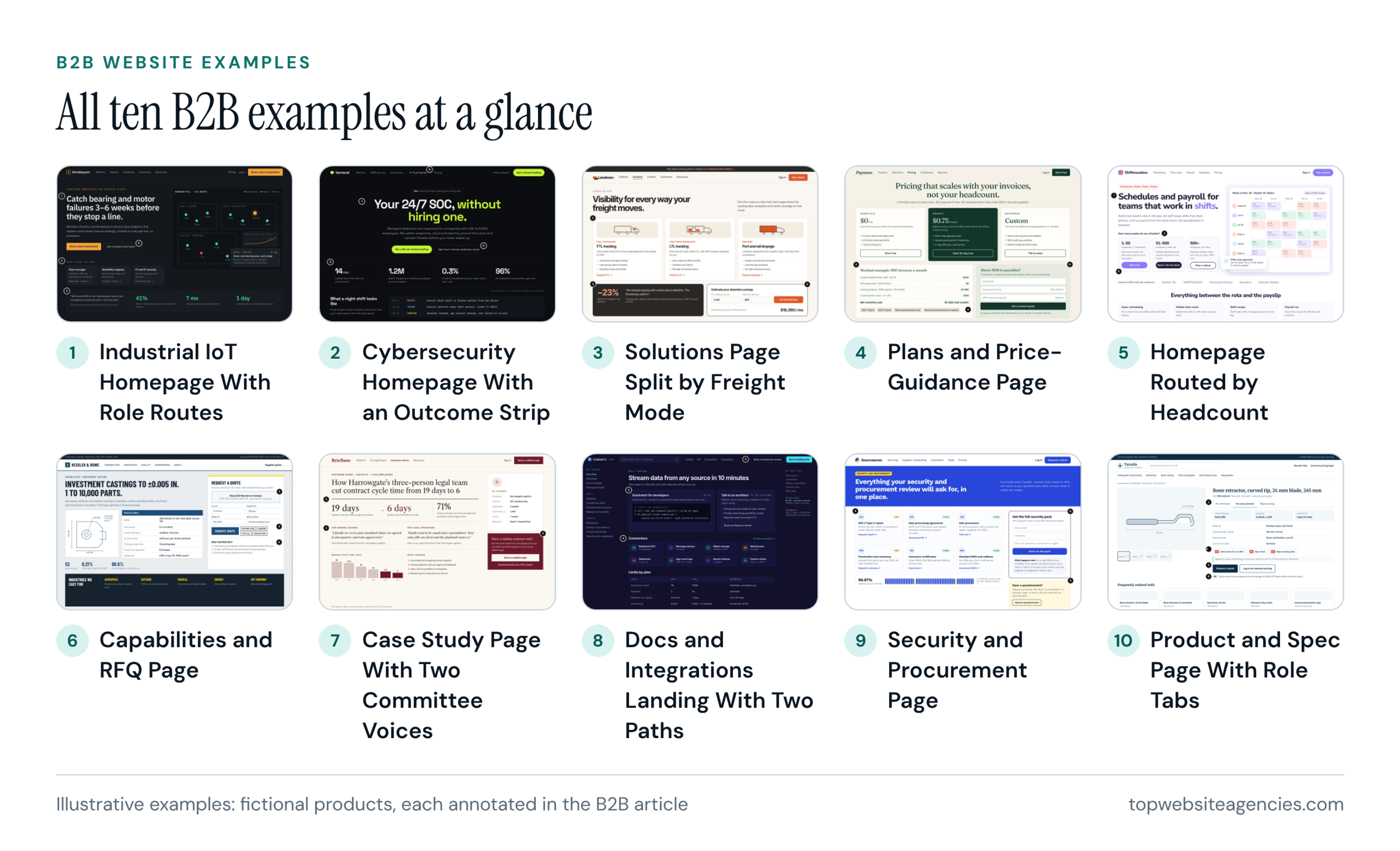
Full annotations for all ten: B2B website examples for long sales cycles.
Start here if you sell to a buying group and your visitors need documents, not slogans, before they talk to anyone.
SaaS
Software buyers compare before they commit, so this set leans on pages past the homepage. Seven of the ten fictional examples are inner pages, covering plans, templates, comparison, a feature tour, signup, integrations and enterprise. Marks run from category and outcome through product on show, self-serve start and proof to plan clarity, and finally expansion and trust. Plan clarity is the mark most likely to fail. The grid below shows the whole set.
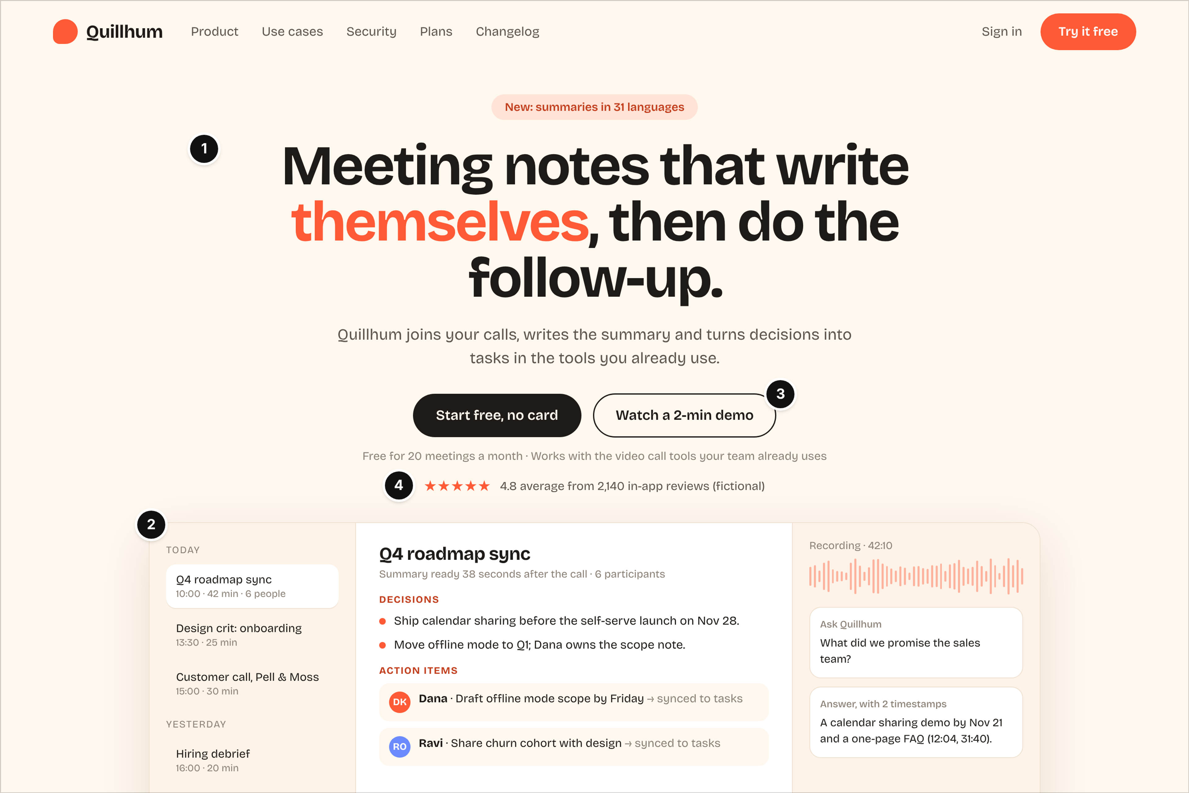
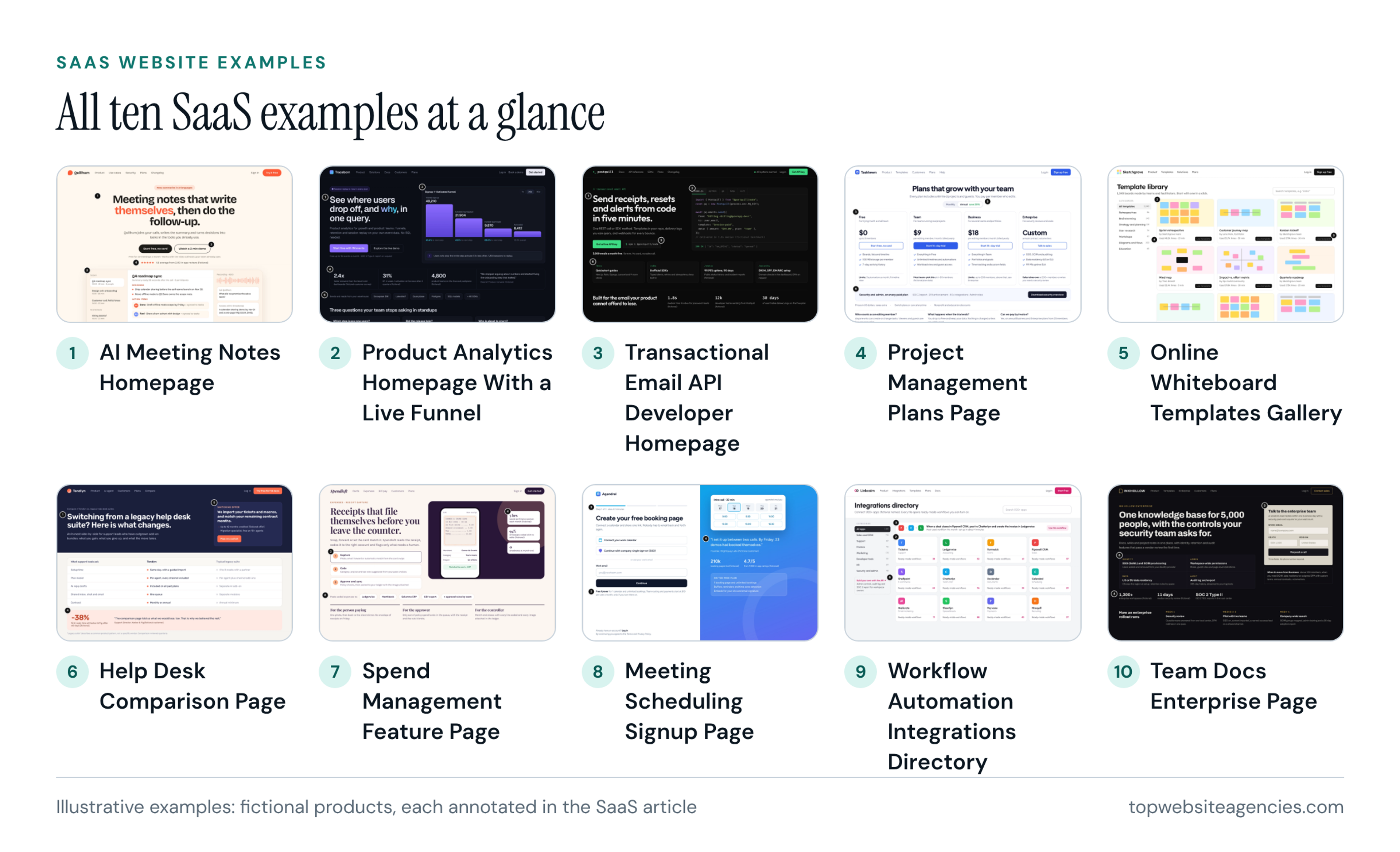
Full annotations for all ten: SaaS website examples: homepages and product pages.
Start here if your plans page has to do the explaining that a sales call would otherwise do.
Startup
What a young company needs from its site changes with funding stage, so the startup article is organized that way instead of by visual style. Seven of its ten fictional examples are page types galleries rarely show: waitlist, founder letter, explainer, pre-order, launch week, careers, and press and investor. The marks are the one-line claim, the stage's next step, founders and team, proof for the stage, hiring and investor readiness, and category ownership. The lesson I would take first is that proof has to match the stage.
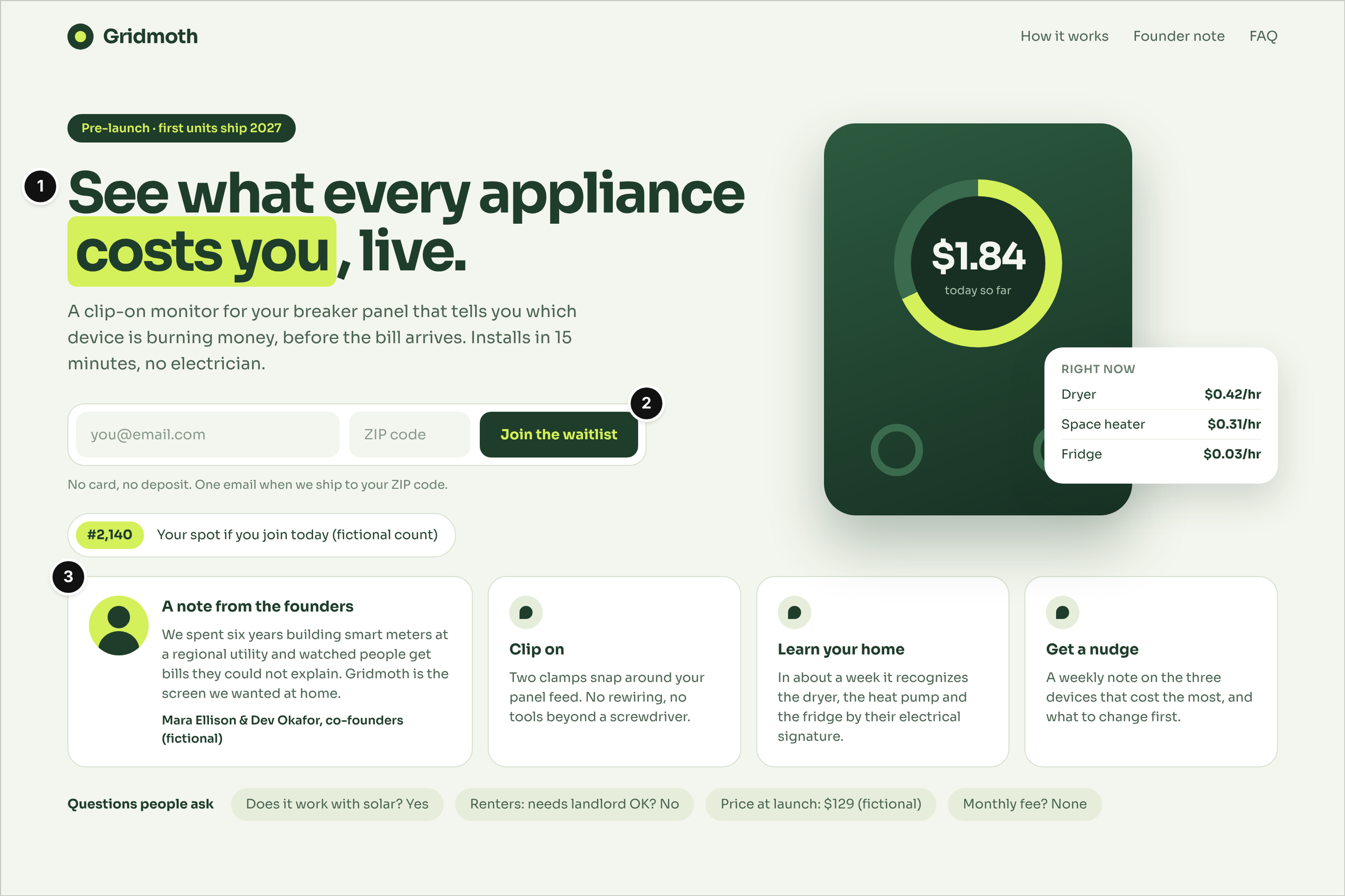
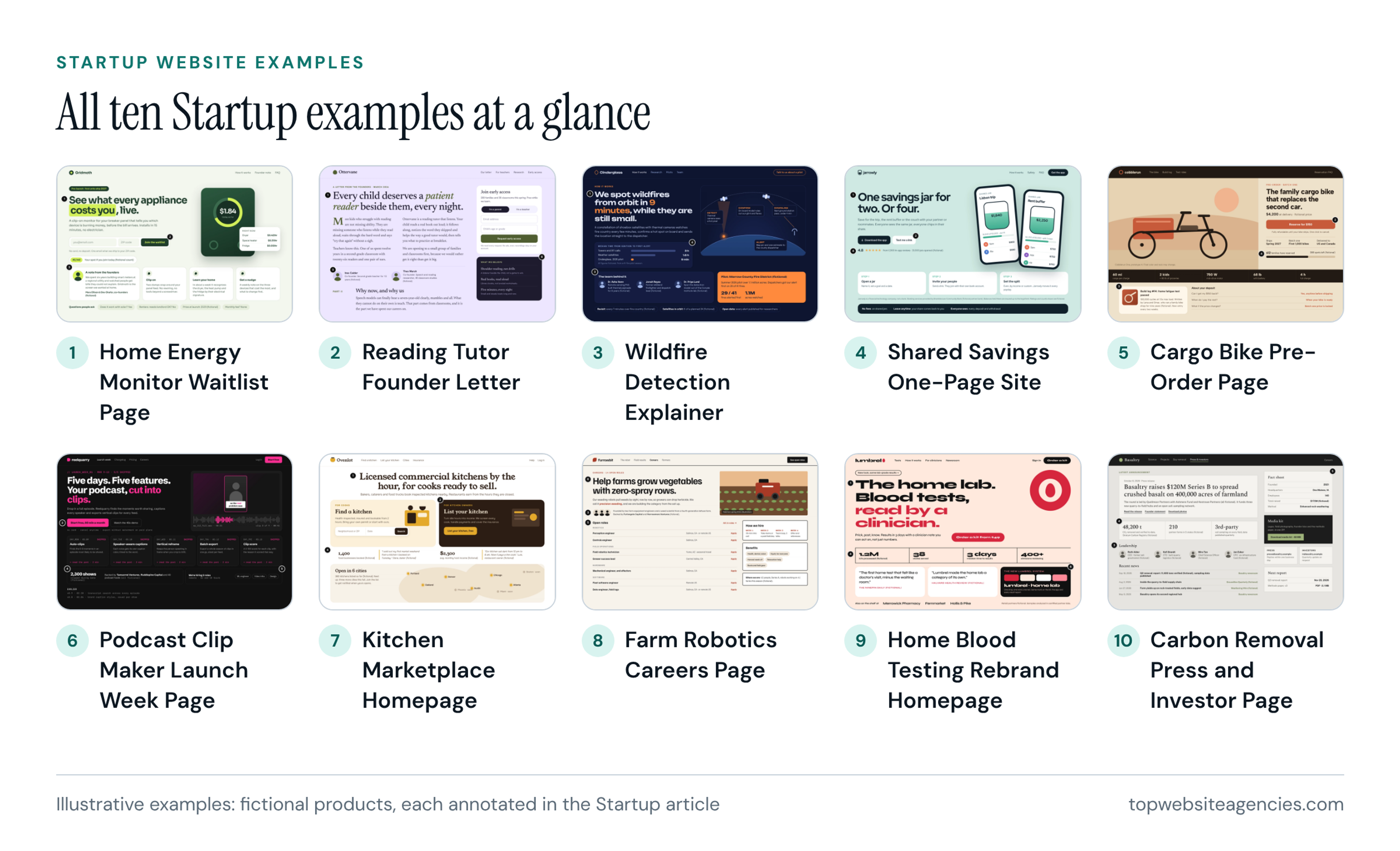
Full annotations for all ten: startup website examples by funding stage.
Start here if you are early and choosing between a waitlist, a pre-order page and a founder letter.
Healthcare
Patients and providers arrive with different jobs, and the eight fictional examples in the healthcare article reflect that. Four are inner pages: a provider directory, a procedure page, a telehealth start-a-visit page and a pharmacy refill page. The marks are main task first, the right clinician, cost and coverage up front, clinical trust, safe routing and access for everyone. Three of the eight carry an emergency or crisis notice, which is the safe-routing mark in practice.
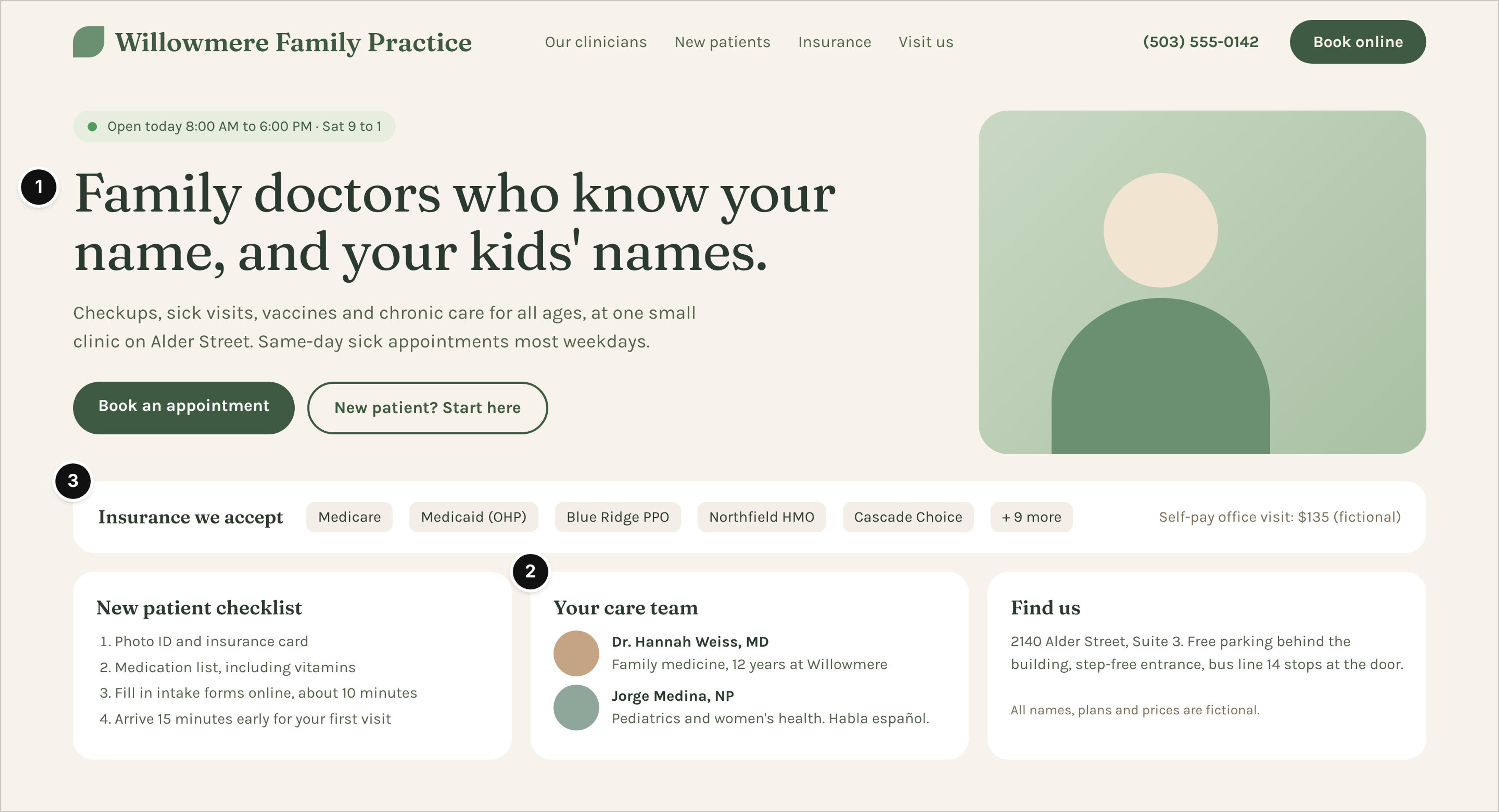
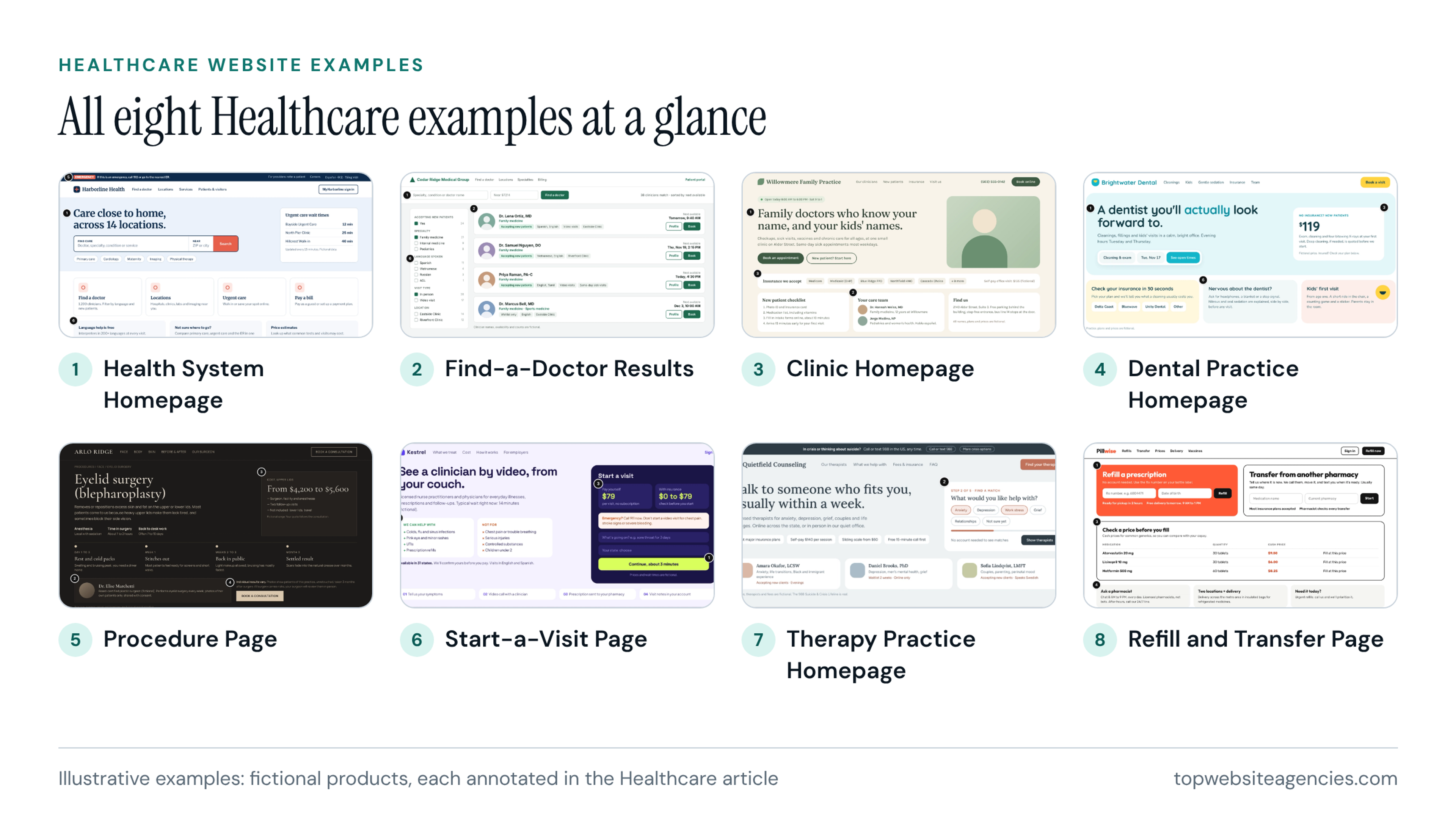
Full annotations for all eight: healthcare website examples for patients and providers.
Start here if your site must get a person to the right clinician or the right next step, including people who should not be using a booking form.
Fintech
Money raises the trust bar, and the eight fictional layouts in the fintech article are marked against it. The six marks are clear offer, fees and rates in numbers, who holds the money, security explained, real product proof and safe paths. The examples include a banking homepage, a send-money calculator, a fees page and a check-your-rate page. Putting a number on the first screen is a decision any team can copy without copying a visual.
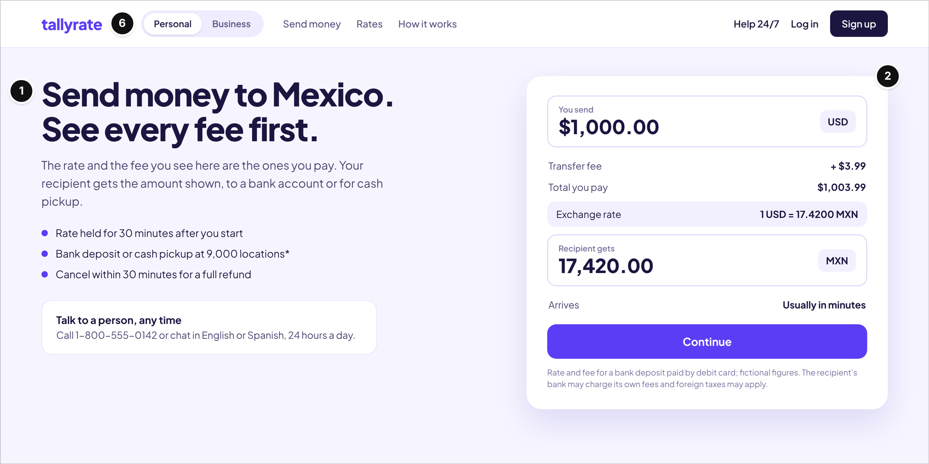
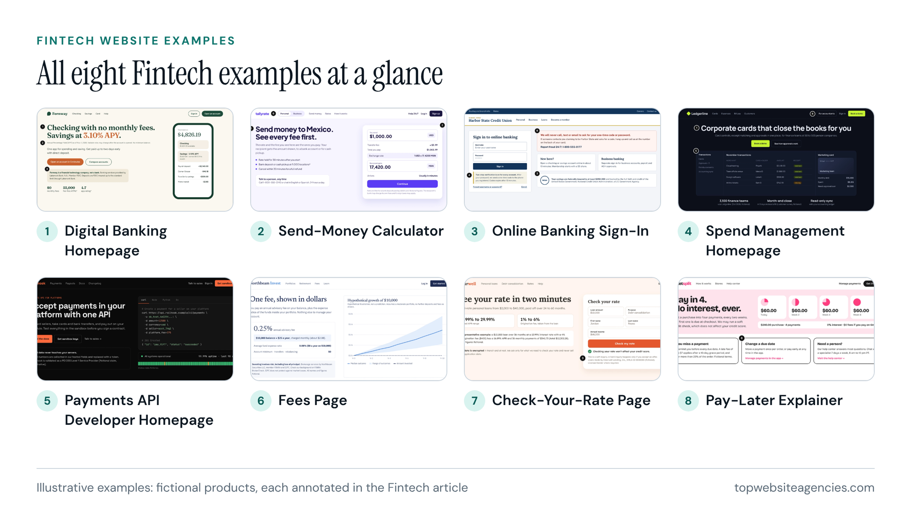
Full annotations for all eight: fintech website examples for trust and compliance.
Start here if your product holds, moves or prices money and visitors will look for the catch.
Ecommerce
Catalog type shapes a store, so the ten fictional layouts in the ecommerce article range from a mattress and a coffee subscription to industrial parts, marketplace search, jewelry and a pet supplies checkout. Apparel, beauty, furniture and a headphones comparison complete the set. The marks are clear offer and path, full price in numbers, fit-to-buy details, delivery and returns promise, real proof, and an easy path to buy and get help. Six of the ten show the full price or total in numbers, and four show real proof with review counts.
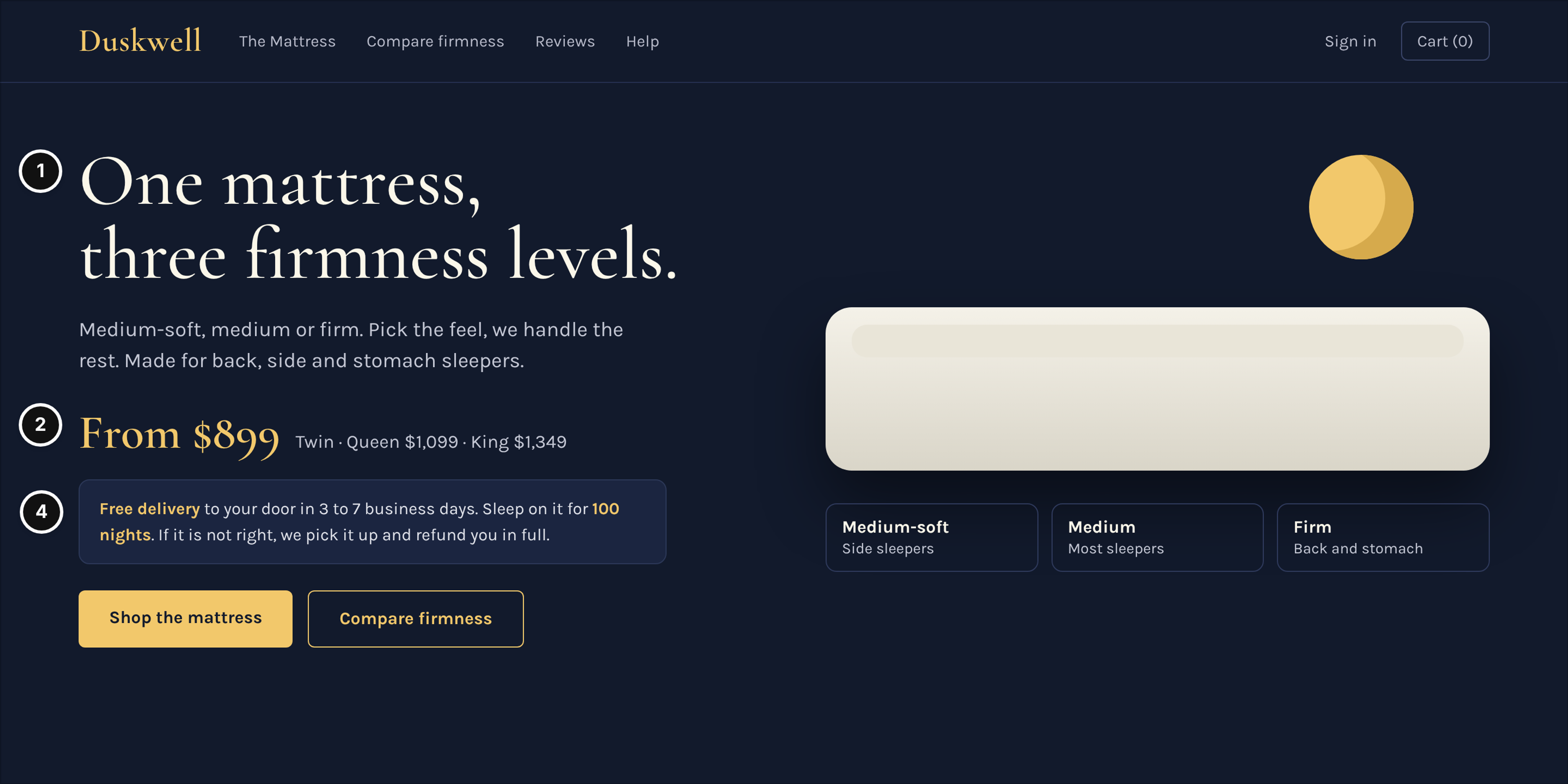
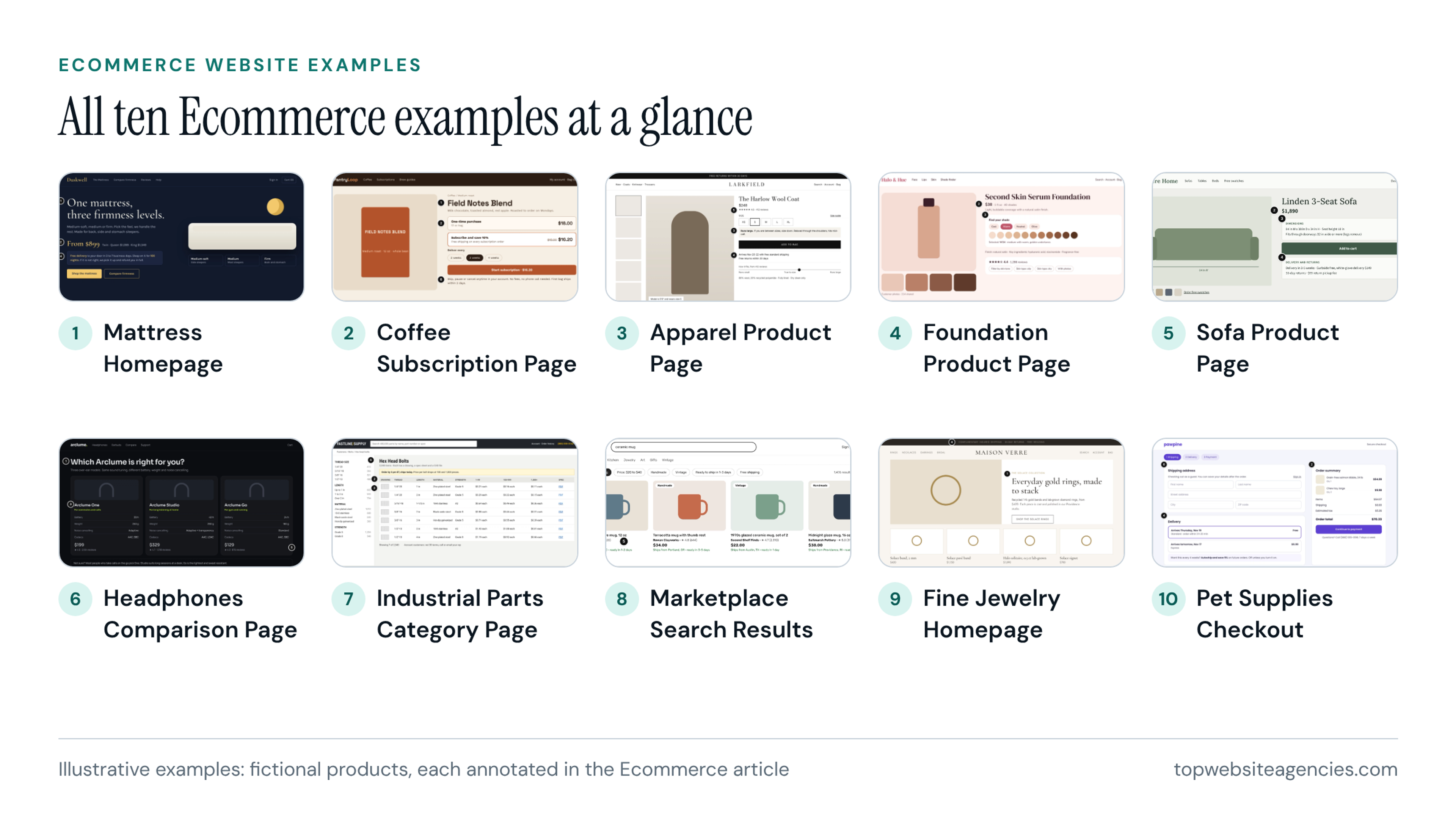
Full annotations for all ten: ecommerce store layouts by catalog type.
Start here if you sell physical goods and want to see how price, shipping promise and buy button sit together.
Website Design Examples by Page Type
Website design examples by page type answer a different question from the industry view: you already know which page you are building and want references for it. The list below names the page type, what to look for and which article holds it. Articles are referred to by industry name only, because the links are in the section above.
- Homepages. Look for the first-screen claim and the routes it gives different visitors. The B2B, SaaS and Fintech articles include a role-routed homepage, an AI meeting-notes homepage and a banking homepage.
- Plans and pricing. Look for whether a buyer can predict the bill. B2B has a plans page with price guidance, SaaS has a plans page, and Fintech has a fees page.
- Comparison and product pages. Look for fit-to-buy details and how the product is shown. SaaS covers a comparison and a feature tour, Ecommerce has a headphones comparison, and B2B has a product spec page.
- Proof and case-study pages. Look for proof placed beside the claim it supports. The B2B article holds the dedicated case-study example.
- Security and procurement pages. Look for the answers a buyer's reviewer needs before approving. B2B has a security and procurement page, and Fintech scores how well security is explained.
- Sign-up and checkout. Look for a next step that fits the visitor and a clear account of what happens after the click. SaaS has signup, Ecommerce has a pet supplies checkout, Healthcare has telehealth start-a-visit and pharmacy refill, and Startup has waitlist and pre-order pages.
- Careers and press. Look for hiring and investor readiness. The Startup article has careers and a press and investor page.
What is coming next. Homepage, pricing page and about page design example articles are on our editorial list. Until then, the industry articles above are where those page types are annotated.
What We Annotate on Every Example
The six rubrics use different labels, but they ask the same six questions. Here is how they line up at a high level:
- First-screen claim: positioning in B2B, category and outcome in SaaS, the one-line claim in Startup, main task first in Healthcare, clear offer in Fintech and Ecommerce.
- Cost or plan clarity: plan clarity in SaaS, cost and coverage up front in Healthcare, fees and rates in numbers in Fintech, full price in numbers in Ecommerce.
- Proof placed next to the claim: proof in B2B and SaaS, proof for the stage in Startup, real product proof in Fintech, real proof in Ecommerce.
- Evaluation and trust material: evaluation assets in B2B, expansion and trust in SaaS, clinical trust in Healthcare, who holds the money and security explained in Fintech.
- The next step that fits the visitor: next step per stage in B2B, self-serve start in SaaS, the stage's next step in Startup, an easy path to buy in Ecommerce.
- What happens after the click: sales handoff in B2B, safe routing in Healthcare, safe paths in Fintech.
Numbered marks beat adjectives like clean or modern because an adjective describes taste, and taste cannot be checked. "Full price in numbers" can be checked in seconds, and it gives a designer a requirement instead of an opinion to argue with.
What is an example of a good website design? In our scoring, it is one where the first screen says what the product is and who it is for, the cost is visible, proof sits next to the claim, and the next step fits the visitor. A good example also makes clear what happens after the click, which is where many pages go quiet.
How to Use This Index When You Are Choosing a Direction
- Pick the closest industry. Read that article first. If your business sits between two, such as a fintech startup, read both and note where their marks overlap.
- Pick the page types you actually need. A team selling to a buying group will get more from plans, security and case-study references than from checkout flows. Choose the three or four pages your visitors will actually use.
- Copy decisions, not visuals. The fictional examples have no brand worth borrowing, which is the point. Carry over choices such as a price on the first screen or a returns promise beside the buy button.
- Build a reference board with one note per page. Each note should say which mark the page meets and what you want to take from it. Illustrative example: "Plans page: shows what next year's bill looks like. We need the same before the plan button."
- Write the notes into a brief. Group the notes by page and turn each into a requirement. The result should be a brief that carries your reference notes to the agency, not a folder of screenshots nobody can interpret.
- Take the board to agencies. Show them the board and the brief together, and ask how they would meet each note. To build a shortlist, use the ranked list linked above: 54 agencies with one five-factor score.
Frequently Asked Questions (FAQ)
What is an example of a good website design?
A good example tells a visitor what the product is on the first screen, shows the cost or plan in plain numbers, and puts proof next to the claim it supports. It then offers a next step that fits where the visitor is. We judge examples against numbered marks for this, not against how the page looks.
What are the top 10 website designs?
We do not publish a top 10 list of sites. Ranking designs has no single measure, because a layout that suits a mattress store would not suit a patient portal. We publish 56 annotated examples instead, and each article's six marks show you how to judge a layout for yourself.
What are the 7 C's of website design?
It is not an official standard, and different authors use different lists of C's. We do not rely on it. Our six marks do the same job for a buying decision, and they change by industry so they can be specific.
What is the 3 second rule in website design?
It is a rule of thumb, and people use it two ways: a visitor should grasp what the site is and what to do next almost immediately, or a page should load in about three seconds. We do not attach a statistic or a study to either. In our scoring the first meaning maps to the first-screen mark, so the test is whether the claim and the next step are visible without scrolling or guessing.
Where can I find real website design examples?
Public galleries show real, published sites, while our six articles annotate fictional ones so that nobody is critiqued. Use both. Galleries are good for seeing what is out there, and the annotated examples show why a layout works and what to copy.
How many examples should I collect?
A handful per page type is enough, as a matter of editor's judgment. More than that tends to produce contradictory notes and a longer brief with no clearer direction. Pick the references you can explain in one sentence each, and drop the rest.
Conclusion
Use this page as a map, not a destination. Pick the industry article closest to your business, read its examples against the six marks, then gather a handful of references for each page type you need. Write one note per page, keep the notes as requirements, and carry them into your brief.
My recommendation is to spend your time on inner pages, where plans, proof, security and checkout decisions are made, and to treat homepages as one page among several. A board built that way gives an agency something specific to meet, and it gives you a way to judge what comes back.