A good B2B website example is one where each person on the buying committee finds the answer they need at their stage of the deal: what the product replaces, whether it fits their role, whether the proof holds up and what happens when they ask for a quote or a security review. The ten examples below are fictional, annotated layouts, one page type each. Read them for the decisions behind each page, then carry those decisions, not the visuals, into your own brief.
If you're also comparing B2B web design agencies ranked on their buying-committee work, these layouts make a useful yardstick for the portfolios you're shown. Seven of the ten are inner pages: a solutions page, a plans page, an RFQ page, a case study, a docs landing, a security pack and a product spec page. That ratio is deliberate. Example galleries are mostly homepages, yet in a long sales cycle the deal is often decided on the pages a champion forwards to finance, IT and procurement.
What are B2B websites? They're websites that sell to other businesses rather than to consumers. Because the purchase usually involves several people, a longer evaluation and a contract, the site has to support research and internal approval, not a quick checkout.
This article stays on examples. The reasoning behind each page type is covered in my guide to what a B2B site has to do for each person on the buying committee. Budgets are in a separate line-by-line budget for a B2B build.
How to Read These Examples
Reviewing shipped client sites is most of my work as editor of our rankings. It's how the web design studios we score on their live client sites get their scores, and it taught me to look at a B2B page the way a buyer does: as a set of questions, asked by different people, in a rough order. Every example below carries numbered marks, and each number means the same thing on every image:
- 1 Positioning: who the product is for and what it replaces, readable in about ten seconds.
- 2 Buyer routes: paths by role, company size, industry or use case, so each committee member finds their own page.
- 3 Proof: named, specific outcomes, case studies, data and references, placed next to the claim they support.
- 4 Evaluation assets: security and compliance documents, specs, docs, integrations and the procurement pack.
- 5 Next step per stage: a demo, quote, calculator, trial or price guidance, sized to how ready the visitor is.
- 6 Sales handoff: form length, routing and what happens after someone clicks submit.
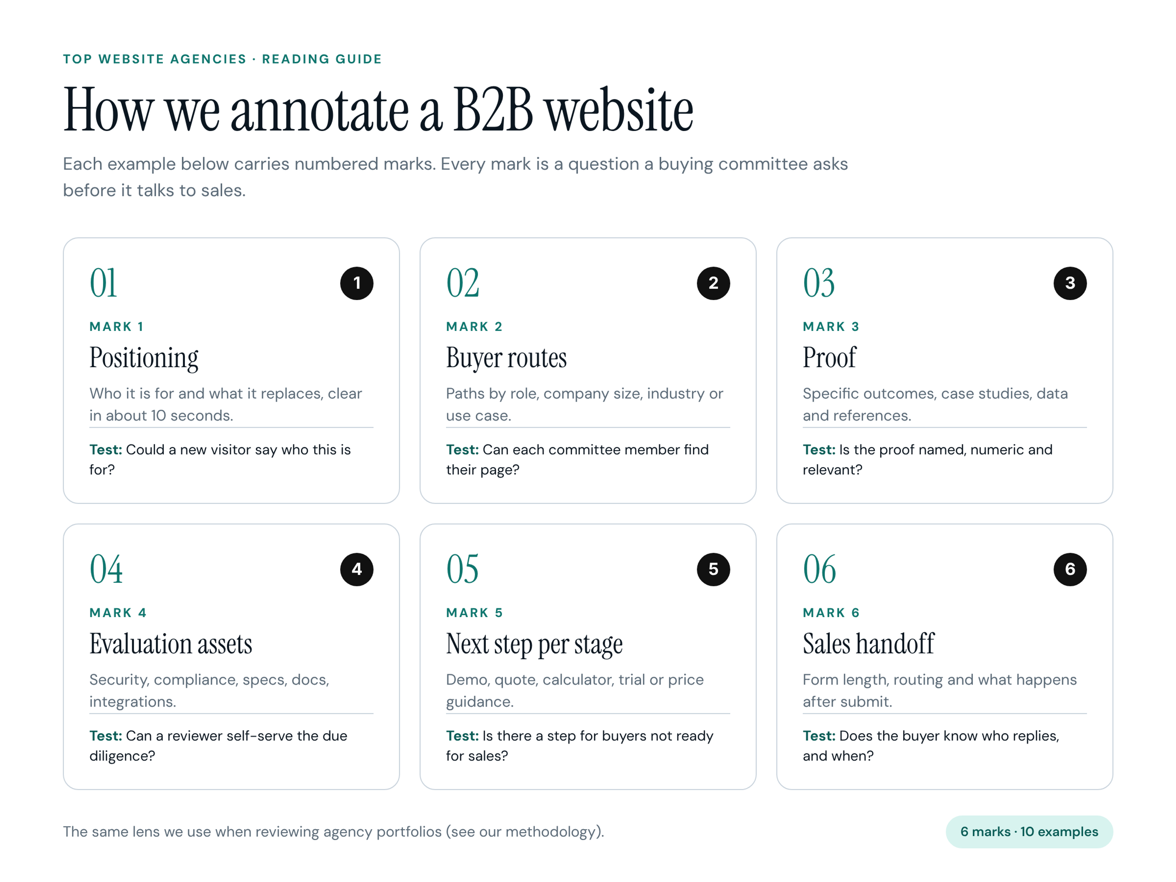
A mark appears only where the page really does that job. A homepage that names its buyer gets a 1; a plans page with a short, honest enterprise form gets a 6. This is the same lens behind the rubric we use to review agency portfolios, applied to one page at a time instead of a whole body of work.
The Ten Examples at a Glance
- Example 1: Brindlepoint, industrial IoT, homepage with role routes, marks 1, 2, 3, 5.
- Example 2: Vantorel, managed detection and response, homepage with an outcome strip, marks 1, 3, 4, 5.
- Example 3: Laneloom, logistics SaaS, solutions page by freight mode, marks 2, 3, 5.
- Example 4: Paystave, AP automation, plans and price-guidance page, marks 4, 5, 6.
- Example 5: Shiftmeadow, HR software, homepage routed by headcount, marks 1, 2, 5.
- Example 6: Kessler & Rowe, precision castings, capabilities and RFQ page, marks 4, 5, 6.
- Example 7: Brieflane, legal tech, case study page, marks 2, 3, 5.
- Example 8: Tidewell, data infrastructure, docs and integrations landing, marks 2, 4, 5.
- Example 9: Sourcewren, procurement software, security and procurement page, marks 4, 5, 6.
- Example 10: Tarsalis Surgical Supply, medical device supplier, product and spec page, marks 2, 4, 5, 6.
Counting the marks across the set says something on its own. Mark 5 appears on all ten pages, because every page type needs a next step. Mark 1 appears only on the three homepages: inner pages inherit positioning and spend their space on the job in front of them. Mark 6, the handoff, shows up on four of the ten, all of them late-stage pages where a buyer is about to hand over a drawing, a volume figure or a security questionnaire.
Ten Annotated B2B Website Examples
1. Brindlepoint: Industrial IoT Homepage With Role Routes
Fictional product: Brindlepoint, condition monitoring for process plants. Page type: homepage (first visit).
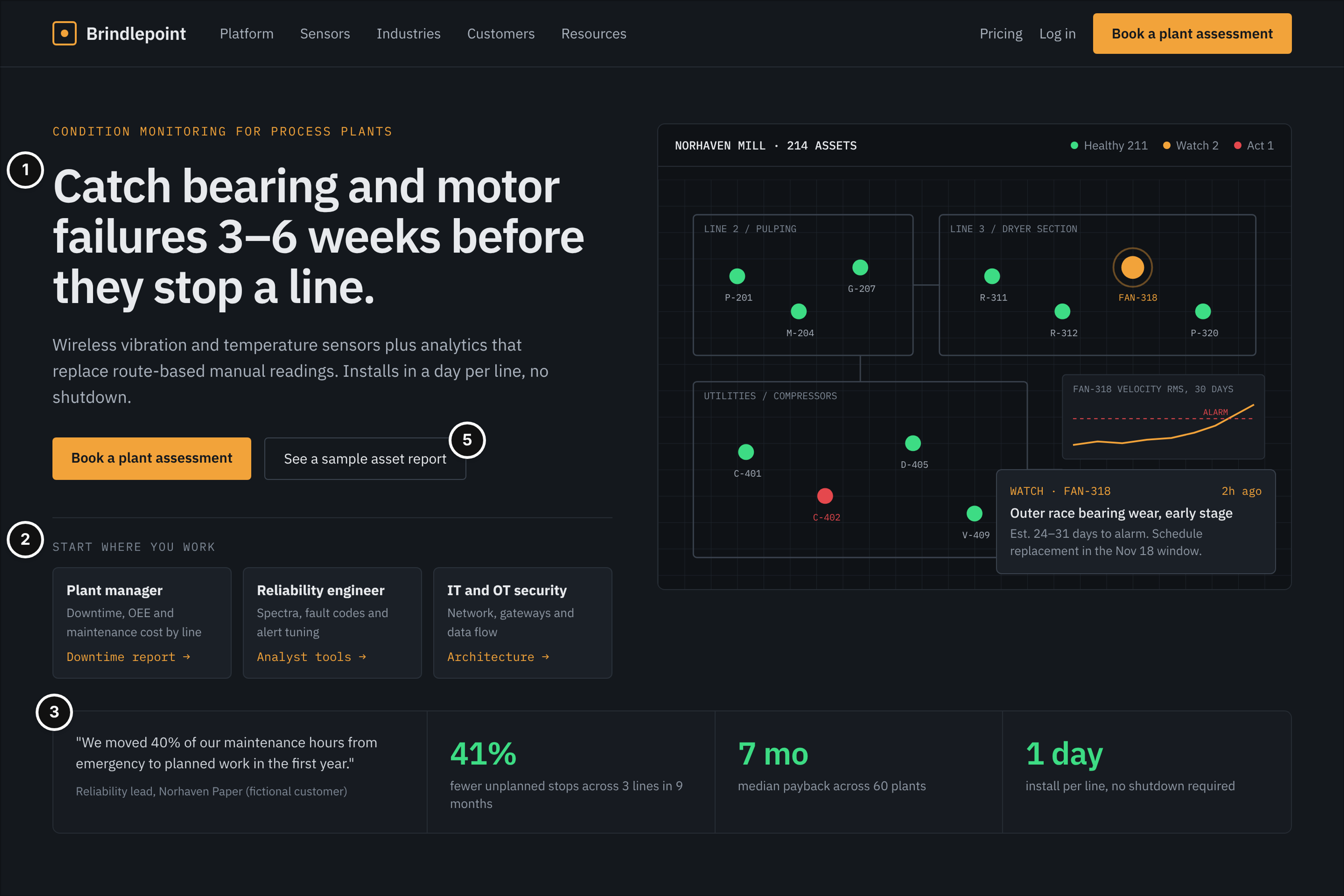
Who it serves and the question: A plant manager or reliability engineer who has heard about predictive maintenance, plus the IT and OT security lead who will be pulled in later. Their question: is this built for plants like mine, and what can I do next without starting a sales cycle?
What works: The headline names the failure it prevents, bearing and motor failures caught weeks early, and the subhead names what it replaces: route-based manual readings (mark 1). Right below, three role cards split the audience into plant manager, reliability engineer and IT/OT security, each pointing to its own page (mark 2). Proof sits beside the live asset map instead of in a logo bar, as a quote from a reliability lead and three figures with units and timeframes, all fictional here (mark 3). There are two calls to action: a plant assessment for the visitor who's ready and a sample asset report for the one who isn't (mark 5).
Watch out: Role cards only help when the pages behind them are real. I regularly see three cards that land on the same generic product page, which teaches the IT reviewer to stop clicking. A "median payback" figure also needs its basis stated on the page it links to, or a skeptical engineer will discount it.
2. Vantorel: Cybersecurity Homepage With an Outcome Strip
Fictional product: Vantorel, managed detection and response. Page type: homepage with a trust center link in the top menu (first visit).
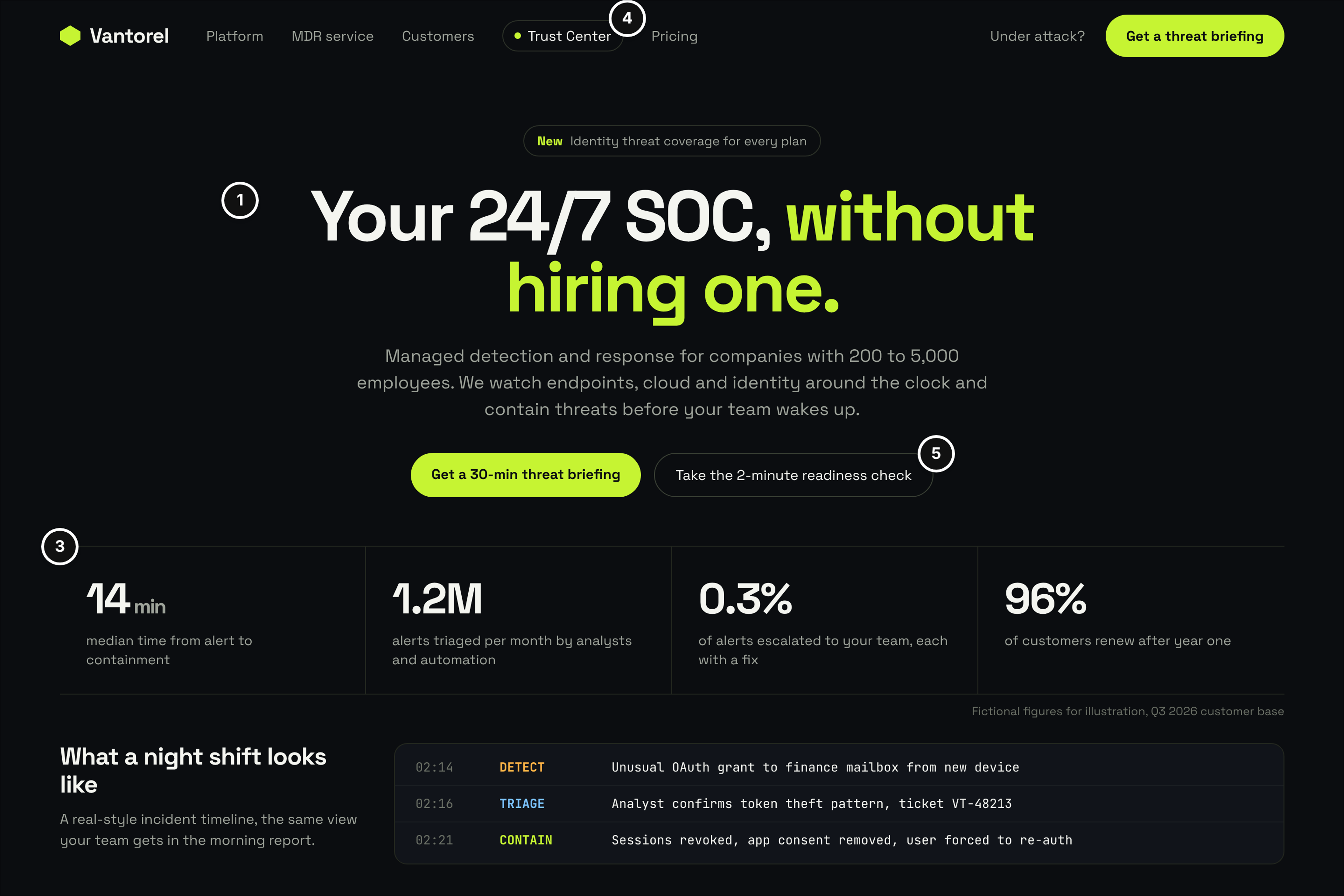
Who it serves and the question: An IT director or CISO at a company of 200 to 5,000 employees without a round-the-clock security team. The question: will this team actually respond at 2 a.m., and can my security reviewer find the evidence without booking a call?
What works: Positioning is a single line that names the alternative, "your 24/7 SOC, without hiring one," and the subhead states the employee range so buyers outside it self-select (mark 1). The outcome strip uses operational figures a buyer can check on a reference call: median time from alert to containment, share of alerts escalated and first-year renewal, labelled as fictional (mark 3). Trust Center sits in the top menu, not the footer, so the security reviewer the champion forwards the link to finds it in one click (mark 4). The two calls to action, a threat briefing and a two-minute readiness check, give early visitors something smaller than a sales call (mark 5).
Watch out: Big volume counts such as alerts triaged per month look impressive and tell the buyer little. What they care about is what reaches their own team, so lead with the escalated share. Keep the "Under attack?" link visible too, because a visitor in the middle of an incident is a different audience with a different first question.
3. Laneloom: Solutions Page Split by Freight Mode
Fictional product: Laneloom, freight visibility for shippers. Page type: solutions page by mode (exploring and early evaluation).
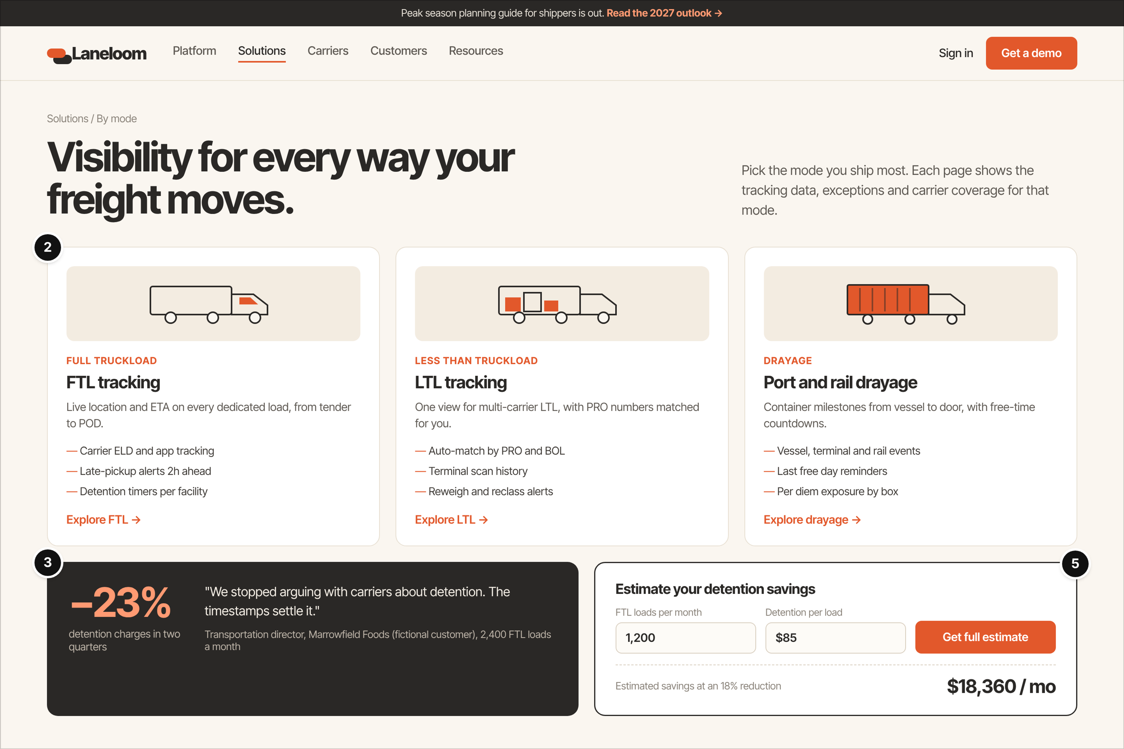
Who it serves and the question: A transportation director at a shipper who already knows they need visibility and is comparing tools. The question: does this cover the way we actually ship, and what is it worth at our volume?
What works: Instead of one solutions page for everyone, the page splits by mode: full truckload, less-than-truckload and drayage. Each card lists the data and exceptions specific to that mode, such as detention timers, PRO number matching and last-free-day reminders (mark 2). That vocabulary is proof of fit in itself. One proof block ties a single outcome to a named, fictional customer and its monthly load count, so the reader can judge how similar that shipper is to them (mark 3). The estimator teaser has two inputs with plausible defaults and shows its assumption, an 18% reduction, right next to the result (mark 5).
Watch out: A calculator without visible assumptions reads as marketing math, and finance will discount it. Don't gate the headline result behind a form either. If you need a lead, gate the detailed report and let the number speak first.
4. Paystave: Plans and Price-Guidance Page
Fictional product: Paystave, AP automation for finance teams. Page type: plans and price guidance (evaluation).
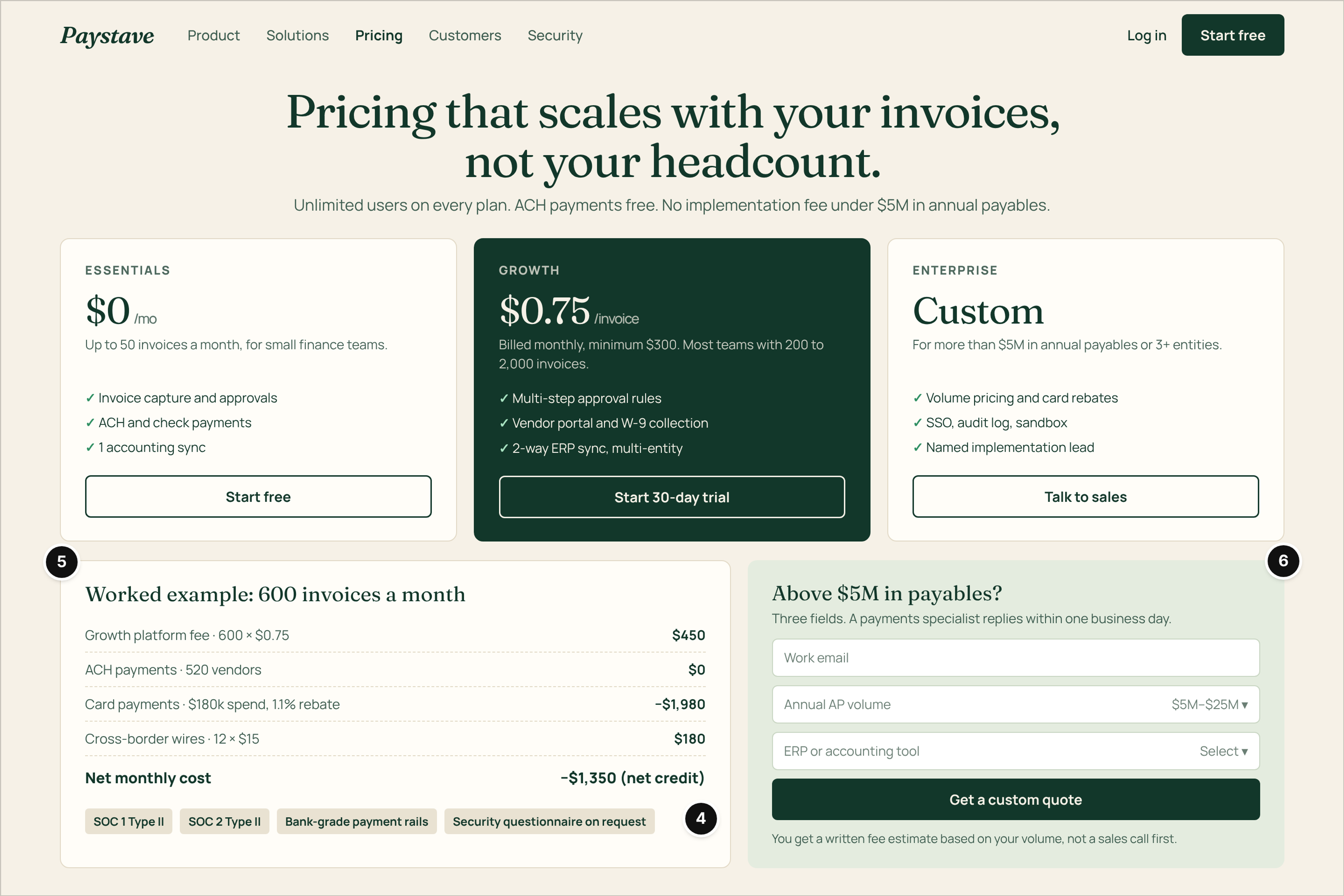
Who it serves and the question: A controller shortlisting accounts payable tools and the CFO who will approve the spend. The question: what will this cost at our invoice volume, and at what point do we have to talk to sales?
What works: Three plans use clear units, a per-invoice fee with a stated monthly minimum, and the page says exactly where custom quotes begin: above $5M in annual payables or three or more entities (mark 5). A worked example walks through 600 invoices a month line by line, rebates included, so the reader can redo the math with their own numbers. Every figure on the page is fictional. Security attestations sit directly under the plans, because finance buyers ask about controls before they ask about features (mark 4). The enterprise form has three fields and says what comes back: a written fee estimate within one business day, not a discovery call (mark 6).
Watch out: A worked example that ends in a net credit, as this one does, can look too good to be true. Add a second, less favorable scenario, or the reviewer will assume you picked the flattering one.
5. Shiftmeadow: Homepage Routed by Headcount
Fictional product: Shiftmeadow, scheduling and payroll for multi-site employers. Page type: homepage (first visit).
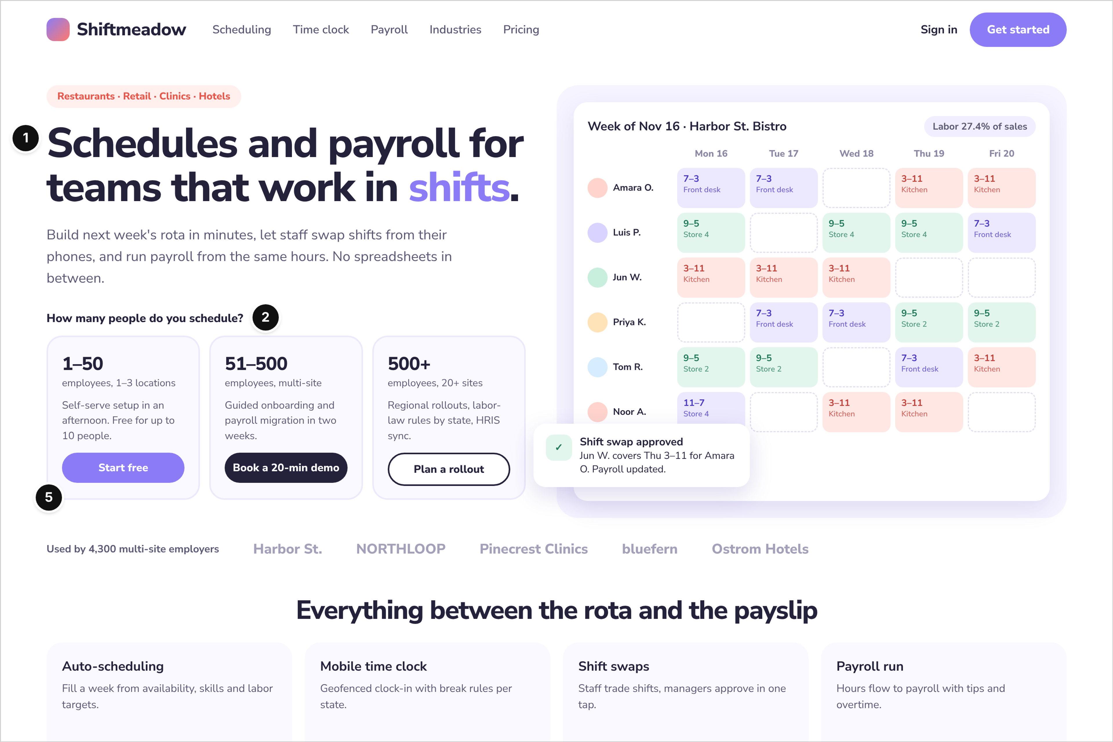
Who it serves and the question: An operations manager at a restaurant group, retail chain, clinic network or hotel group. The question: is this meant for an operation my size, and how much work is setup?
What works: The headline names the work pattern, shifts, and the subhead names what it replaces: the spreadsheets between the rota and payroll (mark 1). The main routing question is plain, "How many people do you schedule?", with three bands that each lead to a different next step (mark 2). Small teams start free, the middle band books a 20-minute demo and large employers plan a rollout, so the call to action matches the effort the buyer expects (mark 5). The product preview shows a realistic week with labor as a share of sales, the number an operator actually watches.
Watch out: Size routing fails when the bands don't match how buyers count. A franchise with 40 small locations may not see itself in an employee band at all. Pair headcount with locations, as this layout does, or ask for both.
6. Kessler & Rowe: Capabilities and RFQ Page
Fictional supplier: Kessler & Rowe, precision investment castings. Page type: capabilities and RFQ page (evaluation and quote).
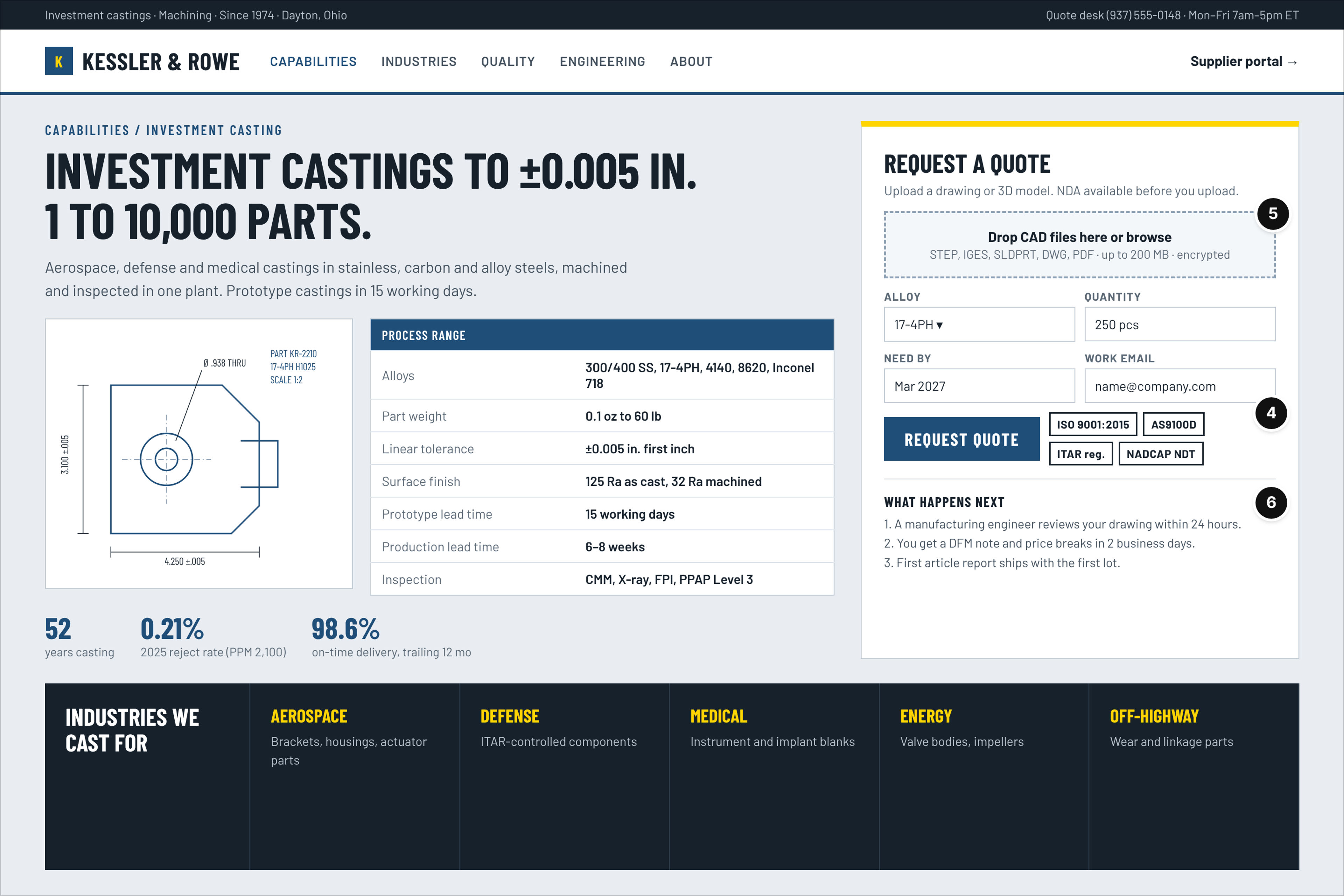
Who it serves and the question: A sourcing engineer or buyer at an aerospace, defense or medical manufacturer with a drawing ready to send. The question: can this supplier hold my tolerances and certifications, and how quickly will I get a quote?
What works: The capabilities panel covers what an engineer filters on: alloys, part weight, tolerance, surface finish, lead times and inspection methods (mark 4). Certifications sit right next to the quote button rather than on an About page, because a buyer who can't confirm the quality system won't upload a drawing (mark 4). The RFQ form accepts CAD files, offers an NDA before upload and asks only for alloy, quantity, need-by date and work email (mark 5). A three-step "what happens next" block says who reviews the drawing and when the price breaks arrive (mark 6).
Watch out: Industrial sites often bury the RFQ form under a generic Contact page. The opposite mistake is just as common: a long RFQ that asks for annual spend before the buyer has seen a price. Ask for what you need to quote and nothing more.
7. Brieflane: Case Study Page With Two Committee Voices
Fictional product: Brieflane, contract lifecycle software for in-house legal teams. Page type: customer case study (evaluation).
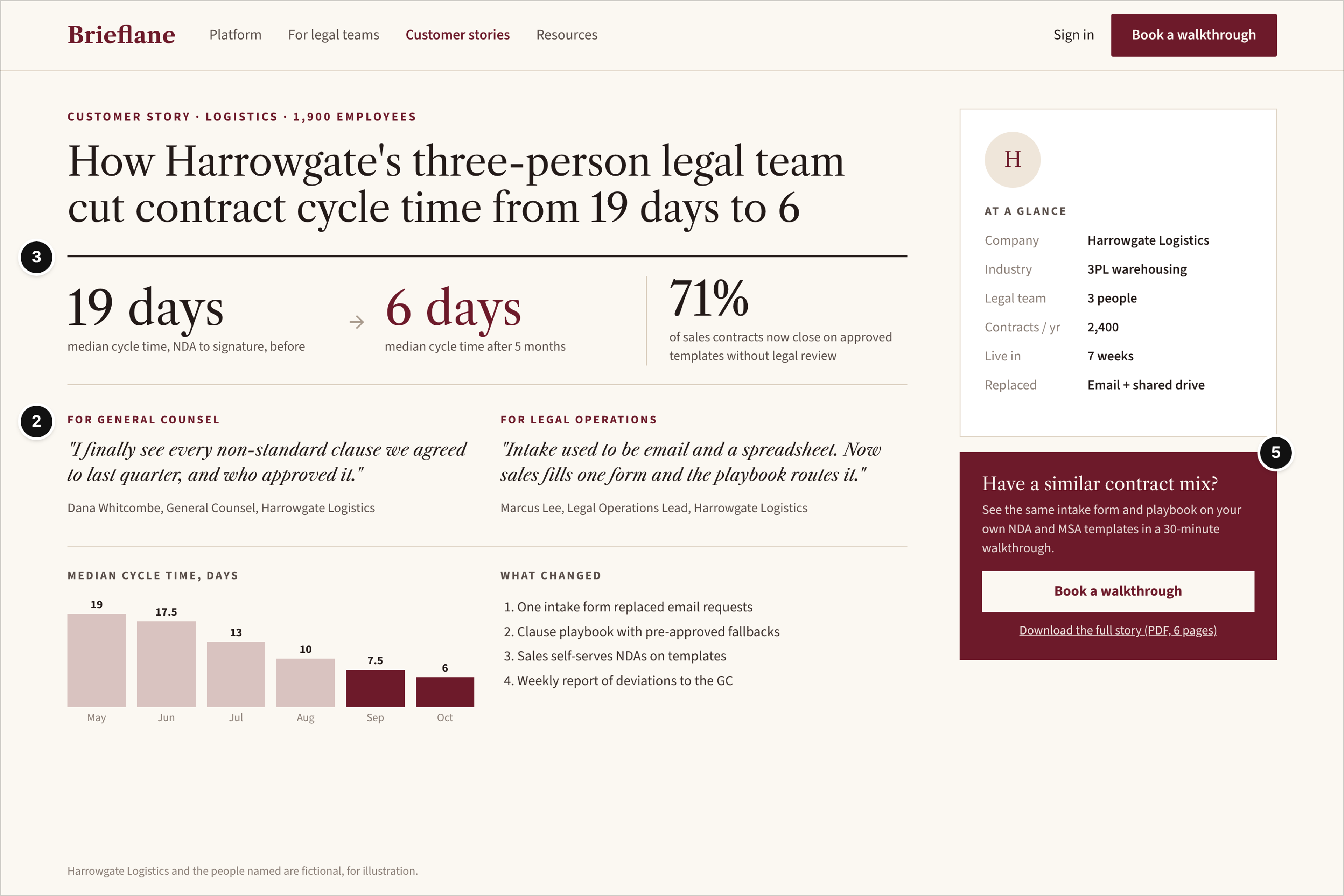
Who it serves and the question: A general counsel deciding whether to sponsor the purchase and the legal operations lead who will run it day to day. The question: did a team like ours get a measurable result, and what had to change to get it?
What works: The headline is the outcome in one sentence, with team size and the before-and-after cycle time, 19 days down to 6 in this fictional story (mark 3). Two quotes, one per role, answer different worries: visibility into non-standard clauses for the general counsel and a cleaner intake process for legal ops (mark 2). An "at a glance" panel lists company size, contract volume, time to go live and what was replaced, so a reader can judge similarity in seconds. The next step offers the same walkthrough on the reader's own templates, which is a smaller ask than a generic demo (mark 5).
Watch out: Case studies written for the vendor's sales deck tend to bury the number in the fourth paragraph. Put it in the headline. And never publish a named person's quote without written permission; in this example the company and the people are fictional and labelled that way on the page.
8. Tidewell: Docs and Integrations Landing With Two Paths
Fictional product: Tidewell, streaming data pipelines. Page type: docs and integrations landing (technical evaluation).
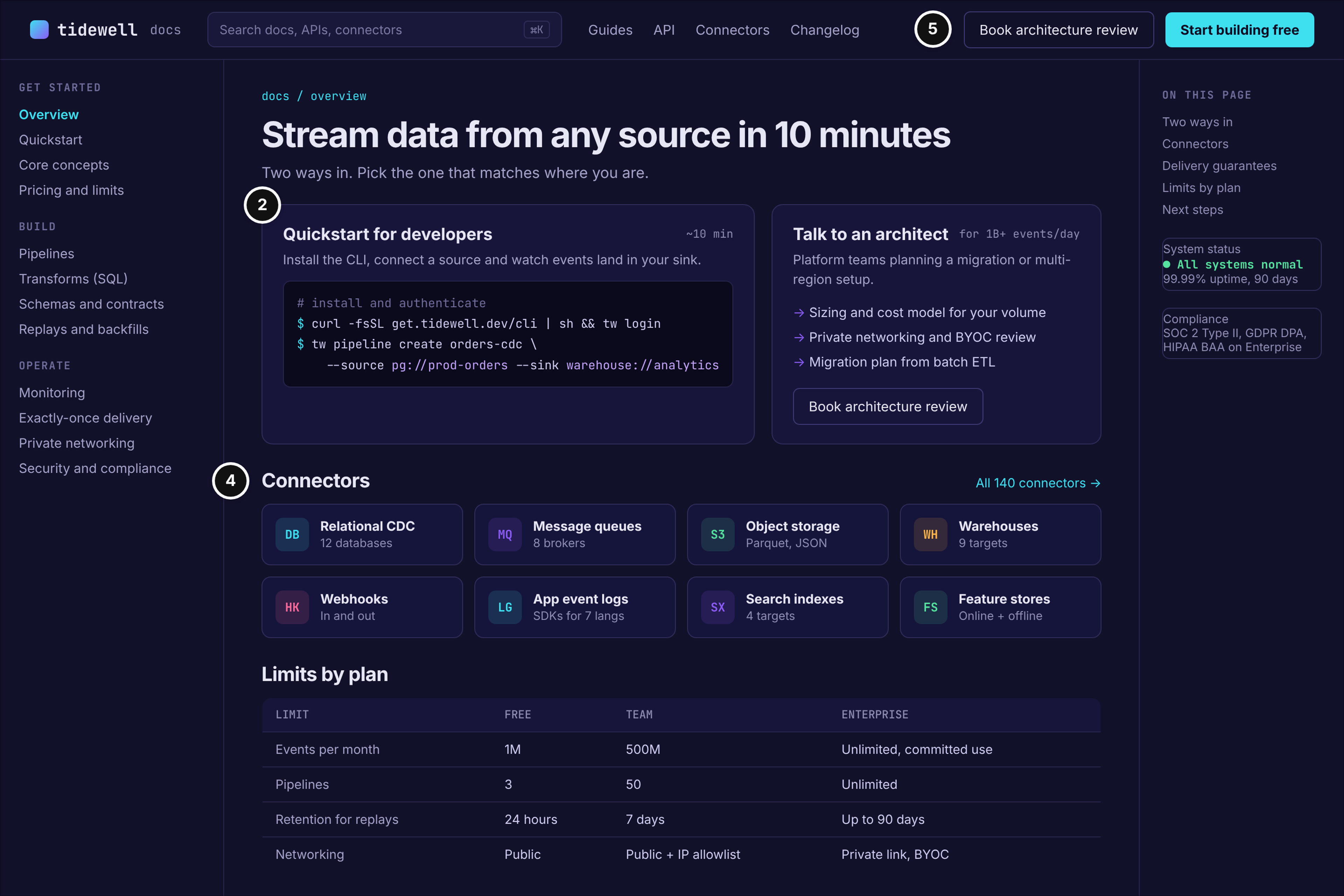
Who it serves and the question: A data engineer evaluating hands-on and a platform lead planning a large migration. The question: can I try this in ten minutes, and does it connect to what we already run?
What works: The page offers two routes at equal visual weight: a quickstart with copyable commands for the developer and an architecture review for teams above a stated event volume (marks 2 and 5). The connectors grid and the limits-by-plan panel answer the integration and scale questions without a call (mark 4). System status and compliance notes sit in the sidebar, exactly where a technical reviewer looks for them before writing up a recommendation.
Watch out: Docs owned by engineering and a marketing site owned by marketing drift apart over time, with different menus and different plan names. Keep plan names and limits identical across both, or the engineer will report one set of numbers to finance while your plans page shows another.
9. Sourcewren: Security and Procurement Page
Fictional product: Sourcewren, sourcing and supplier onboarding software. Page type: security and procurement pack (procurement review).
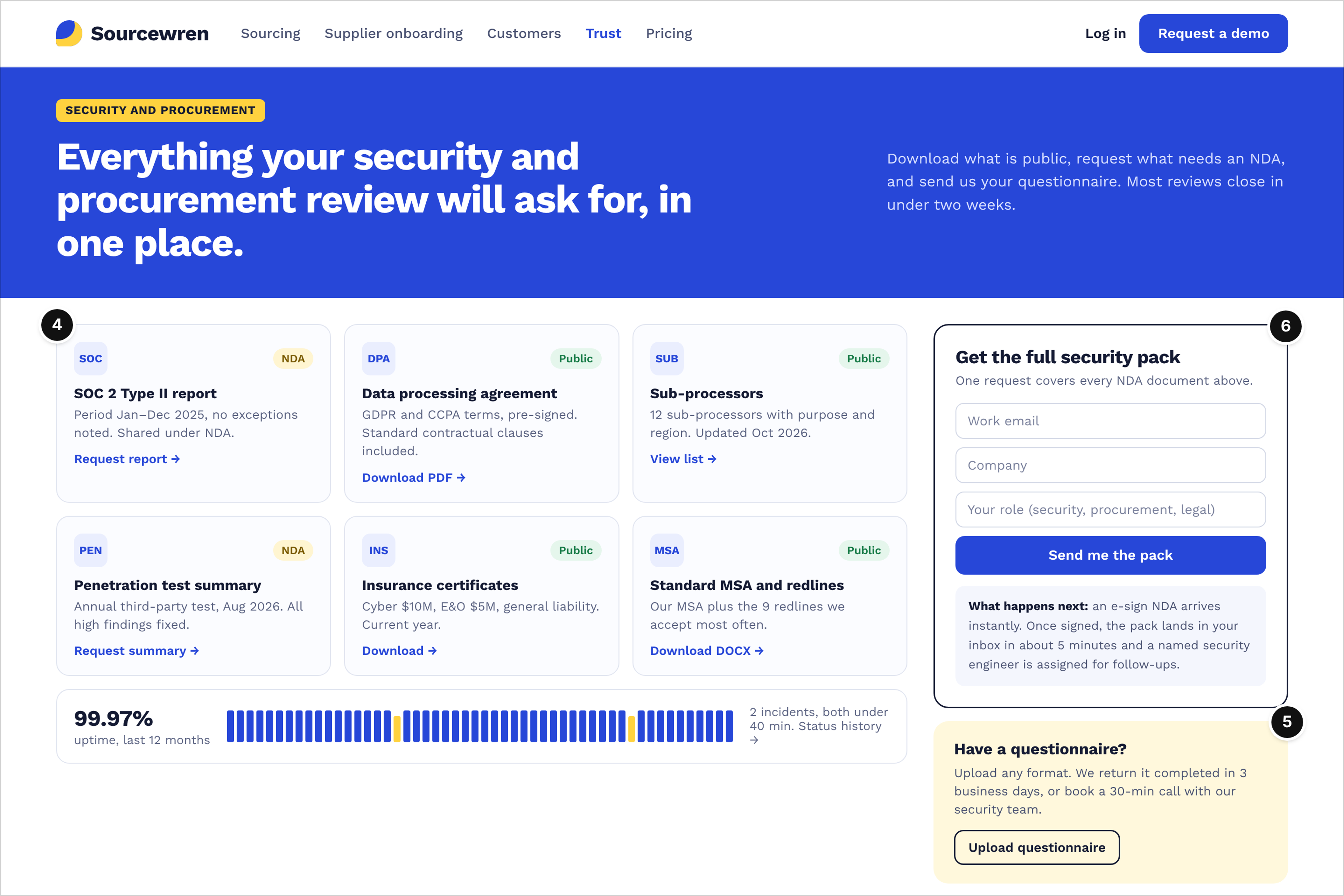
Who it serves and the question: The buyer's security reviewer and procurement manager, usually late in the cycle after the champion has already said yes. The question: can we get every document we need without weeks of email?
What works: Each document gets a card with its access level, public or under NDA, and a single action: the SOC 2 Type II report request, the data processing agreement, the sub-processor list, a pen test summary, insurance certificates and the standard MSA with the redlines the vendor accepts most often (mark 4). One request covers every NDA document, and the copy says what happens after submit: an e-sign NDA right away, the pack by email once it's signed and a named security engineer for follow-ups (mark 6). A questionnaire upload with a stated turnaround gives the reviewer a next step that doesn't depend on a sales rep's calendar (mark 5).
Watch out: Publishing accepted MSA redlines speeds up legal review, but agree on it with your legal team first, because once it's public it becomes your opening position. Keep the dates current as well. A sub-processor list last updated a year and a half ago will show up as a finding in the buyer's review.
10. Tarsalis Surgical Supply: Product and Spec Page With Role Tabs
Fictional supplier: Tarsalis Surgical Supply, orthopedic instruments for hospitals and surgery centers. Page type: product and spec page (procurement and reorder).
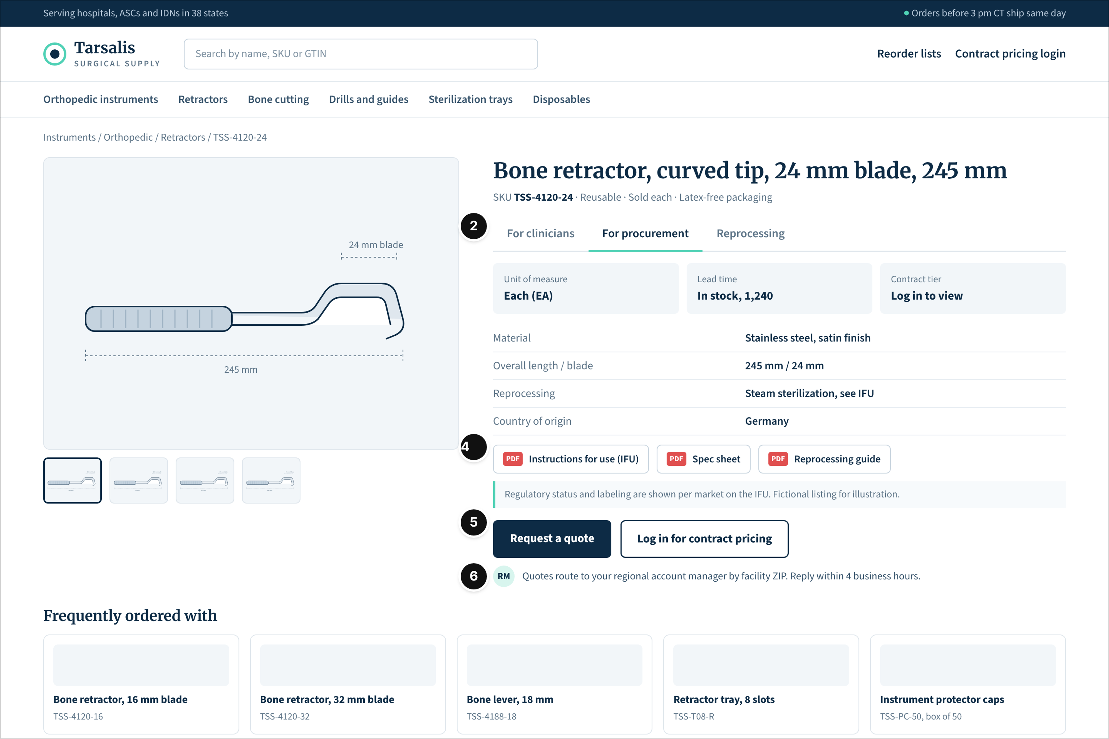
Who it serves and the question: A clinician confirming the instrument, the materials manager placing a reorder and sterile processing staff checking how it's reprocessed. The question: is this the right item, what does it cost under our contract and how do we handle it after use?
What works: Tabs split the same SKU by audience: clinicians, procurement and reprocessing (mark 2). The spec table and the downloadable instructions for use, spec sheet and reprocessing guide sit high on the page (mark 4). Two actions match two buyer states: request a quote for a new account, log in for contract pricing for an existing one (mark 5). Quote routing is spelled out, by facility ZIP code to a regional account manager with a reply window (mark 6).
This is a design pattern only, not regulatory guidance. Labeling and regulatory content for medical devices belong to your regulatory team.
Watch out: Hiding prices behind a login is normal for contract buyers, but the login wall shouldn't hide specs or documents. A reviewer who can't open the instructions for use without an account will usually check the next supplier instead.
What the Ten Layouts Have in Common
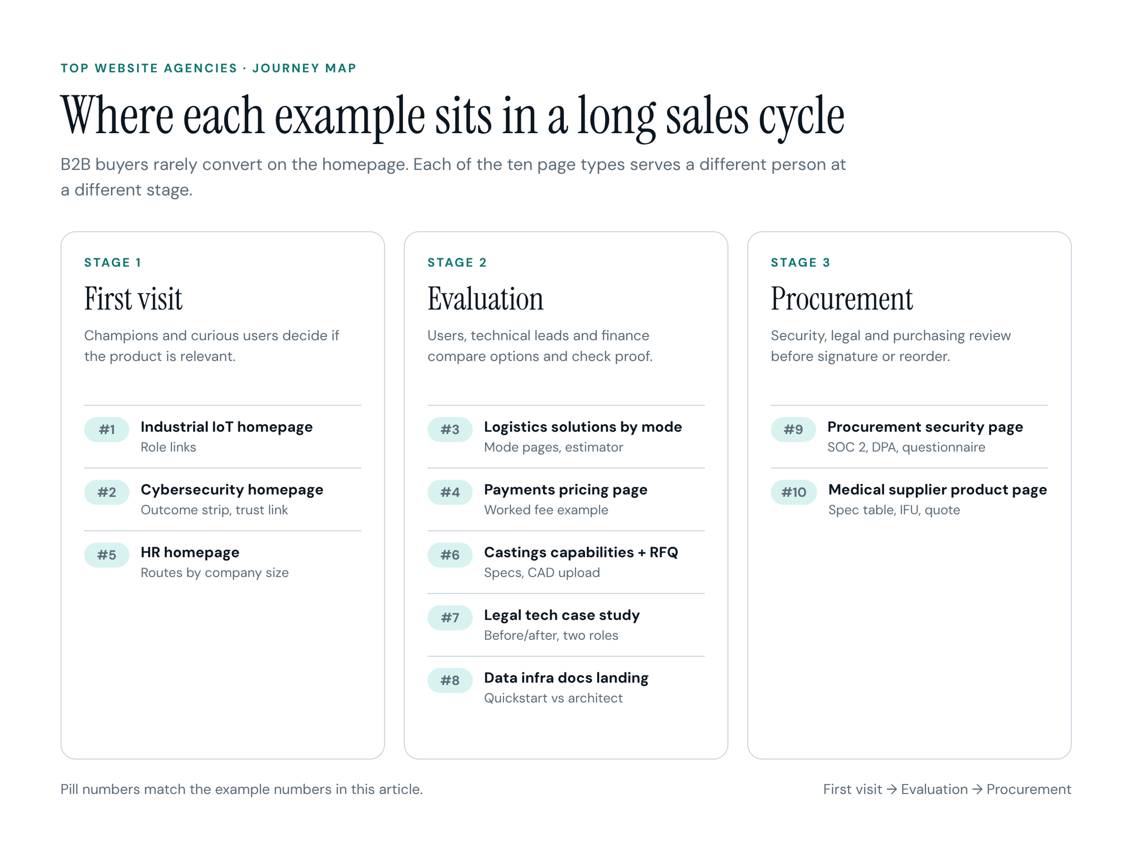
Put the ten pages on a timeline and the long sales cycle becomes visible. Homepages handle the first visit, when a champion decides whether the product is relevant. Solutions, plans, RFQ, case study and docs pages carry the evaluation, when users, technical leads and finance compare options. The security pack and the product spec page close procurement, when legal and purchasing check the details before signature or reorder. Five patterns run across all three stages:
- Positioning names the alternative. The strongest first lines say what the product replaces: manual route readings, an in-house SOC, spreadsheets between rota and payroll. A buyer explains a purchase internally by contrast, so hand them the contrast.
- Routes come before features. Each page splits its audience early, by role, company size, freight mode or technical depth. A feature list can't do that, because every committee member reads the same list for a different reason.
- Proof carries context. Numbers sit next to the claim they support and come with enough detail (team size, volume, timeframe) for the reader to judge whether that customer resembles them. A logo bar without context is the weakest proof on the page.
- Every readiness level has a step. Nine of the ten pages offer something besides "talk to sales": a sample report, a readiness check, an estimator, a free plan, a quickstart, a document download. Champions use these steps to build their internal case before they're ready for a call.
- The handoff is written, not assumed. The four pages with mark 6 tell the buyer who replies, how fast and what arrives. On most real sites I review, this is the copy nobody wrote, and the form simply ends in "Thanks, we'll be in touch."
How to Use These Examples With Your Design Team
A reference board does more for a designer than a list of sites you like, as long as it carries your reasoning. This is the format I'd hand over:
- Organize by page type, not by brand. Make a column for each page you need (homepage, solutions, plans, case study, security, RFQ or docs) and collect two or three references per column.
- Annotate before you share. Put the six marks on each reference and write one line on the question that page answers. "Certifications next to the quote button" is a brief; "clean industrial look" is a mood.
- Ask for the inner pages early. Most kickoff boards are all homepages. If your deal is decided in security review or on a plans page, those pages belong in the first design round, not in a later phase.
- Give feedback in decisions. Instead of "make it pop," say which mark is weak: "the proof isn't near the claim" or "a finance reader can't find the threshold for custom quotes."
- Bring sales into the handoff. Form fields, routing rules and reply times are sales operations decisions. Get them agreed before the forms are designed, or the design will promise a response the team can't deliver.
- Copy patterns, never pages. Your routes come from your buyers and your proof comes from your customers. A borrowed layout with someone else's buyer logic in it will look right and convert like a template.
Where to Find More Real Examples
Once you know what to look for, real sites are easy to find. Design showcase galleries, website builder showcases, tag pages on design communities, roundups by B2B marketers and community threads where marketers trade favorite sites all turn up plenty of material, across SaaS, industrial, logistics and professional services.
What these sources miss is the rest of the site. Galleries show homepages and hero sections, sometimes a single scroll. You rarely see a security page, a plans page with real thresholds, an RFQ form or a docs landing, and you never see what happens after submit. Treat a gallery as a list of addresses. Open the live site, click through to the security, plans, case study and contact pages, read the form and its confirmation copy without submitting it, and score what you find against the six marks. Ten minutes per site tells you more than an afternoon of scrolling screenshots.
Frequently Asked Questions (FAQ)
What are B2B websites?
They're sites run by businesses that sell to other businesses: software vendors, manufacturers, distributors, logistics providers and professional services firms. Some sell directly online through a B2B storefront with account pricing and reorder lists. Most support a sales process instead, where the site's job is to get the right people from first visit to a demo, quote or contract with enough evidence along the way.
What is a good example of B2B?
A good B2B example is a page pattern, not a famous brand. Look for a homepage that names the buyer and the alternative in one line, a solutions page that splits by role or use case, a plans page that states when custom quotes start, a case study with a named, specific result, and a security or procurement page a reviewer can use without a call. If a site has those five pages and each one answers its reader's question, it's worth studying, whatever it looks like.
Should a B2B website show prices?
Show as much as you can defend. Exact prices fit self-serve and mid-market products. For complex deals, price guidance works: the units you charge in, a starting point, a worked example and the threshold where a custom quote begins, as the Paystave layout does. What hurts is a plans page with nothing but "Contact us," because finance buyers drop vendors they can't size.
Do B2B ecommerce sites follow the same patterns?
Partly. Ordering sites for distributors and suppliers put more weight on search, SKU-level spec pages, account pricing and reorder lists, the way the Tarsalis layout does. The committee logic still applies, though. Clinicians, procurement and processing staff each need their own tab or route, and quote and account requests still need a clear handoff.
Conclusion
The B2B websites worth learning from aren't the prettiest ones in a gallery. They're the ones where a plant manager, a CFO, a security reviewer and a sourcing engineer can each find their answer on the page meant for them, and where the next step fits how ready they are. Use the ten layouts as a checklist of page types and the six marks as the lens. Then build your own reference board from live sites, inner pages included, and brief your designer on the decisions you want, not the looks you like.