Strong ecommerce website examples put the offer, the full price and the delivery and returns promise next to the buy button. They also help shoppers find and judge the right item fast. The ten fictional examples below are annotated against that standard, and in our review only 5 of the 10 put delivery and returns right next to the button.
If you already want a team to build or rebuild your store, start with these web design teams that build and redesign online stores. If you are still shaping the brief, the examples below show what each kind of catalog needs on the page before anyone draws a layout.
How to Read These Examples
Every example is marked against the same six questions a shopper needs answered before adding to cart and paying. The same questions are useful when you review store builds in agency portfolios, for example alongside our side-by-side scorecards for web design studios: look past the hero image and check whether the pages that sell actually answer the shopper.
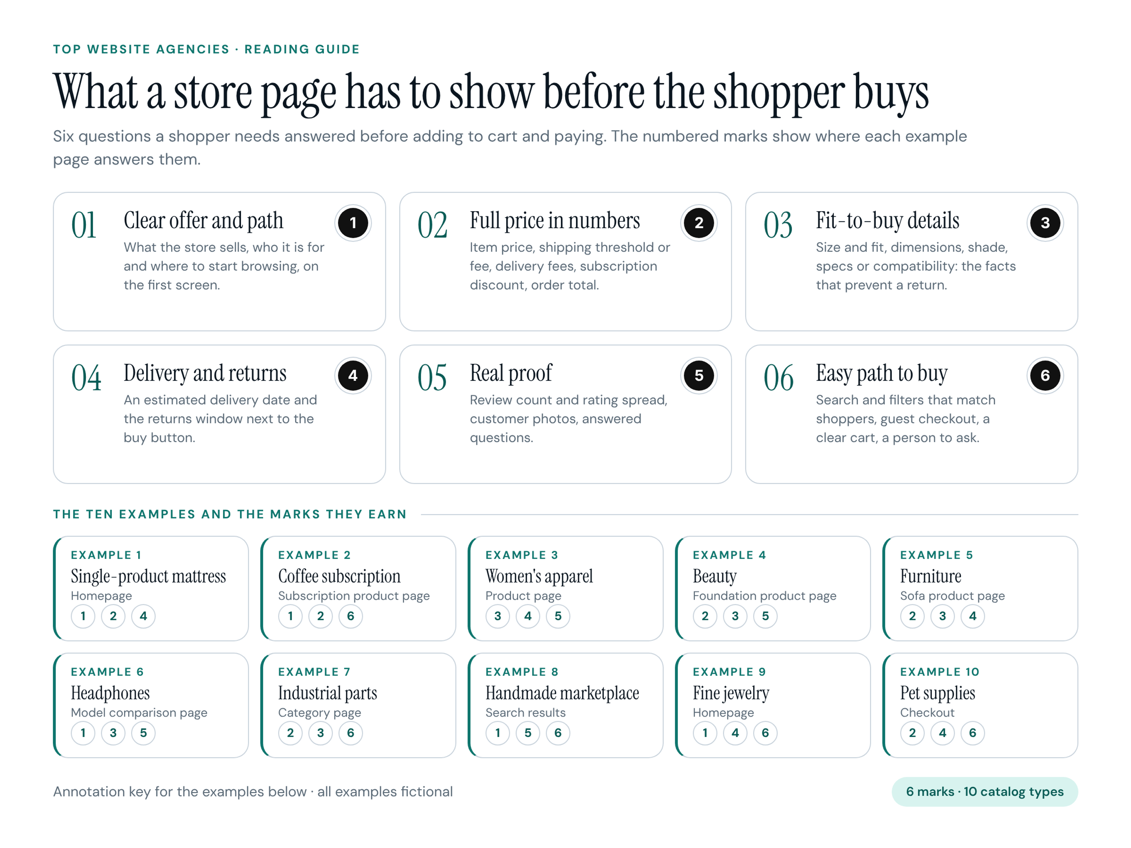
- 1 Clear offer and path: What the store sells, who it is for and how to start browsing, visible on the first screen.
- 2 Full price in numbers: The item price, the free-shipping threshold or shipping fee, delivery or assembly fees, the subscription discount and the order total, so there is no surprise at checkout.
- 3 Fit-to-buy details: Size and fit, dimensions, shade, specs or compatibility: the facts that prevent a return.
- 4 Delivery and returns promise: An estimated delivery date and the returns window placed next to the buy button, not only in the footer.
- 5 Real proof: Reviews with a count and a rating distribution, customer photos and answered questions.
- 6 Easy path to buy and get help: Search and filters that match how shoppers think, guest checkout, a clear cart and a visible way to reach a person.
The numbered marks on each image show where that page answers one of these questions. Each example earns three marks, which keeps the notes focused on what that page type does well. All stores, products, prices, reviews and phone numbers in the images are fictional.
The Ten Examples at a Glance
- Example 1, Duskwell: single-product mattress brand, homepage, marks 1, 2, 4.
- Example 2, Pantry Loop: coffee subscription, subscription product page, marks 1, 2, 6.
- Example 3, Larkfield: women's apparel, product page, marks 3, 4, 5.
- Example 4, Halo & Hue: beauty, foundation product page, marks 2, 3, 5.
- Example 5, Oakmere Home: furniture, sofa product page, marks 2, 3, 4.
- Example 6, Arclume Audio: headphones, model comparison page, marks 1, 3, 5.
- Example 7, Fastline Supply: industrial and B2B parts, category page, marks 2, 3, 6.
- Example 8, Loomstead: handmade marketplace, search results page, marks 1, 5, 6.
- Example 9, Maison Verre: fine jewelry, homepage, marks 1, 4, 6.
- Example 10, Pawpine: pet food and supplies, checkout page, marks 2, 4, 6.
Single-Product and Subscription Stores
Shoppers need to understand the core offer instantly on these layouts. They want to know what the flagship item is, what it costs in each size and how the subscription commitment works, without reading dense blocks of text.
1. Duskwell: Mattress Homepage
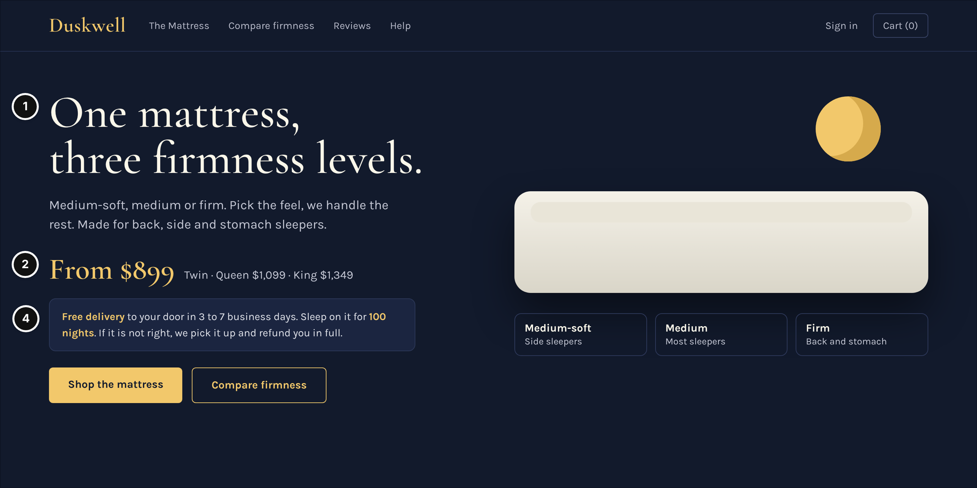
Duskwell, a direct-to-consumer mattress brand with one hero product, homepage.
Who it serves and the question: A shopper looking for a new bed who needs to know the comfort options, the price for their size and the trial terms before committing.
What works: The hero states "One mattress, three firmness levels" and the three levels sit under the product as plain labels with the sleeper they suit (mark 1). The price reads "From $899" with every size priced on the same line, queen $1,099 and king $1,349, so nobody has to open a dropdown to learn the real number (mark 2). Free delivery in 3 to 7 business days and the 100-night trial with pickup and a full refund sit right under the price, before the two buttons "Shop the mattress" and "Compare firmness" (mark 4).
Watch out: Hiding the price difference between sizes until the user clicks a dropdown option causes unnecessary friction and breaks trust.
2. Pantry Loop: Coffee Subscription Page
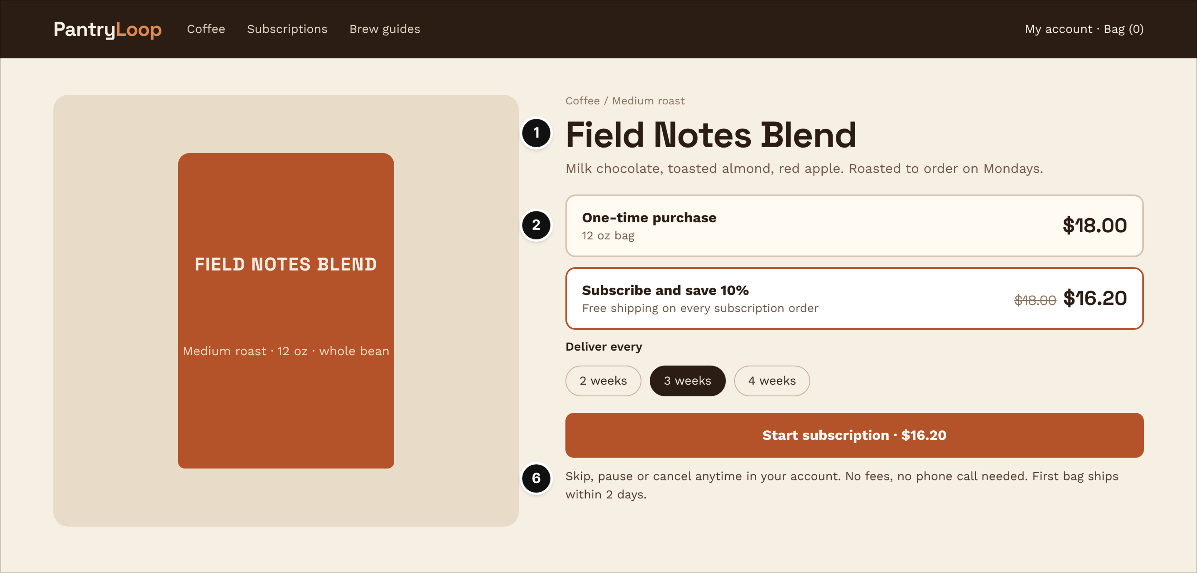
Pantry Loop, a coffee subscription, subscription product page.
Who it serves and the question: A coffee drinker deciding whether the recurring delivery is worth the savings and easy to manage.
What works: The page names the blend, the roast and the tasting notes before anything else, so the first screen says exactly what arrives (mark 1). The two purchase options sit as equal rows: a 12 oz bag at $18.00 one-time against $16.20 with subscribe and save 10%, with the struck-through price and free shipping on every subscription order (mark 2). Delivery every 2, 3 or 4 weeks is a visible choice, and "Skip, pause or cancel anytime in your account" sits immediately under the button, with no fees and no phone call needed (mark 6).
Watch out: Preselecting the subscription option without making the commitment obvious can lead to chargebacks and angry support tickets.
Fashion and Beauty: Fit and Shade
Buying wearables or cosmetics online means removing the fear of a physical mismatch. Shoppers look for exact sizing guidance, color undertones and proof from customers who look and shop like them.
3. Larkfield: Apparel Product Page
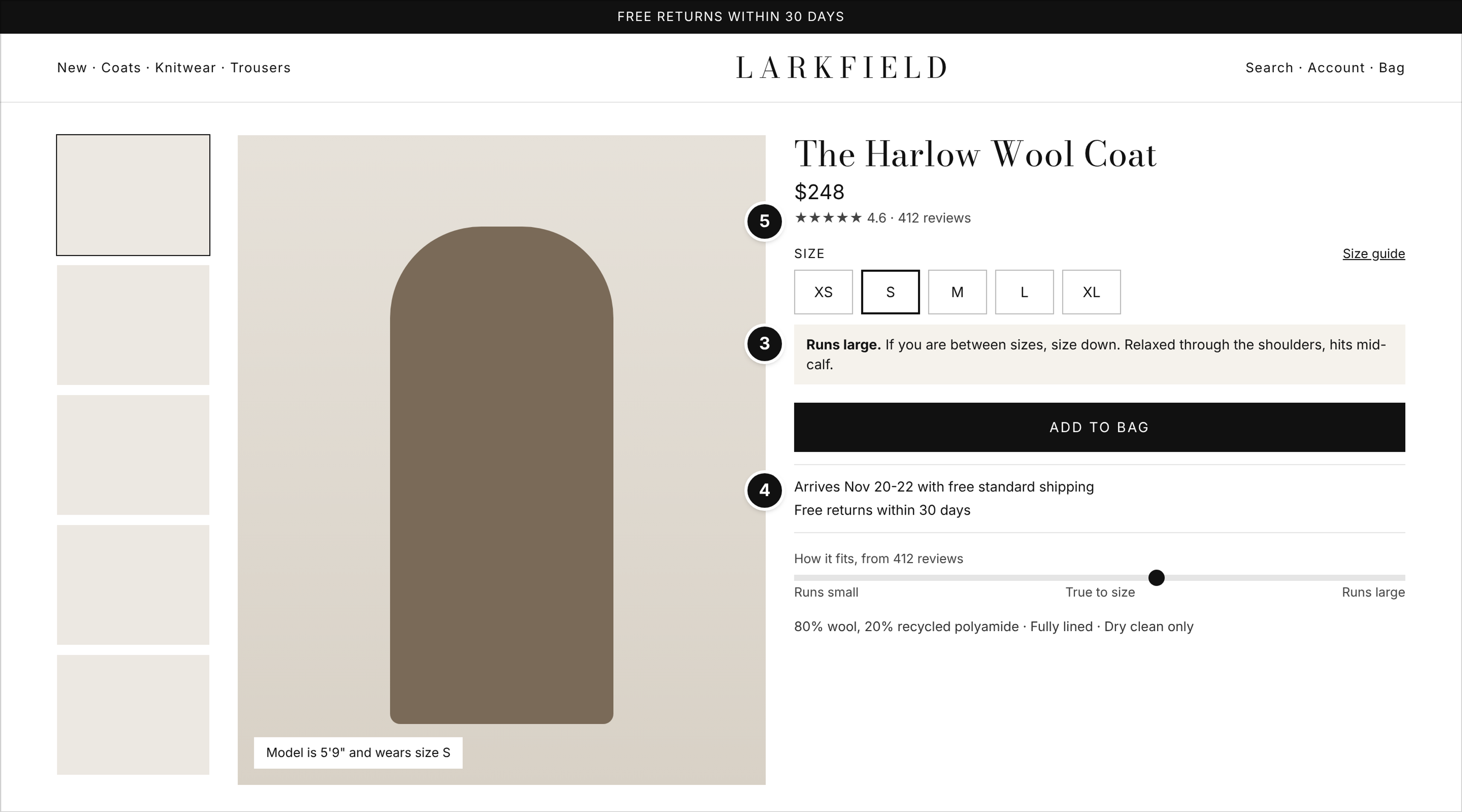
Larkfield, a women's apparel brand, product page for a $248 wool coat.
Who it serves and the question: A shopper who wants to know whether the coat will fit, when it arrives and how to return it if it does not.
What works: The size selector carries a specific fit note, "Runs large. If you are between sizes, size down", next to the model's height and size, plus fabric and care details (mark 3). "Arrives Nov 20-22" and "Free returns within 30 days" sit directly under the Add to bag button (mark 4). The 412 reviews at a 4.6 average feed a fit bar that shows whether buyers felt it runs small, true to size or large (mark 5).
Watch out: Relying entirely on a generic size chart link instead of specific item fit notes leaves shoppers guessing about fit, which can lead to avoidable returns.
4. Halo & Hue: Foundation Product Page
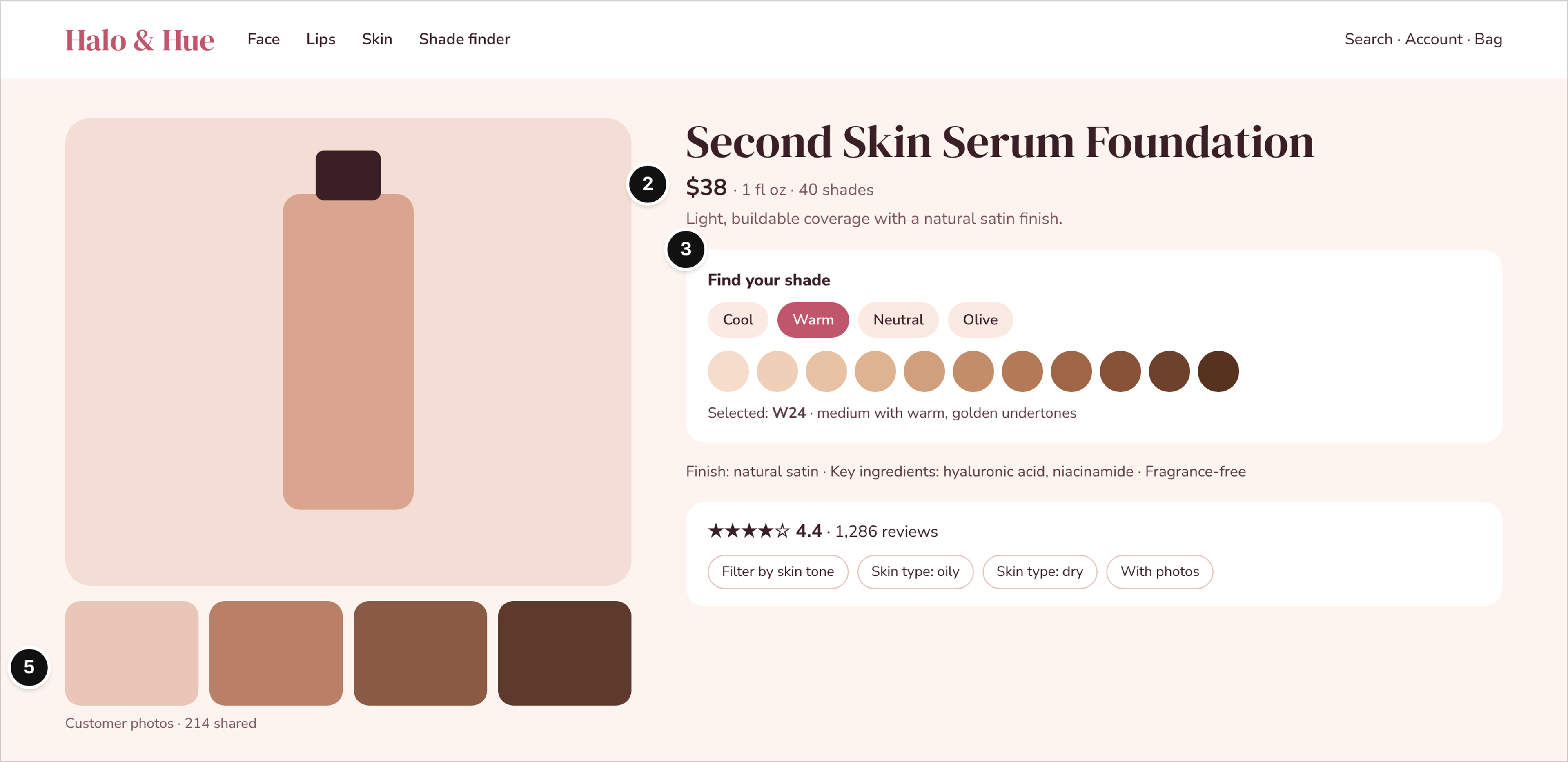
Halo & Hue, a beauty brand, foundation product page.
Who it serves and the question: A makeup buyer trying to match their skin tone and skin type online without testing the product.
What works: The price, size and range are on one line: $38 for 1 fl oz, 40 shades (mark 2). A shade finder starts with undertone (cool, warm, neutral, olive) and then shows the selected shade in words, such as medium with warm, golden undertones, next to the finish and key ingredients (mark 3). The 1,286 reviews can be filtered by skin tone and skin type, and customer photos sit under the product image (mark 5).
Watch out: Showing color swatches without describing the underlying tones leaves buyers guessing about the real color.
Big-Ticket and Spec-Heavy Products
Expensive or technical items demand clarity on dimensions, compatibility and final logistics. Shoppers check delivery fees, delivery timelines and return costs before they spend more than a thousand dollars, or before they pick between three similar models.
5. Oakmere Home: Sofa Product Page
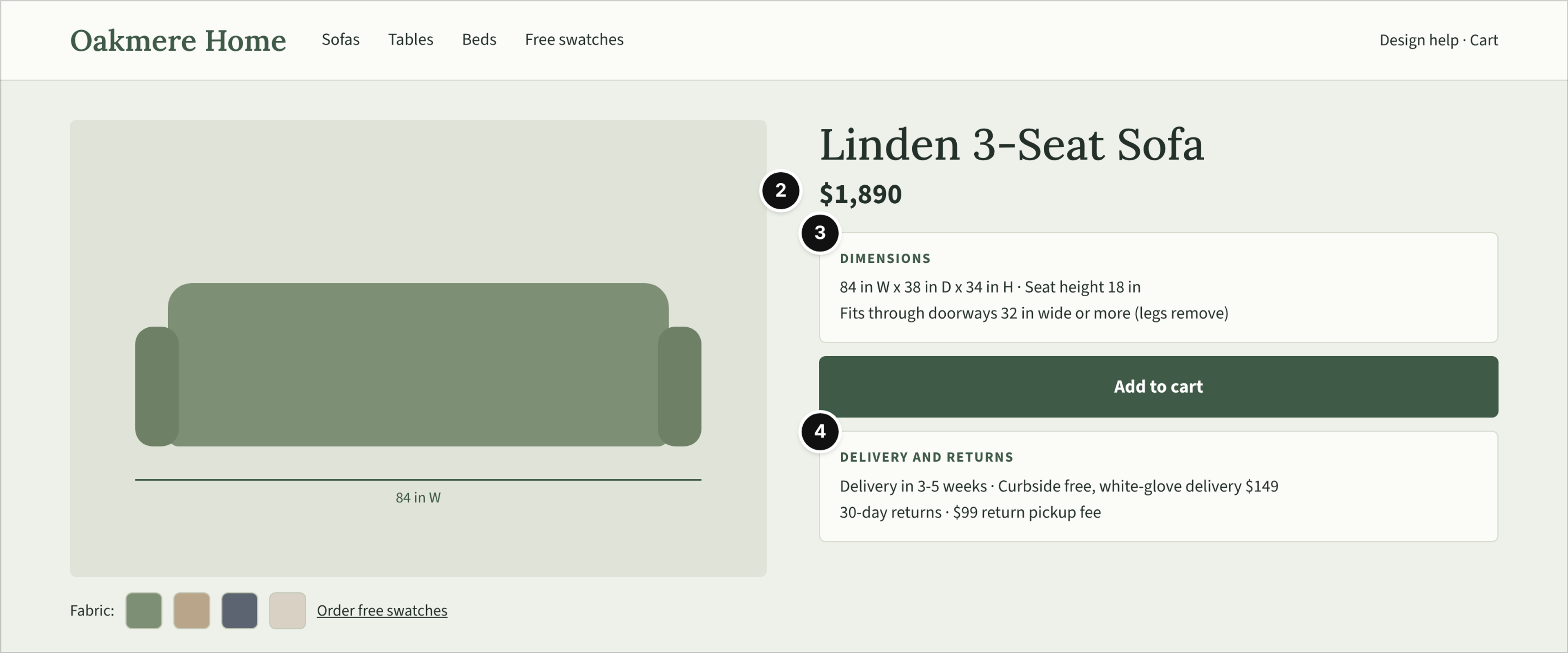
Oakmere Home, a furniture store, sofa product page.
Who it serves and the question: A homeowner who needs to know whether the $1,890 sofa fits the living room and can get through the front door.
What works: The price is large and alone, and the delivery fees are spelled out in numbers rather than "calculated at checkout" (mark 2). The page lists exact dimensions (84 in W x 38 in D x 34 in H) paired with a doorway-width note and a link to order free fabric swatches (mark 3). "Delivery in 3-5 weeks", free curbside or $149 white-glove delivery and a 30-day return window with its $99 return pickup fee sit in one box under the button (mark 4).
Watch out: Hiding heavy freight surcharges or return pickup fees until the final checkout step is a common reason shoppers abandon the cart.
6. Arclume Audio: Headphones Comparison Page
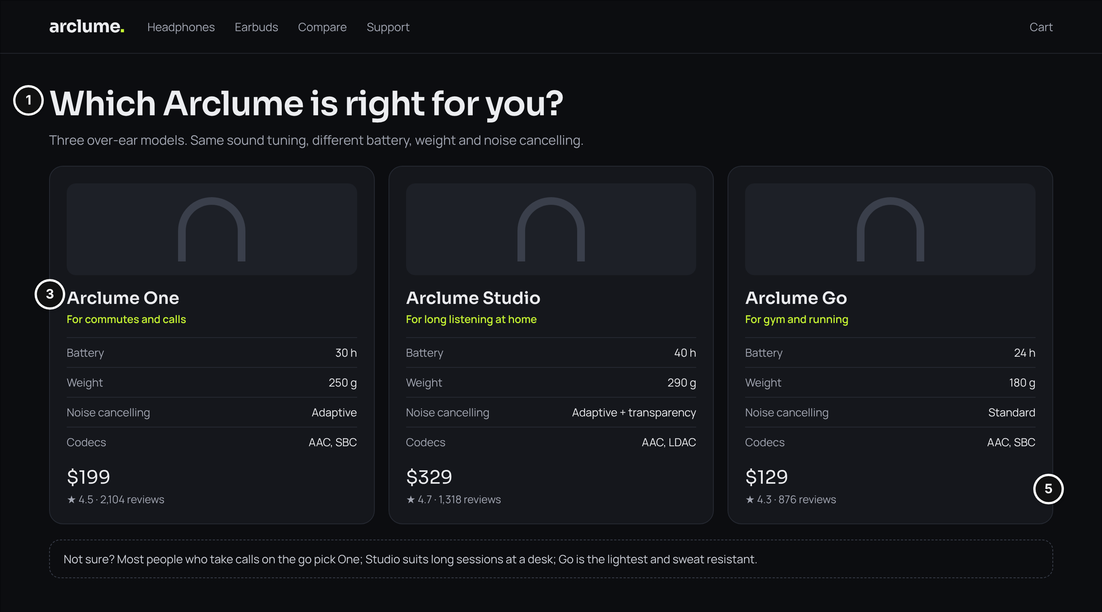
Arclume Audio, a headphones brand, comparison page for three models.
Who it serves and the question: A buyer deciding which of three similar headphones fits their use and budget.
What works: The headline asks the shopper's own question, "Which Arclume is right for you?", and one sentence explains what differs between the models (mark 1). The specs sit side by side as cards with the same rows in the same order (battery hours, weight, noise cancelling, codecs), and each card names the use it suits (mark 3). Each model carries its own rating and review count, and a short guidance line closes the page for the undecided (mark 5).
Watch out: Listing marketing features instead of comparable hard specifications makes side-by-side comparison useless for technical buyers.
Large Catalogs and Marketplaces
Big inventories need filters that match how buyers think and clear stock and shipping status. Buyers need to find a specific item quickly and, on a marketplace, check the seller before they check the product.
7. Fastline Supply: Industrial Parts Category Page
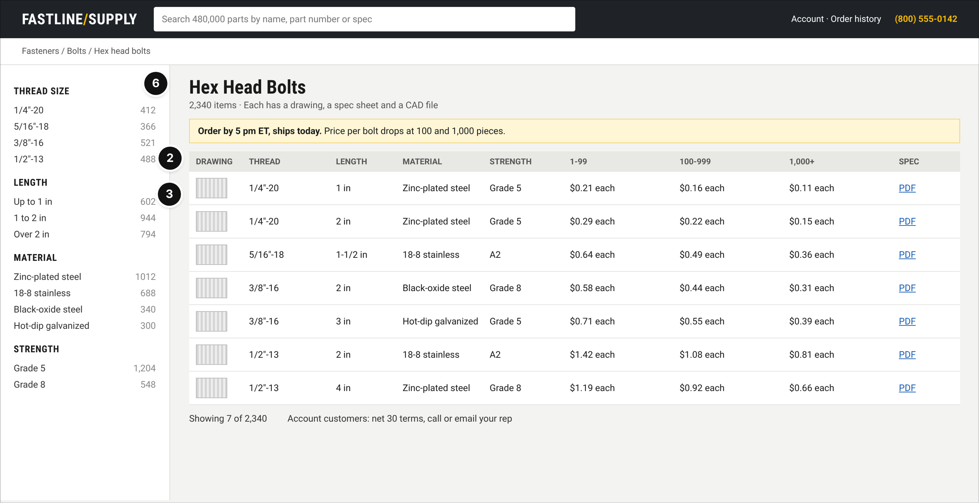
Fastline Supply, an industrial and B2B parts supplier, category page for hex bolts.
Who it serves and the question: A maintenance or procurement buyer who needs a specific fastener fast, often in bulk.
What works: Quantity price breaks (1-99, 100-999, 1,000+) are visible on every row of the list, and a banner says "Order by 5 pm ET, ships today" (mark 2). Each of the 2,340 items has thread size, length, material and strength in its own column, plus a drawing and a spec sheet (mark 3). Filters by thread size, length, material and strength show item counts, and the phone line for account customers sits in the header (mark 6).
Watch out: Using standard consumer pagination instead of high-density lists forces professional buyers into tedious clicking.
8. Loomstead: Marketplace Search Results
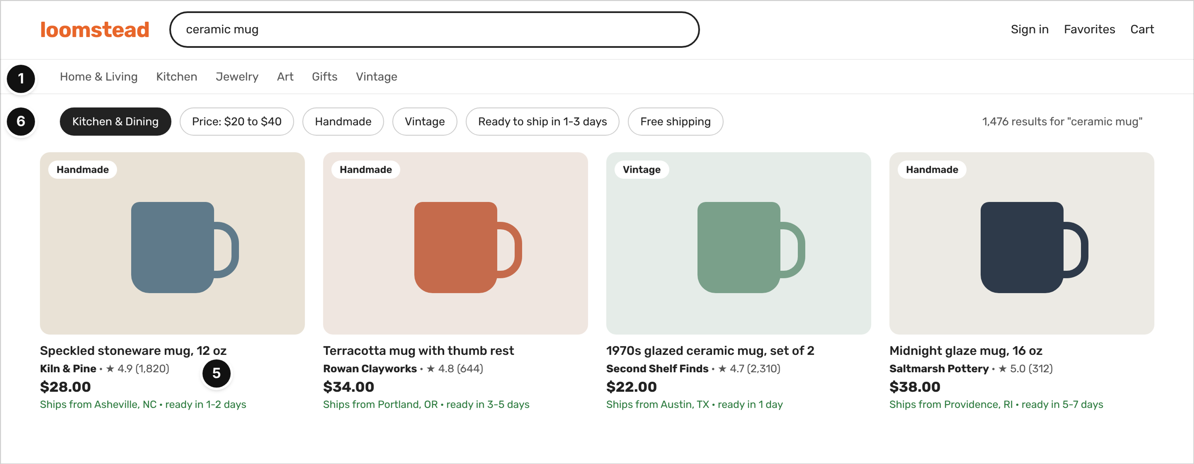
Loomstead, a handmade goods marketplace, search results page for "ceramic mug".
Who it serves and the question: A gift buyer looking for something unique within a budget and a deadline.
What works: The category row, the search query and the result count tell the shopper where they are and how much there is to look through (mark 1). Every card shows the seller name, the seller rating and review count, so trust is judged before the click (mark 5). Filters for price, handmade versus vintage, ready to ship in 1-3 days and free shipping match how a gift buyer thinks, and every card shows "Ships from" and processing time (mark 6).
Watch out: Mixing very different processing times in search results without clear labels frustrates shoppers on a deadline.
Brand-Led Stores and the Checkout
Luxury items rely on editorial presentation, but they still need clear prices and a clear path to purchase. The checkout has to stay focused and free of surprises so a decided shopper can finish.
9. Maison Verre: Fine Jewelry Homepage
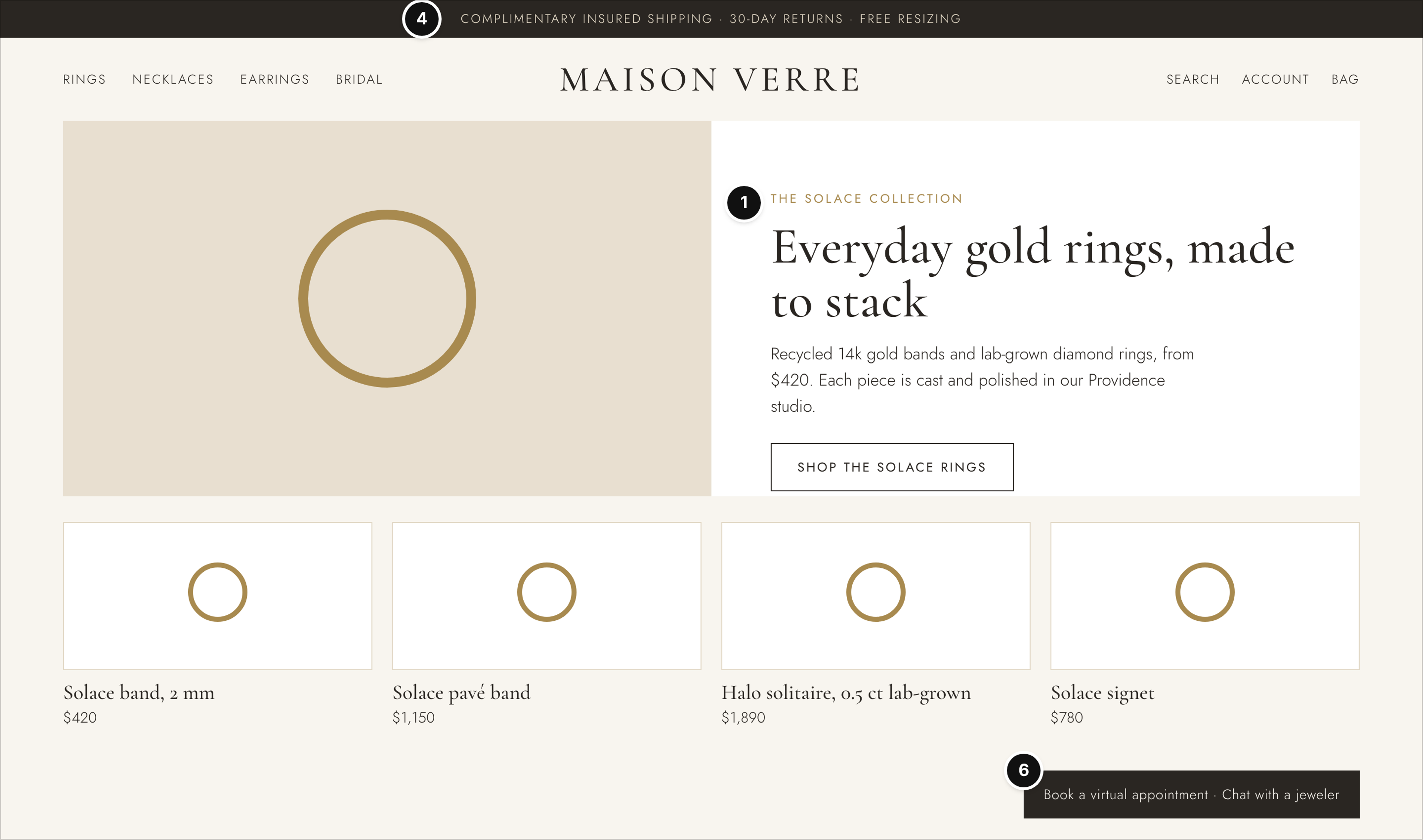
Maison Verre, a fine jewelry brand, homepage.
Who it serves and the question: A shopper buying a considered piece who wants to judge the brand, the price level and the safety of buying online.
What works: Editorial imagery names the collection in plain words, "Everyday gold rings, made to stack", with a starting price of $420 in the copy and a price on every product tile (mark 1). The top strip states complimentary insured shipping, 30-day returns and free resizing before the navigation (mark 4). "Book a virtual appointment" and "Chat with a jeweler" stay visible for the shopper who wants a person before a big purchase (mark 6).
Watch out: Forcing shoppers to click into a product just to see the starting price creates a frustrating browsing experience.
10. Pawpine: Pet Supplies Checkout
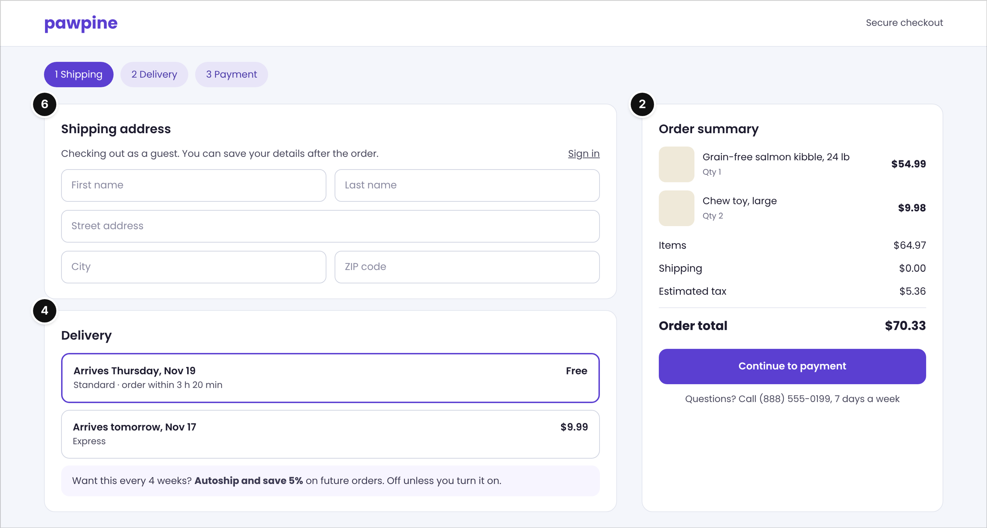
Pawpine, a pet food and supplies store, checkout page.
Who it serves and the question: A new or returning customer who wants to finish the order quickly without creating an account.
What works: The order summary breaks down items at $64.97, shipping $0.00, estimated tax $5.36 and the order total of $70.33 before the payment step (mark 2). Delivery options show dates ("Arrives Thursday, Nov 19") instead of abstract speeds, with a cutoff countdown for standard delivery (mark 4). Guest checkout is the default across three steps (shipping, delivery, payment), "Autoship and save 5%" is offered but off unless the shopper turns it on, and a help phone line sits under the button (mark 6).
Watch out: Forcing account creation before showing the final tax and shipping totals will kill the conversion.
What the Ten Examples Have in Common
What makes a good ecommerce website? A good ecommerce website removes guesswork. It answers the shopper's practical questions (what is it, what will it cost in total, will it fit, when will it arrive, what if it is wrong, who can help) exactly where the decision happens, rather than burying them in an FAQ page or a footer link. During my time as Director of Design at HackerRank and working on the AWS Design System, we constantly observed how small friction points break a user experience, and this is entirely true for retail layouts.
Counted from the ten examples above (three marks each, 30 marks in total):
- 6 of 10 show the full price or total in numbers (mark 2).
- 5 of 10 make the offer and path clear on the first screen (mark 1).
- 5 of 10 carry fit-to-buy details (mark 3).
- 5 of 10 put delivery and returns next to the button (mark 4).
- 4 of 10 show real proof with counts (mark 5).
- 5 of 10 make the path to buy or get help easy (mark 6).
Four patterns repeat across catalog types:
- The number sits next to the claim. "Free shipping" without a threshold, or "fast delivery" without a date, asks the shopper to trust you. A threshold, a fee and a date let them check.
- Fit details are written for this product. A fit note on the coat, a doorway width on the sofa and a thread size on the bolt answer fit questions that a generic size chart cannot.
- Proof is specific. A review count, a rating spread, a fit bar or seller ratings on a search card tell the shopper more than a star average alone.
- A person is one step away. A phone line, a chat with a jeweler or an account rep line matters most on the pages where money changes hands.
What Shoppers Check Before They Buy
Most of the decision happens on the cart and checkout pages, and that is where stores lose people. Baymard Institute has tracked the average cart abandonment rate for 14 years and it currently sits at 70.19%, and its benchmark rates only 2% of checkout flows as "good" (Baymard's cart and checkout usability research). That is why examples 5 and 10 put every fee and the total in front of the shopper before payment.
Reviews also have to be real. The FTC's rule on consumer reviews and testimonials, 16 CFR Part 465, prohibits fake or false reviews, buying reviews and review suppression. For design, that means the review block shows what customers actually wrote, including the lower ratings, and the fit bar or rating spread comes from real reviews.
The same product facts also travel beyond your store. Google says product structured data lets shoppers see price, availability, review ratings and shipping information right in search results, so the numbers on the page should be the numbers in the markup.
This section is design guidance, not legal advice; check review and disclosure wording with your own counsel.
How to Use These Examples With Your Designer
Before bringing in a designer, build a reference board organized by your catalog type, not by visual taste alone. Ask for mockups of the inner pages your store needs (the product page, the category page with filters, search results, the cart and the checkout), not only the homepage. Check that every price, fee and date on a mockup is real and consistent from the product page all the way to checkout.
Write your fit, shipping and returns copy before you finalize the layout, so the design makes room for the words you actually need. Never copy a competitor visually; borrow the pattern, not the page. If you need to plan how filters, subscriptions or a custom checkout affect the budget, see these budget ranges for a Shopify or custom store build. If the platform is still open, start by choosing between Shopify and WooCommerce on WordPress.
Where to Find More Real Examples
Galleries and award sites are useful for visual range, but they show mostly homepages and carry no notes on why a specific pattern sells. Real stores are worth reading page by page the way a cautious shopper would: pick a product, find the total, find the delivery date, check the returns window and see how easy it is to reach a person. The ten examples above are fictional. The live stores below show some of the same patterns, as we saw them on Nov 16, 2026; offers and pages change often, so treat them as a current reference, not a template.
- Single-product trial and delivery: Casper's homepage states a 100-night risk-free trial and free mattress delivery, with white glove delivery available, alongside a 10-year limited warranty.
- Membership price in plain numbers: Thrive Market's homepage compares a monthly membership at $12 a month with an annual one at $60 billed annually, right on the homepage.
- Free-shipping threshold in the header: Allbirds' homepage carries "Free ground shipping on orders over $100" at the top of the page, and the cart tells shoppers to spend more to earn free shipping.
- Threshold for a smaller basket: Glossier's homepage states free standard shipping on US orders of $40 or more in its banner.
- Help and size tools for a big multi-brand catalog: Zappos' homepage lists 24/7 customer service with a phone number, a size conversion chart and the shipping and returns policy in its footer.
- Catalog-first industrial store: McMaster-Carr's homepage opens straight into a catalog of product categories, from abrading and polishing to suspending, with search, an order pad and a phone number at the top.
FAQ
What are good examples of ecommerce websites?
Good examples depend on the catalog type. A strong apparel store focuses on fit notes and sizing. An industrial B2B site prioritizes dense specification filters and quantity pricing. A furniture site must clearly show dimensions and delivery fees. The strongest examples give the exact information a buyer needs to overcome the fear of returning the item.
What pages does an ecommerce website need?
Beyond the homepage, an effective online store needs functional inner pages: a category page with filters, a search results page, a detailed product page, a cart and a checkout. Depending on the catalog, it may also need subscription management or side-by-side comparison pages.
Should an online store show shipping costs before checkout?
Yes. Hiding shipping costs until the final payment screen is a common reason shoppers abandon a cart. Showing an exact shipping cost or a clear free-shipping threshold near the buy button sets accurate expectations before checkout.
How many product images does a product page need?
There is no fixed number. A product page needs enough images to replace holding the item: a clean main shot, different angles, a context image that shows scale, and close-ups of texture or hardware. Apparel and beauty products also benefit from images that show the item on different body types or skin tones.
Conclusion
The ecommerce website examples worth copying are the ones that answer the shopper's practical questions on the page where they decide: the full price, the delivery date, the returns window, the fit details and real proof. Use the six marks to review your own product, category, search and checkout pages, and brief your designer by catalog type, not by homepage style.