A good SaaS website example makes the product obvious in the first screen, shows the interface working instead of describing it, and lets the right visitor start on their own, whether that's a free plan, an API key or a sales conversation. The ten examples below are fictional, annotated pages, one page type each. Read them for the decisions behind each page and carry those decisions, not the visuals, into your own brief.
If you're also comparing SaaS web design agencies ranked on the product sites they shipped, these pages make a practical yardstick for the portfolios you're shown. Seven of the ten are inner pages: a plans page, a templates gallery, a comparison page, a feature tour, a signup step, an integrations directory and an enterprise page. That ratio is deliberate. Example galleries are mostly hero sections, yet trials are won or lost on the pages a visitor reaches from search, from a teammate's link or from the plans menu.
This article stays on examples. The page set and the information architecture behind it are covered in my guide to which pages a SaaS marketing site needs and how to structure them. If your product sells through a sales team to a group of approvers rather than through self-serve trials, the annotated layouts for sales-led B2B buying committees are the better companion.
How to Read These Examples
I've led design at software companies, including Copy.ai and Around, and reviewing shipped client sites is now most of my work as editor of our rankings. It's how the directory that grades web design studios on their real launches builds its scores, and it taught me to read a SaaS page the way a visitor does: as a short list of questions asked in a rough order. Every example carries numbered marks, and each number means the same thing on every image:
- 1 Category and outcome: what the product is, who it's for and the result, readable in about five seconds.
- 2 Product on show: a real interface, a live demo or a guided tour near the top, not abstract art.
- 3 Self-serve start: a free plan, trial or signup with the friction removed (no card, single sign-on, start from a template).
- 4 Proof: specific numbers, named customer stories and ratings that say where they come from.
- 5 Plan clarity: a plan ladder, a value metric, visible limits and the point where sales takes over.
- 6 Expansion and trust: integrations, security, admin controls and docs for the people who approve the purchase.
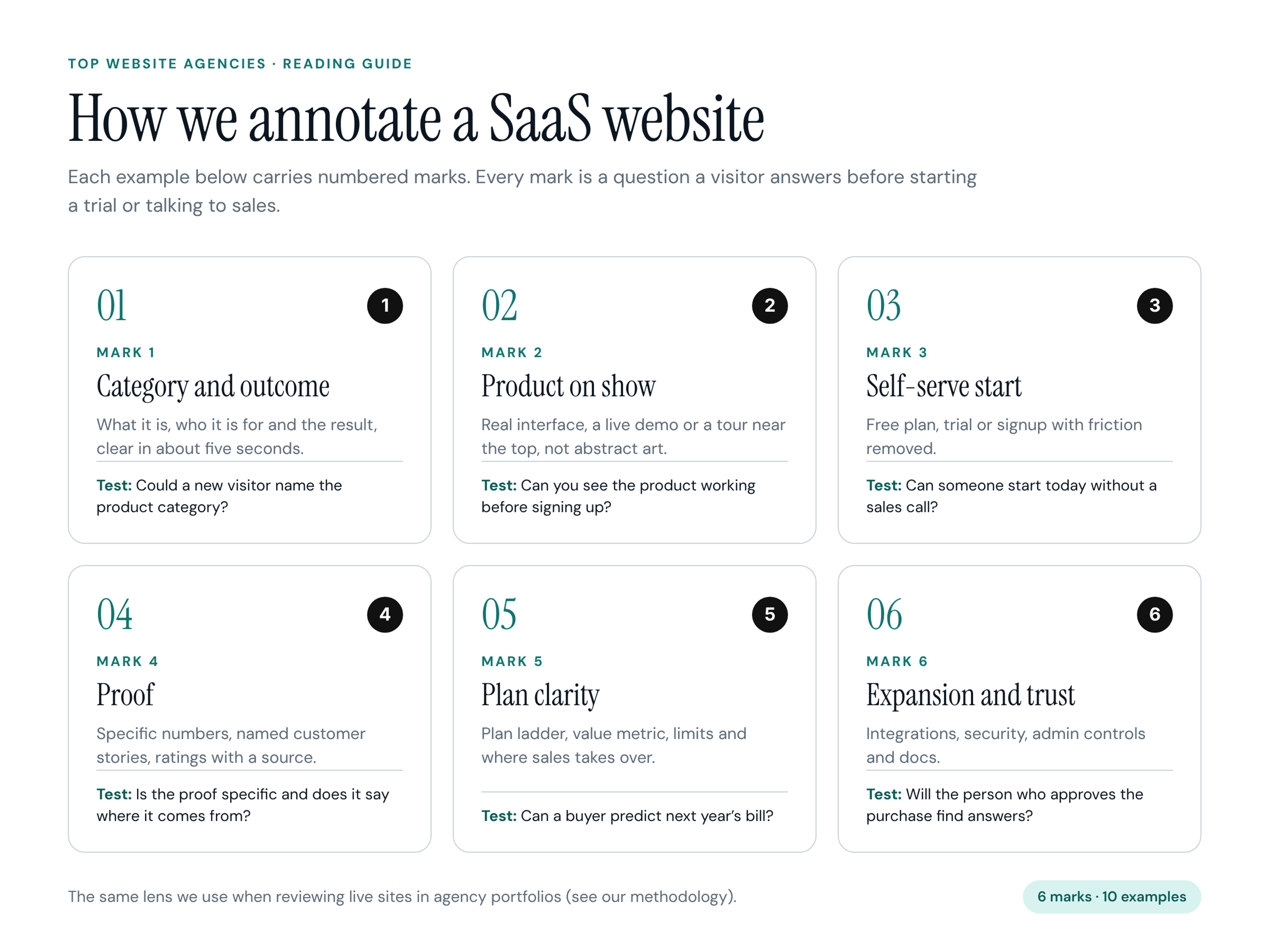
A mark appears only where the page really does that job. A homepage that names its category gets a 1; a plans page that says exactly when sales steps in gets a 5. The test under each mark is the question I ask when I score a page.
The Ten Examples at a Glance
- Example 1: Quillhum, AI meeting notes, homepage, marks 1, 2, 3, 4.
- Example 2: Traceborn, product analytics, homepage with a live funnel, marks 1, 2, 4, 6.
- Example 3: Postquill, transactional email API, developer homepage, marks 1, 2, 3, 6.
- Example 4: Taskhewn, project management, plans page, marks 3, 5, 6.
- Example 5: Sketchgrove, online whiteboard, templates gallery, marks 2, 3, 4.
- Example 6: Tendlyn, help desk, comparison page, marks 1, 4, 5.
- Example 7: Spendloft, spend management, feature page, marks 2, 4, 6.
- Example 8: Agendrel, meeting scheduling, signup page, marks 3, 4, 5.
- Example 9: Linkcairn, workflow automation, integrations directory, marks 2, 3, 6.
- Example 10: Inkhollow, team docs, enterprise page, marks 4, 5, 6.
Counting the marks across the set tells its own story. Proof (mark 4) appears on seven of the ten pages, because every page type needs a reason to believe. Category and outcome (mark 1) appears on only four: the three homepages and the comparison page, which has to reposition the product against what the visitor already uses. Plan clarity (mark 5) also shows up four times, and never on a homepage. It lives where the money question is asked: the plans page, the comparison, the signup step and the enterprise page.
Ten Annotated SaaS Website Examples
All products, names, customers and numbers below are fictional. The pages illustrate patterns, not real companies.
1. Quillhum: AI Meeting Notes Homepage
Fictional product: Quillhum, an AI note taker for team meetings. Page type: homepage (first visit, product-led).
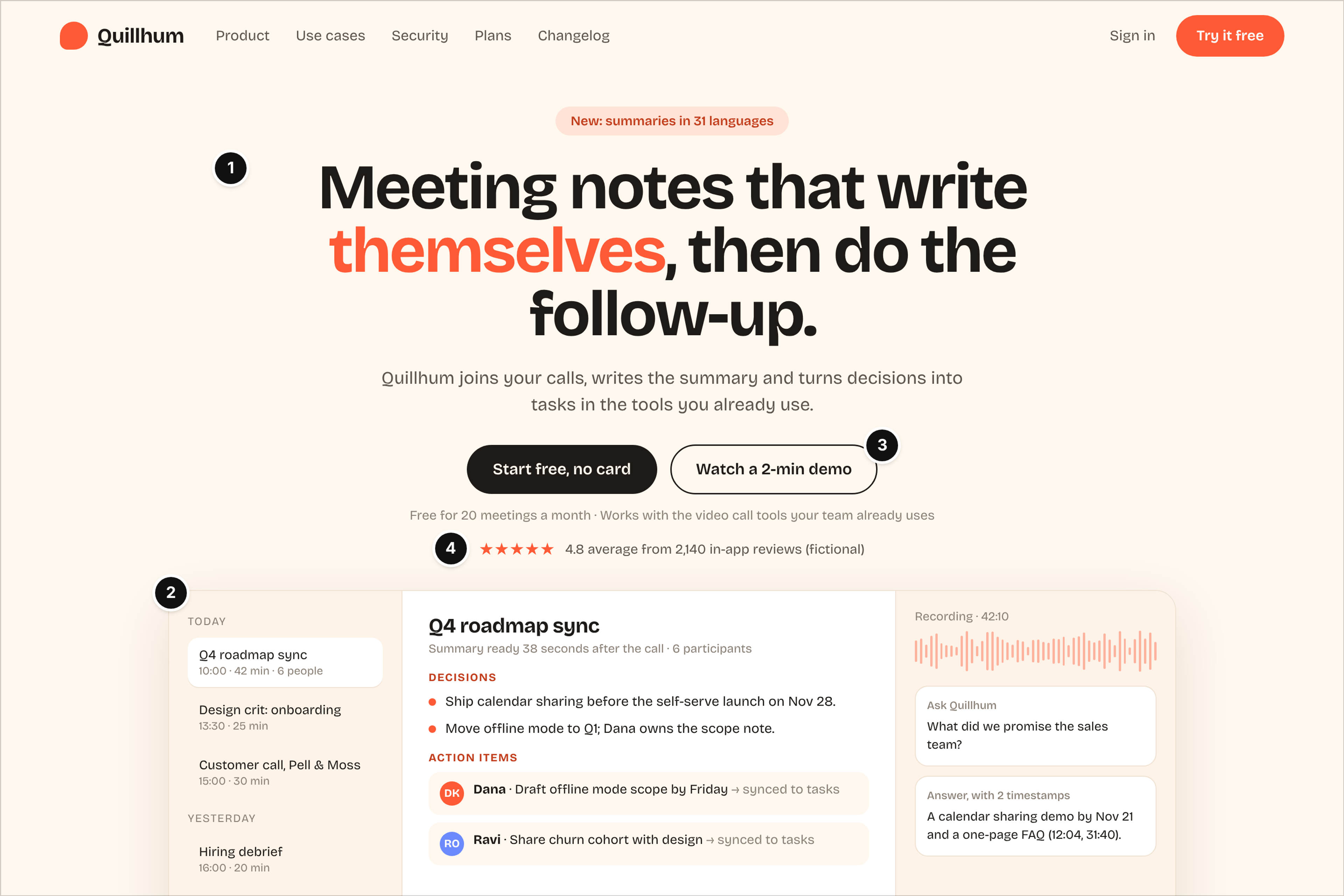
Who it serves and the question: A team lead or individual contributor who sits in back-to-back calls. Their question: will this actually save me time before my next meeting, and can I try it without asking anyone?
What works: The headline says what the product does and the result in one line, "meeting notes that write themselves, then do the follow-up," and the subhead explains how (mark 1). The right half of the hero is the product itself: a meeting list, a finished summary with decisions and action items, and an "Ask Quillhum" answer with timestamps (mark 2). The main button reads "Start free, no card," and the line under it states the free allowance, 20 meetings a month (mark 3). The rating sits directly under the buttons and names its source, 2,140 in-app reviews, labeled fictional here (mark 4).
Watch out: A hero mockup this detailed has to stay readable on a phone. Crop it to the summary panel on small screens rather than shrinking the whole interface to unreadable type. And keep the summary content plausible; a fake meeting full of buzzwords undoes the product-on-show effect.
2. Traceborn: Product Analytics Homepage With a Live Funnel
Fictional product: Traceborn, product analytics for growth and product teams. Page type: homepage with a live-UI hero (first visit).
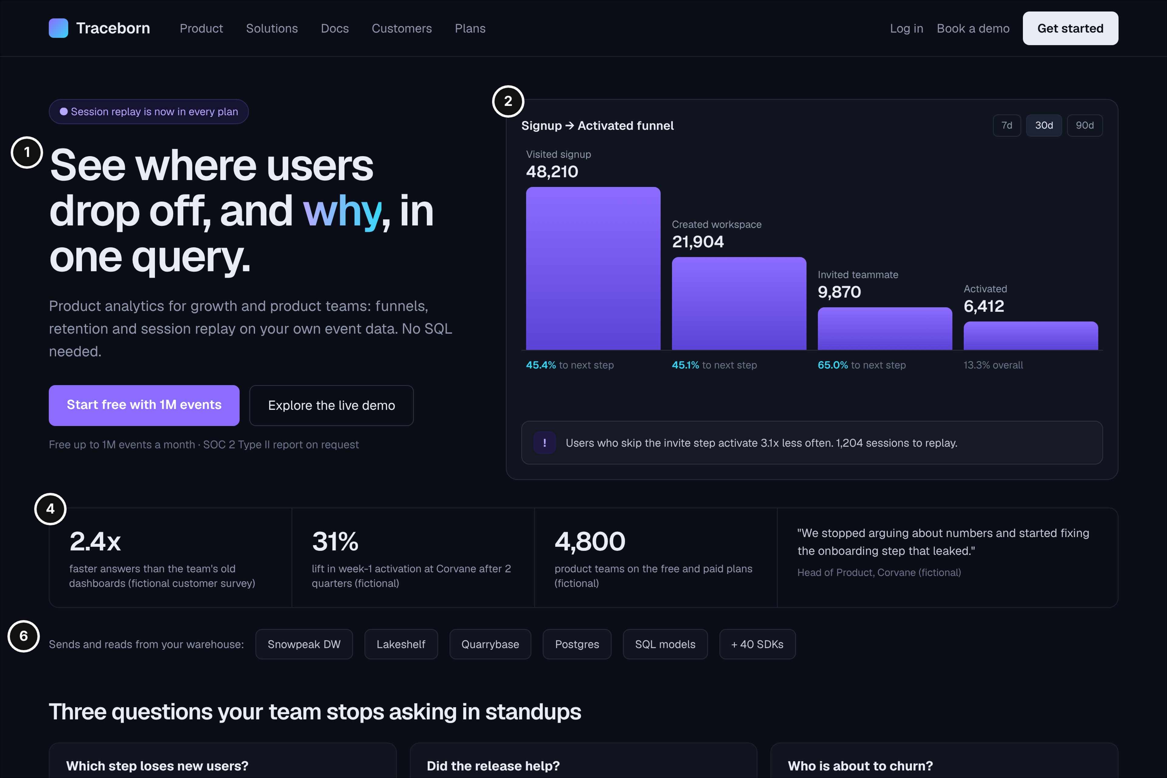
Who it serves and the question: A product manager or data lead who already has event data in a warehouse. Their question: can this answer our activation questions without another SQL backlog, and does it work with the data we already have?
What works: The headline promises a specific outcome, "see where users drop off, and why," and the subhead names the audience and the features (mark 1). The hero shows a real funnel with step counts, conversion rates and an insight callout about the invite step, so a visitor can judge the product's depth before clicking anything (mark 2). Below the hero, a metric strip uses outcomes with context: answer speed, an activation lift at a named customer and a quarter count (mark 4). A warehouse row shows where the data comes from and goes (mark 6).
Watch out: Dark themes are a common choice for analytics and developer tools, but chart labels and muted gray text often fail contrast checks. Test the hero on a laptop in daylight, not only on a designer's monitor.
3. Postquill: Transactional Email API Developer Homepage
Fictional product: Postquill, an email API for receipts, password resets and alerts. Page type: developer homepage (first visit, technical evaluation).
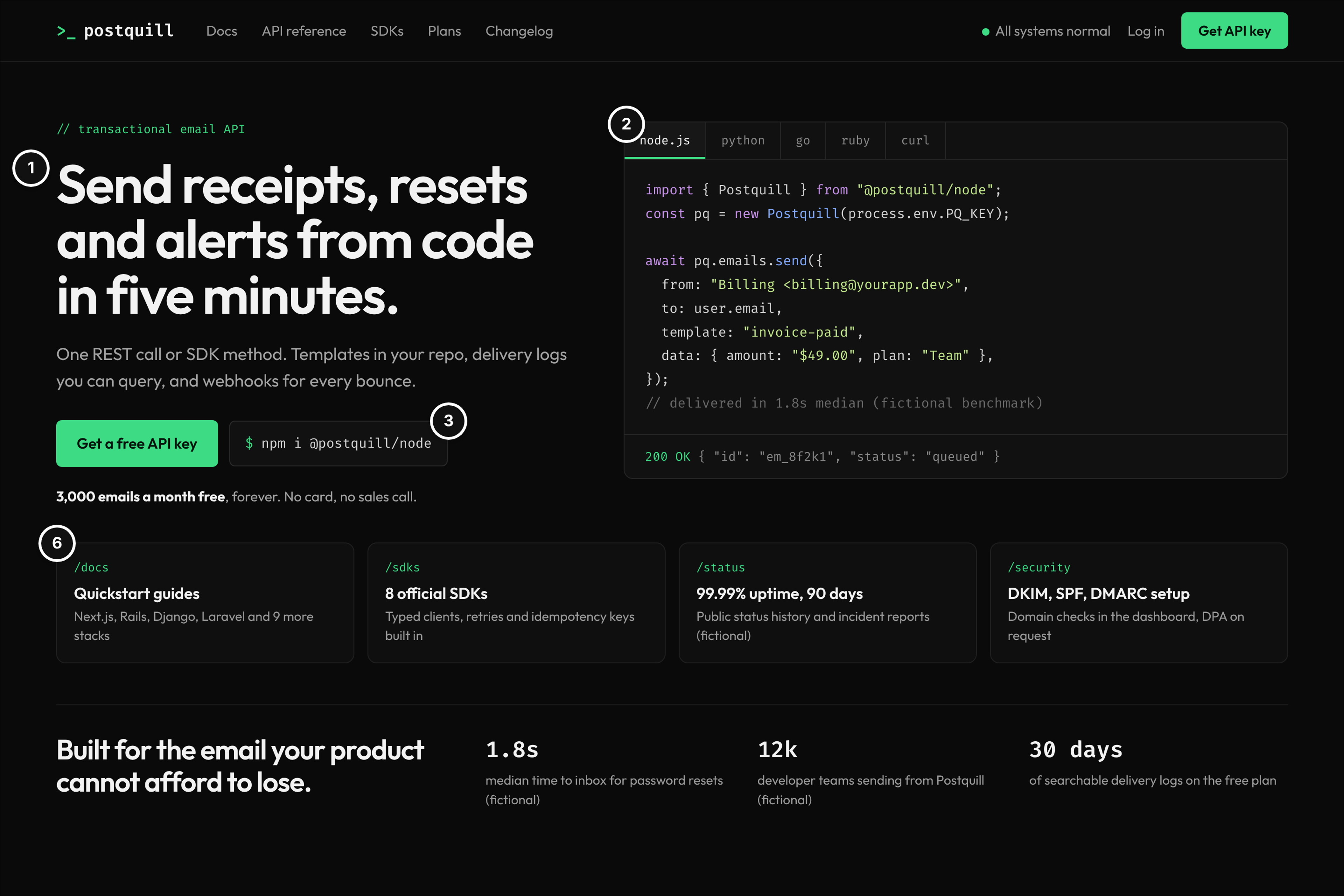
Who it serves and the question: A developer choosing an email provider for a product that can't afford lost password resets. Their question: how fast can I send the first email, and what happens when something breaks?
What works: The headline names the job and the time it takes, "send receipts, resets and alerts from code in five minutes" (mark 1). A working code sample with language tabs replaces the usual hero image, and it shows the response the API returns (mark 2). The install command and the free allowance, 3,000 emails a month with no card and no sales call, sit right under the headline (mark 3). Four tiles route to docs, SDKs, the status page and domain security setup, which is what an engineering lead checks before approving a vendor (mark 6).
Watch out: A developer homepage still gets visited by the founder or engineering manager who signs off on the spend. Give them one plain-language line about reliability and cost per email, or a link to the plans page, so the technical evaluator isn't the only one who can read the page.
4. Taskhewn: Project Management Plans Page
Fictional product: Taskhewn, project management for growing teams. Page type: plans page (evaluation).
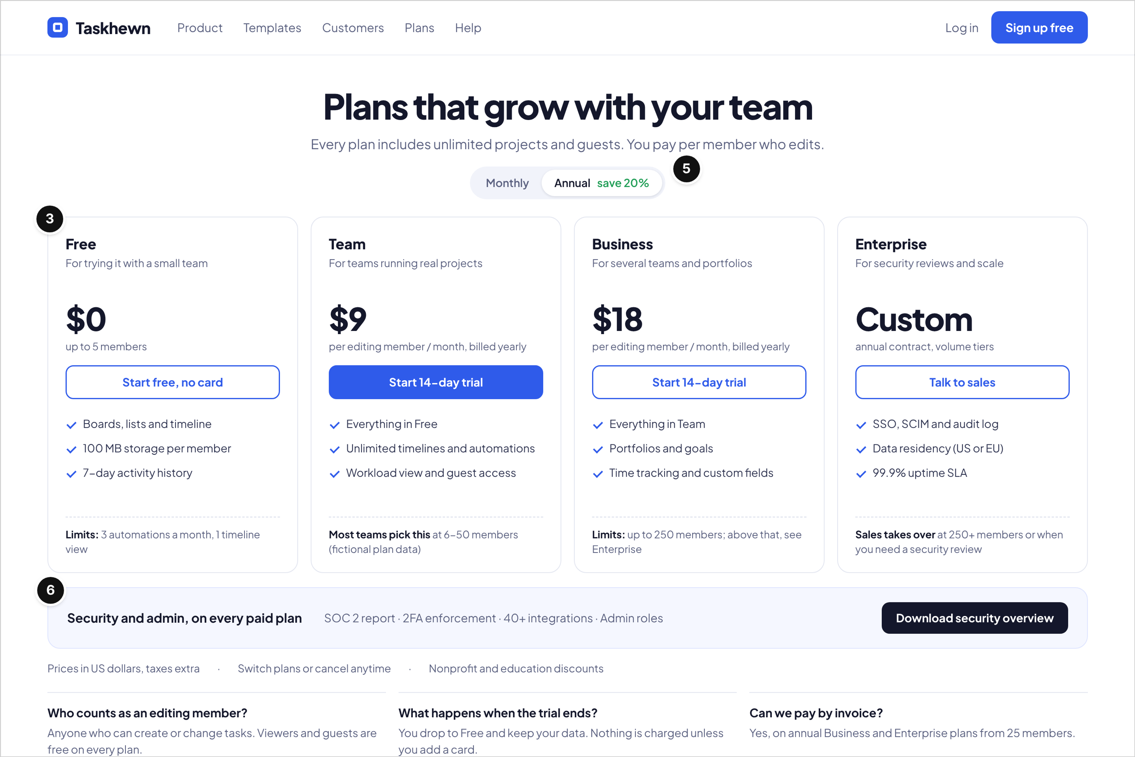
Who it serves and the question: The team lead or operations manager who has to budget for a rollout. Their question: what will this cost for my team today, and what happens when we grow past 50 people?
What works: The value metric is stated once at the top, "you pay per member who edits," and viewers and guests are free (mark 5). Each column ends with its limits, and the Business column says where the ladder stops: "up to 250 members; above that, see Enterprise." The Free plan starts without a card and both paid plans offer a 14-day trial (mark 3). A security strip under the columns lists the audit report, admin roles and integrations available on every paid plan (mark 6). The filled Team button with the "Most teams pick this" note is the recommended-plan pattern, and it says why: teams of 6 to 50 members.
Watch out: The short FAQ under the plans carries a lot of weight here, especially "who counts as an editing member?" If your value metric needs a definition, put it on the plans page, not in the help center.
5. Sketchgrove: Online Whiteboard Templates Gallery
Fictional product: Sketchgrove, an online whiteboard. Page type: templates gallery (often the first visit from search).
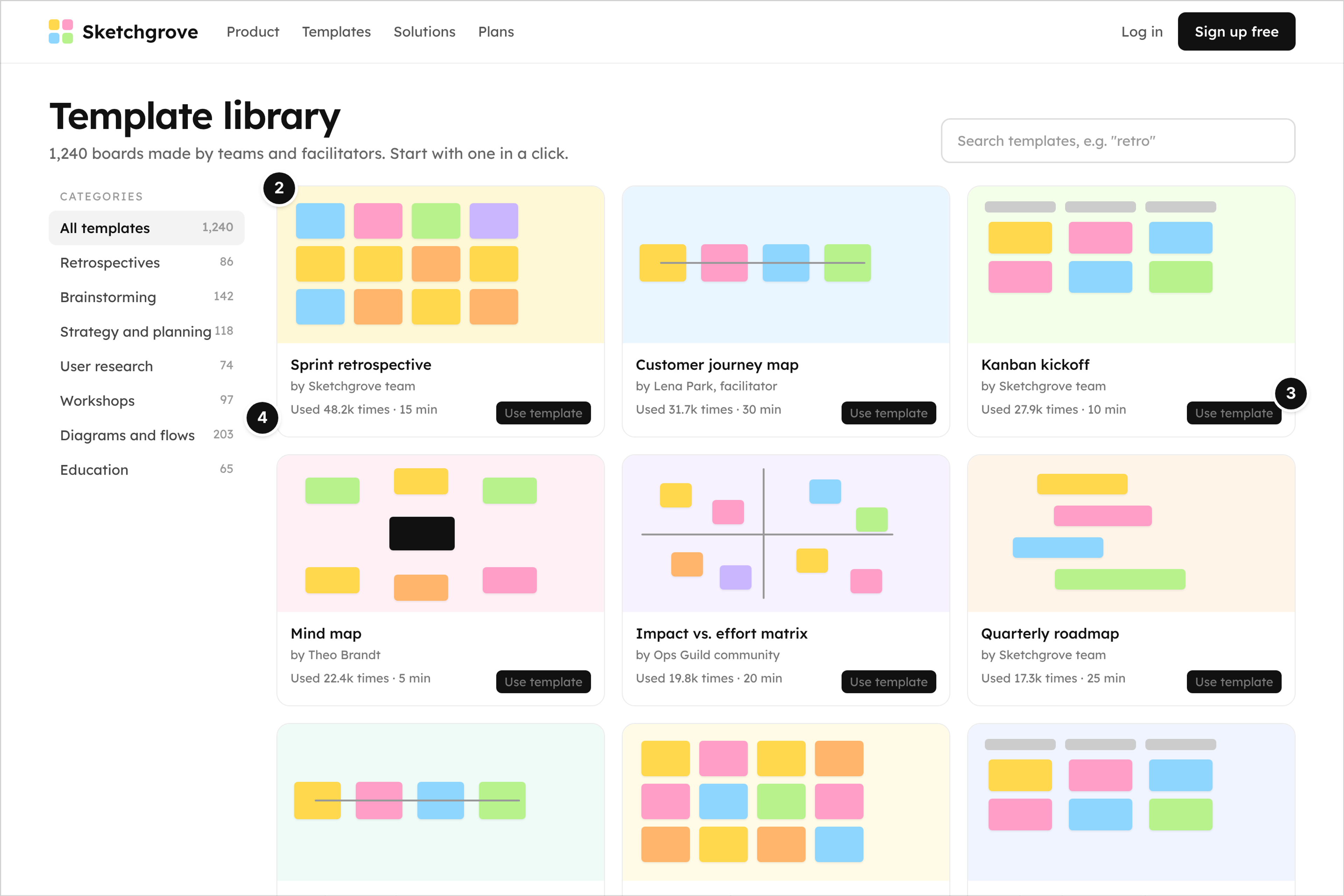
Who it serves and the question: A facilitator or manager who searched for "sprint retrospective template" the night before a workshop. Their question: is there a ready board I can use tomorrow morning?
What works: Template cards show the actual board layouts, so the gallery doubles as a product tour (mark 2). Each card names its author, including community facilitators, and shows how many times it has been used and how long the exercise takes (mark 4). "Use template" opens the board directly, which turns a search visit into a signup at the moment of intent (mark 3). Category counts on the left help a visitor judge the depth of the library at a glance.
Watch out: Use counts only work as proof when they're real and current. A gallery where every template claims tens of thousands of uses reads as invented. Also give each popular template its own indexable page with a description, because that's the page that will rank.
6. Tendlyn: Help Desk Comparison Page
Fictional product: Tendlyn, a help desk for support teams. Page type: comparison page against a generic legacy suite (evaluation, switching).
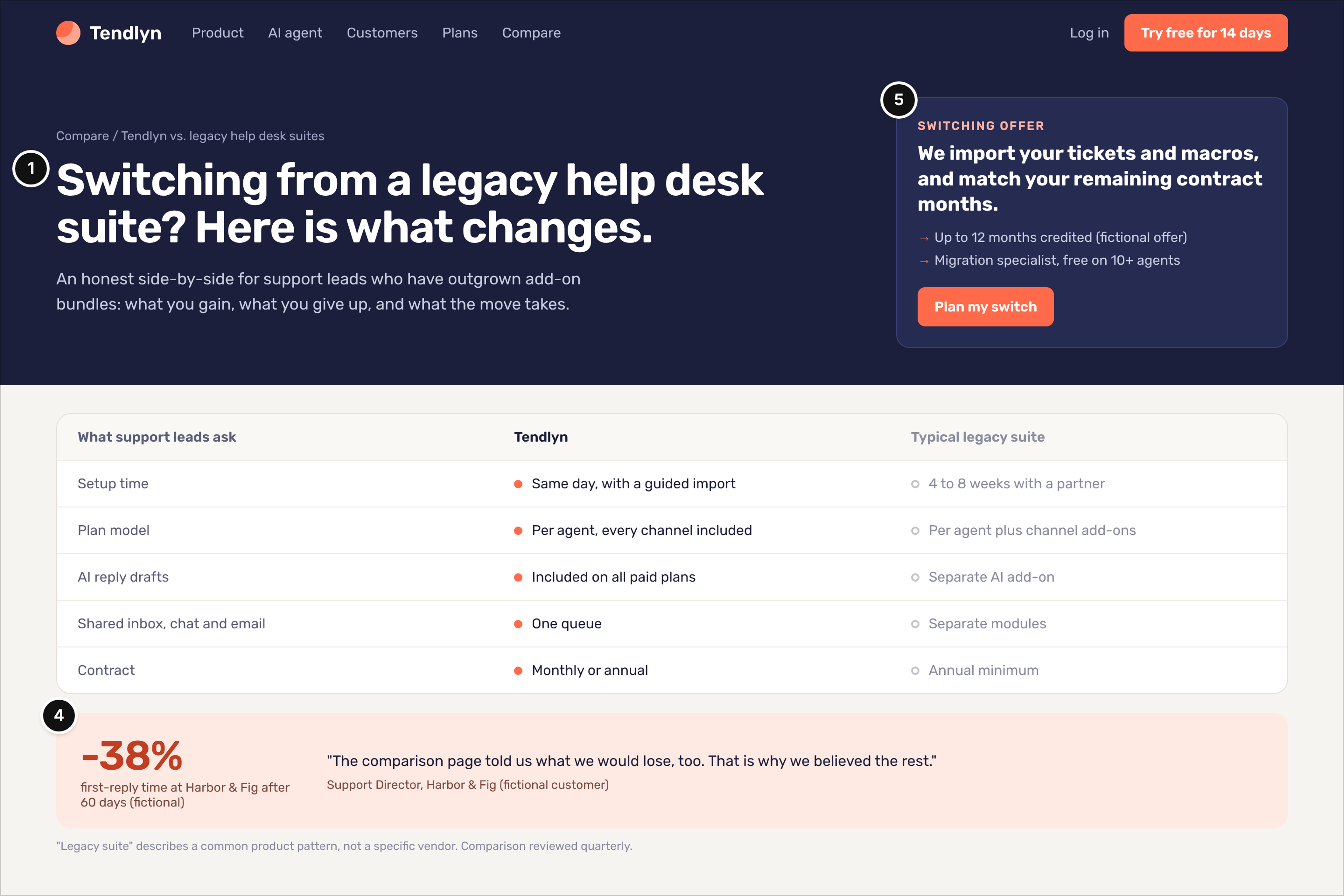
Who it serves and the question: A support lead who has outgrown an older help desk and needs a case for switching. Their question: what actually changes, what do we lose, and how painful is the move?
What works: The page names the visitor's situation instead of a competitor, "switching from a legacy help desk suite?", and promises an honest side-by-side (mark 1). The switching offer answers the money question before it's asked: tickets and macros imported, remaining contract months matched up to a stated cap, and a free migration specialist from 10 agents (mark 5). The comparison rows cover what support leads ask about, including setup time, plan model, AI reply drafts and contract terms, with filled dots for Tendlyn and outline dots for the legacy column so the two sides stay distinct without colored checkmarks. Under the grid, a first-reply figure from a named customer sits next to a quote saying the page told them what they would lose, too (mark 4).
Watch out: Naming a real competitor invites legal review and ages the page every time their product changes. A pattern-level comparison with a "reviewed quarterly" note, as here, is easier to keep accurate.
7. Spendloft: Spend Management Feature Page
Fictional product: Spendloft, corporate cards and expense management. Page type: feature page and product tour for receipt capture (evaluation).
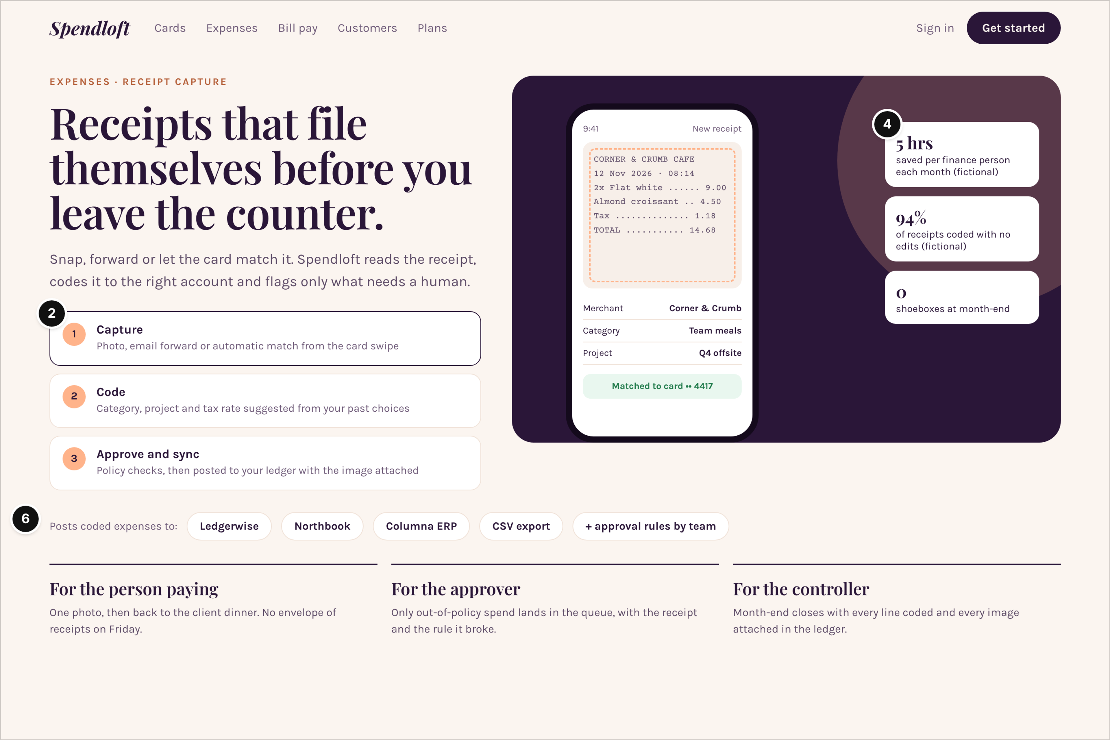
Who it serves and the question: A finance lead or controller who has been burned by expense tools employees refused to use. Their question: will people actually submit receipts, and will the data arrive in our ledger coded correctly?
What works: The feature is explained as three steps, capture, code, approve and sync, with the current step outlined, next to a phone showing a receipt matched to a card and coded to a project (mark 2). Proof is stated in the finance team's units: hours saved per finance person each month and the share of receipts coded with no edits (mark 4). Accounting sync tiles and approval rules show the integration path a controller needs before a pilot (mark 6). Three short role blocks speak to the person paying, the approver and the controller.
Watch out: Feature pages often turn into scroll-triggered animation. Keep the steps readable as static content, so the controller who skims the page and the finance lead who forwards it both get the full story.
8. Agendrel: Meeting Scheduling Signup Page
Fictional product: Agendrel, booking pages for meetings. Page type: signup page, step 1 of 3 (activation).
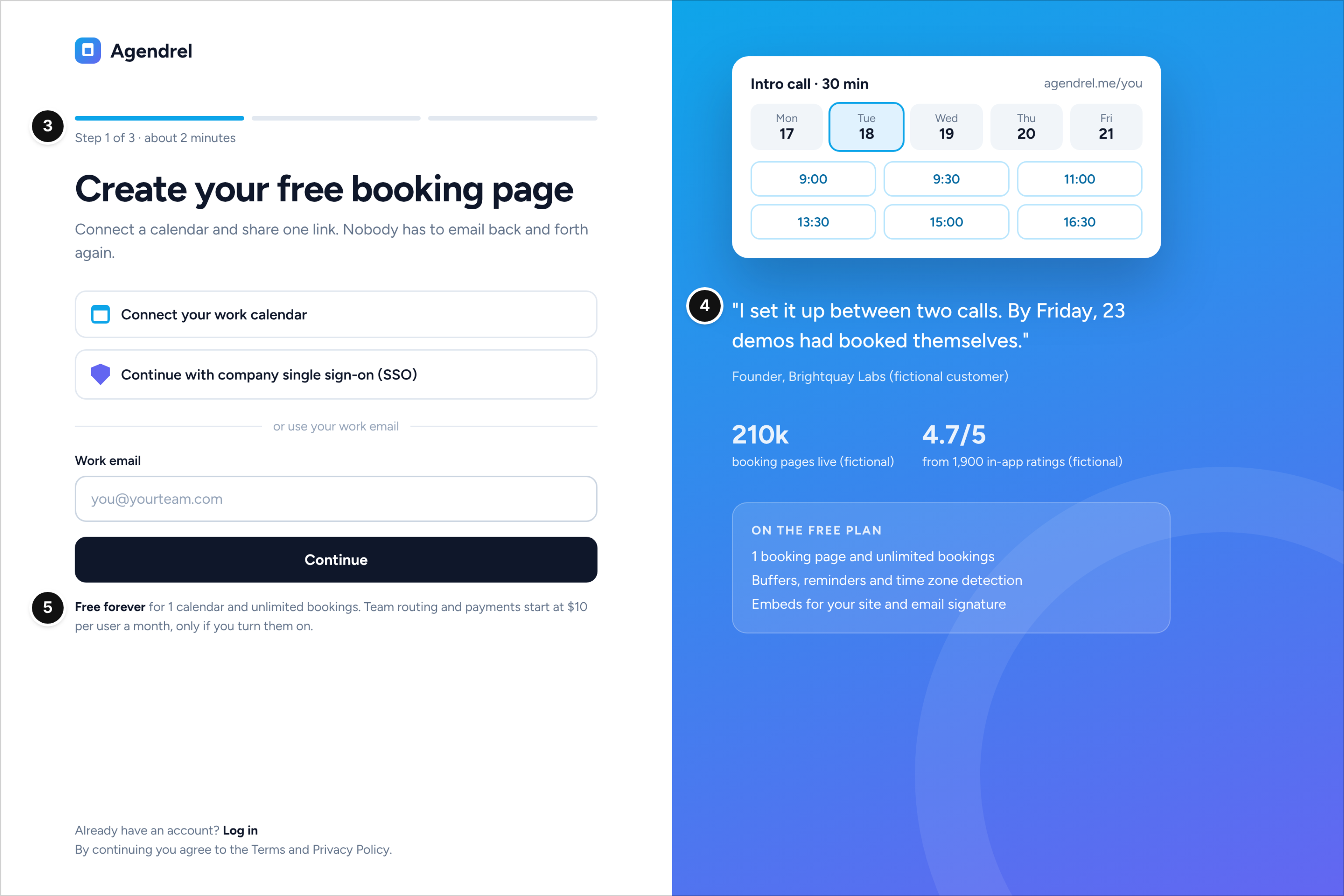
Who it serves and the question: A consultant or founder who is ready to create an account but wary of long onboarding. Their question: how long will this take, and will I get charged later?
What works: The step counter says "Step 1 of 3, about 2 minutes," and the first option is to connect a work calendar or use company single sign-on, with work email as a fallback (mark 3). The free plan note sits right under the form: free forever for one calendar and unlimited bookings, with paid features starting at $10 per user a month "only if you turn them on" (mark 5). The right side shows a booking page preview, a customer quote and two counts with sources (mark 4).
Watch out: Every extra field or marketing checkbox on step 1 adds friction at the moment the visitor is most ready. Ask for the calendar first and collect the rest after the visitor has seen their own booking page.
9. Linkcairn: Workflow Automation Integrations Directory
Fictional product: Linkcairn, workflow automation across business apps (all app names in the image are fictional). Page type: integrations directory (evaluation, often a search entry).
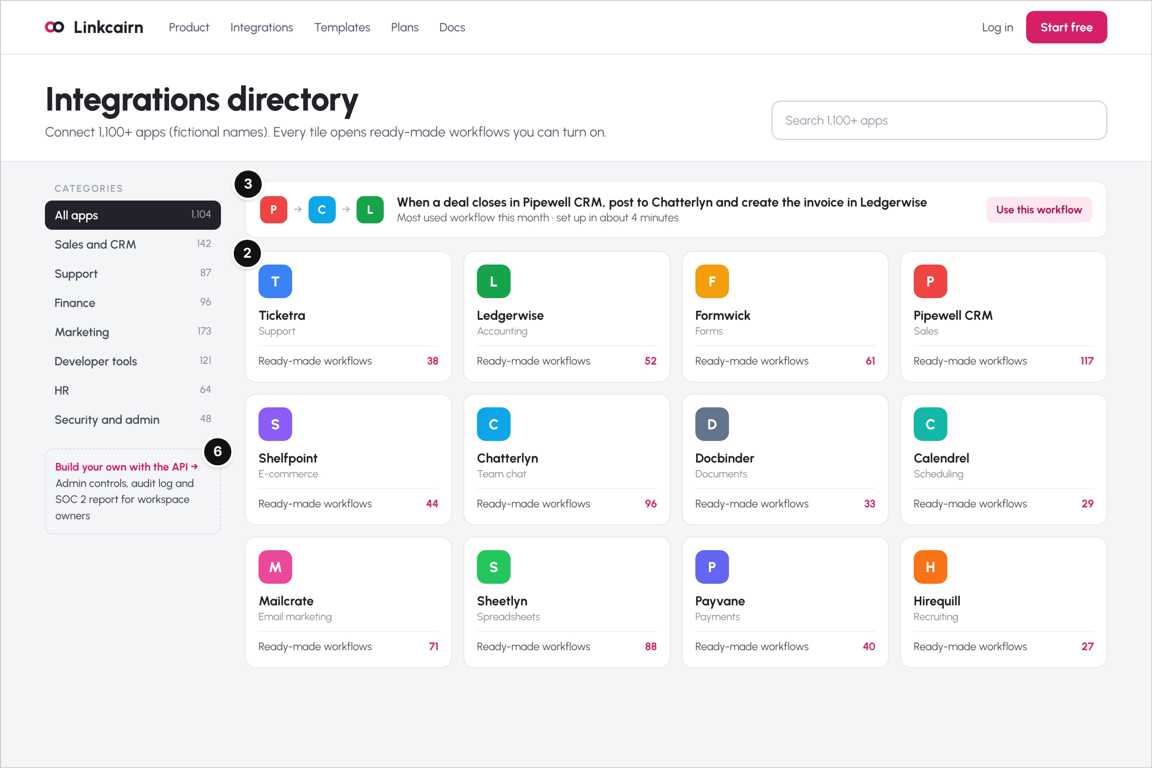
Who it serves and the question: An operations manager checking whether the tool connects the two apps their process depends on. Their question: does it work with my CRM and my billing tool, and how much setup does that take?
What works: A featured workflow at the top connects three apps in one sentence, shows that it takes about four minutes to set up and offers "Use this workflow," so a visitor can start from a working example instead of a blank canvas (mark 3). Every tile shows how many ready-made workflows exist for that app, which turns the directory from a logo wall into a view of what the product actually does (mark 2). The category list with counts, the API link and the line about admin controls, audit log and the security report give the workspace owner what they check before approving (mark 6).
Watch out: "Coming soon" tiles in an integrations directory cost trust with exactly the buyer who needs that connection today. List what works now, and offer a request form for the rest.
10. Inkhollow: Team Docs Enterprise Page
Fictional product: Inkhollow, a team knowledge base and wiki. Page type: enterprise page (security review and procurement).
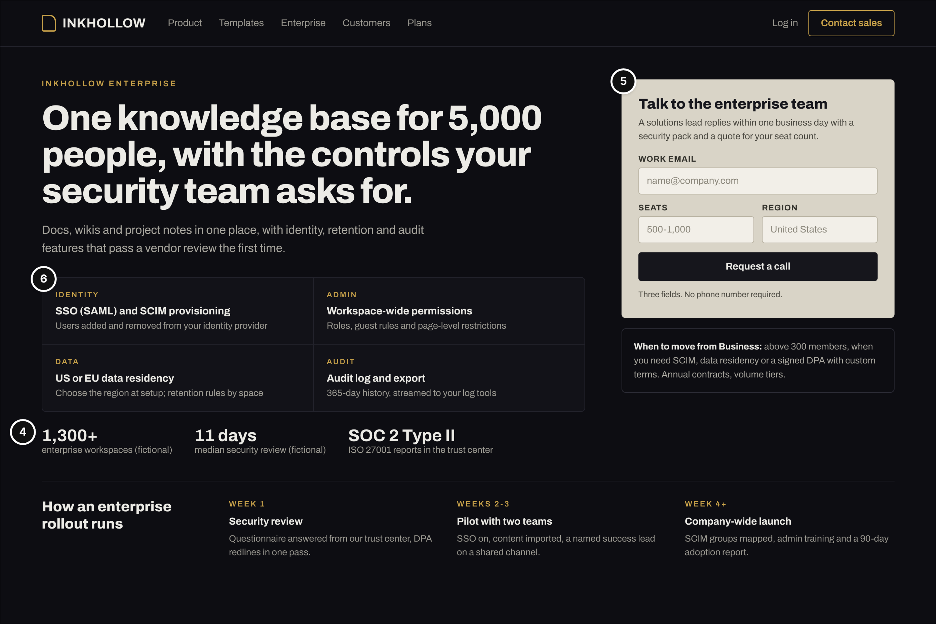
Who it serves and the question: An IT or security lead plus the champion who wants a company-wide rollout. Their question: will this pass our vendor review, and how long will the rollout take?
What works: Four tiles cover what a security reviewer asks first: identity (single sign-on and SCIM provisioning), admin permissions, data residency and the audit log (mark 6). Proof is operational: the number of enterprise workspaces, a median security review time in days and the audit reports available in the trust center (mark 4). The sales form has three fields and says who replies, how fast and what arrives, a security pack and a quote, and the line under it states when to move up from the Business plan (mark 5). A four-week rollout timeline answers the champion's second question.
Watch out: Enterprise pages often hide behind a long discovery form. A short form with a stated reply time respects the buyer's time; a questionnaire they abandon halfway gets you nothing.
What the Ten Examples Have in Common
Strip away the palettes and the type, and the strongest pages share a few decisions:
- The product is the hero. Six of the ten pages put the interface, code, templates or a live workflow in the first screen. A visitor decides whether a tool fits by looking at it, not by reading adjectives.
- Every page has its own start. A free plan on the homepage, an API key on the developer page, "Use template" in the gallery, "Use this workflow" in the directory. Inner pages reached from search work as landing pages, so they need their own next step.
- Proof sits beside the action. Ratings under the signup button, a customer figure beside the switching offer, audit reports next to the sales form. Proof moved to a separate customers page does less work.
- Limits are written down. The plans, signup and enterprise pages all say where the free plan ends and where sales takes over. That's what lets a buyer predict next year's bill without a call.
- The approver has a path. Docs, status, security reports and admin controls are one click away on the pages a champion forwards to finance or IT.
What makes a good SaaS website? One where each visitor can answer their own question on the page they landed on: what the product does, whether it works, how to start and what it will cost as the team grows.
How to Use These Examples With Your Designer
A reference board helps a designer most when it carries your reasoning. This is the format I'd hand over:
- Organize by page type, not by brand. Make a column for each page you need (homepage, plans, signup, integrations, templates, comparison, enterprise) and collect two or three references per column.
- Annotate before you share. Put the six marks on each reference and write one line on the question that page answers. "Free allowance stated under the main button" is a brief; "clean and modern" is a mood.
- Ask for the inner pages early. Most kickoff boards are all homepages. If trials start on a template page or deals stall on the plans page, those pages belong in the first design round.
- Give feedback in marks. Instead of "make it pop," say which mark is weak: "the product isn't visible in the first screen" or "a team lead can't tell what 40 seats will cost."
If the rebuild runs on Webflow, set the budget before you collect references; this breakdown of what a Webflow rebuild of a SaaS site tends to cost helps you decide how many of these page types fit in the first phase.
Where to Find More Real Examples
Once you know what to look for, real sites are easy to find. Landing page galleries, website builder showcases, tag pages on design communities, annotated roundups and community threads where founders trade favorite sites all turn up plenty of SaaS material.
What these sources miss is the rest of the site. Galleries show hero sections and homepages, sometimes a single scroll. You rarely see a plans page with real limits, a signup flow, an integrations directory or an enterprise page. Treat a gallery as a list of addresses. Open the live site, click through to the plans, signup, integrations and security pages, and score what you find against the six marks. Ten minutes per site tells you more than an afternoon of scrolling screenshots.
Frequently Asked Questions (FAQ)
What is a good example of a SaaS website?
A good example is a page pattern, not a famous brand. Look for a homepage that names the category and shows the product, a plans page with a clear value metric and limits, a signup that asks for as little as possible, and an integrations or security page an approver can use without a call. If a site has those pages and each one answers its reader's question, it's worth studying, whatever it looks like.
Should a SaaS homepage show the product or an illustration?
Show the product. Visitors decide in the first screen whether a tool is relevant, and an abstract illustration makes them guess what the software does. A real interface, a short demo or a code sample answers the question at once. Illustrations can support the page, but they shouldn't replace the product in the hero.
How many plans should a SaaS site show?
Three or four is common and easy to compare: a free or entry plan for activation, a team plan, a business plan with admin controls, and an enterprise option for custom contracts. More important than the count is that each plan states its limits and the value metric, so buyers can see when they'd move up.
Do developers care about website design?
Yes, but they judge it by function. Developers look for a working code sample, quick access to docs and SDKs, a free key without a sales call, and a public status page. Polish matters less than finding those things in one click.
Conclusion
The SaaS websites worth learning from aren't the prettiest ones in a gallery. They're the ones where a team lead, a developer, a finance controller and a security reviewer can each find their answer on the page meant for them, and start, compare or approve without waiting for a call. Use the ten examples as a checklist of page types and the six marks as the lens. Then build your own reference board from live sites, inner pages included, and brief your designer on the decisions you want, not the looks you like.