Fintech website examples worth copying show the cost in numbers, say who holds the money, and prove the product before asking for sign-up. The eight fictional examples below, from a digital banking homepage to a pay-later explainer, are annotated against that idea, and our own count says how often each signal shows up.
If you already want a team to build yours, start with web design teams that build for banks, lenders and payment startups. The layouts here are design patterns, not legal, compliance or financial advice.
How to Read These Examples
Every example carries numbered marks on the image, and each number points to one of six questions a visitor needs answered before trusting a money product. Leading design at Copy.ai, Around and HackerRank, and on the AWS Design System, taught me that trust on a product page is rarely about the visual style; it is about whether the page answers the question the visitor has at that moment. We use the same lens when we look at live client sites in agency portfolios for our rankings that score web design studios on the client sites they ship.
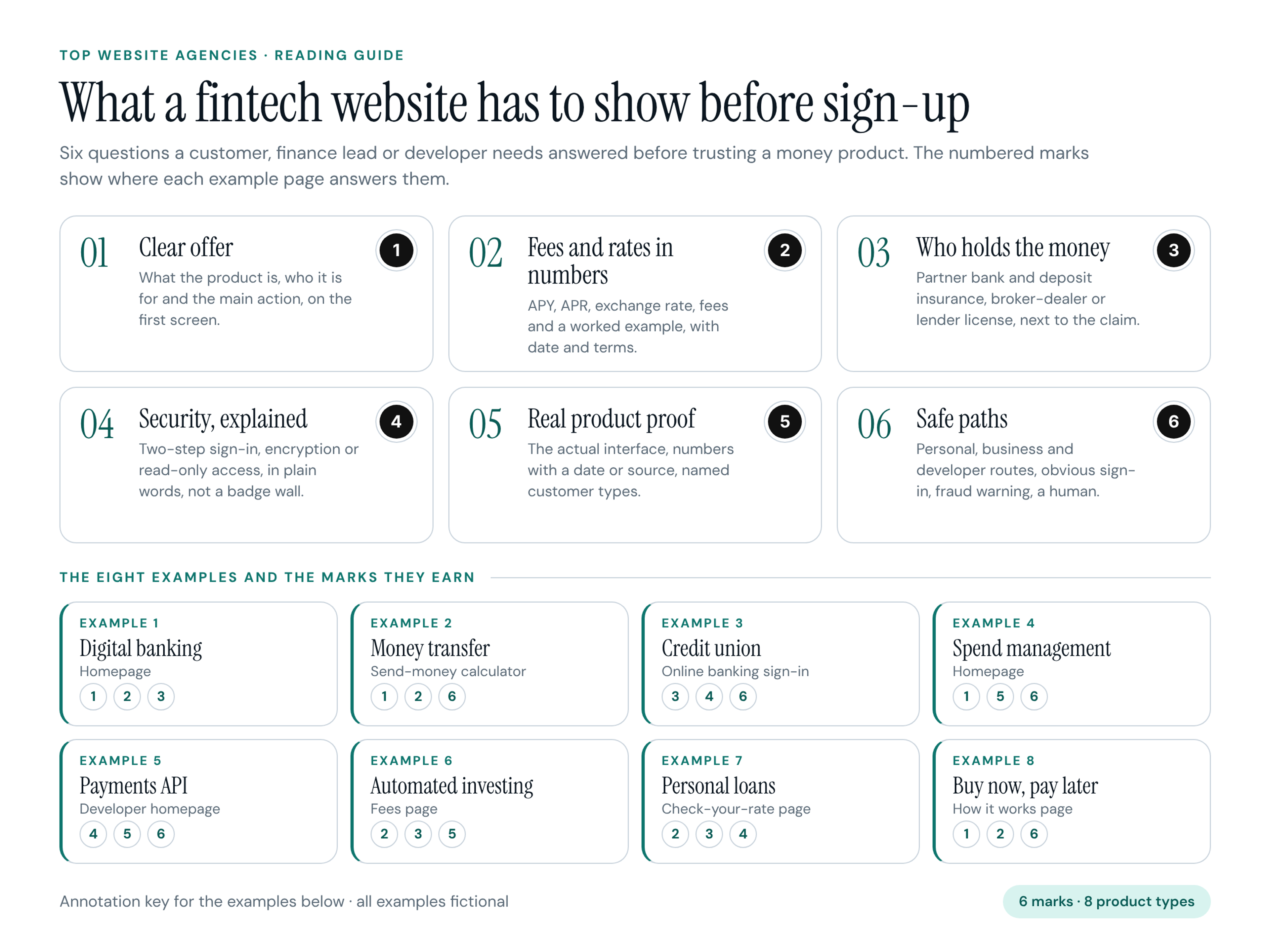
- Mark 1, Clear offer: what the product is, who it is for and the main action, all on the first screen.
- Mark 2, Fees and rates in numbers: APY, APR, exchange rate, fees and a worked example, with the date and terms next to the number.
- Mark 3, Who holds the money: regulatory status in plain words next to the claim it supports, such as the partner bank and deposit insurance, broker-dealer membership or a lender license ID.
- Mark 4, Security, explained: how accounts and data are protected, such as two-step sign-in, encryption or tokenized card data, written as a sentence rather than a wall of badges.
- Mark 5, Real product proof: the actual interface, numbers with a date or a source, and named customer types.
- Mark 6, Safe paths: separate personal, business and developer routes, an obvious sign-in, a fraud warning and a way to reach a human.
The Eight Examples at a Glance
All companies, people and figures below are fictional. They were designed for this article so each pattern can be shown and annotated without critiquing a real brand.
- Example 1: Fernway, consumer digital banking app, homepage. Marks 1, 2, 3.
- Example 2: Tallyrate, international money transfer, send-money calculator. Marks 1, 2, 6.
- Example 3: Harbor State Credit Union, community credit union, online banking sign-in. Marks 3, 4, 6.
- Example 4: Ledgerline, corporate cards and spend management, homepage. Marks 1, 5, 6.
- Example 5: Railhook, payments API for platforms, developer homepage. Marks 4, 5, 6.
- Example 6: Northbeam Invest, automated investing, fees page. Marks 2, 3, 5.
- Example 7: Clearwell Lending, personal loans, check-your-rate page. Marks 2, 3, 4.
- Example 8: Pocketsplit, buy now, pay later, how it works page. Marks 1, 2, 6.
Banking and Money Transfer
People who move their paycheck or send money to family want three answers before anything else: what it costs, when the money arrives and who is responsible for it. Feature lists come later. These three examples answer those questions on the screen where the decision happens.
1. Fernway: Digital Banking Homepage
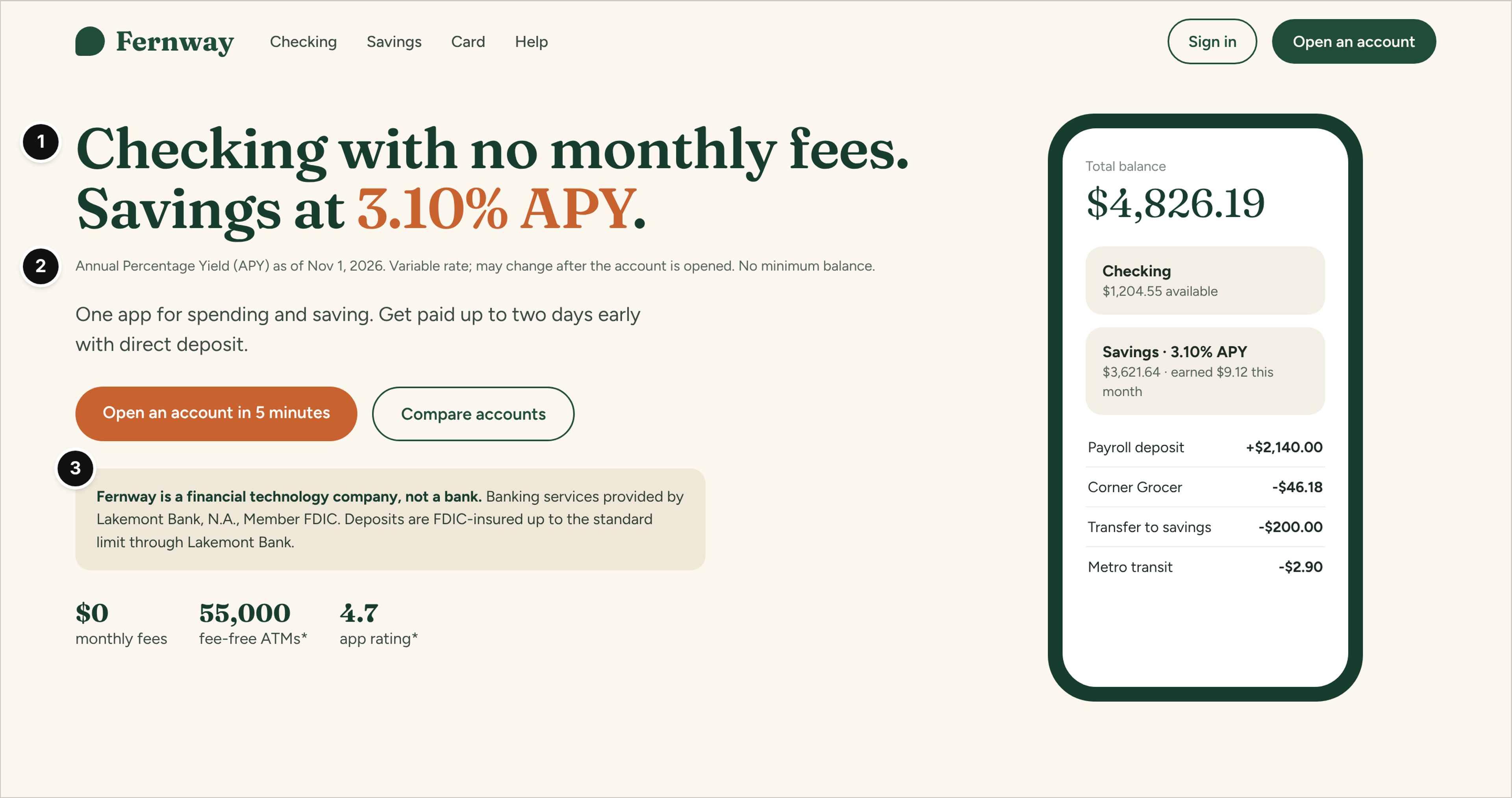
Fernway, consumer digital banking app (a financial technology company, not a bank), homepage.
Who it serves and the question: A consumer comparing a new app with their current bank, asking "what does it pay, what does it cost, and is my money actually safe here?"
What works: The headline is the offer itself, no monthly fees on checking and 3.10% APY on savings, with "Open an account in 5 minutes" as the one primary action (mark 1). The APY footnote sits directly under the headline, with the as-of date (Nov 1, 2026) and the fact that the rate is variable, so the number never floats alone (mark 2). Right below the buttons, a shaded line says in plain words that Fernway is not a bank and names Lakemont Bank, N.A., Member FDIC, as the bank that provides the accounts (mark 3). The phone screen shows real balances and transactions, which tells a visitor more than a lifestyle photo would.
Watch out: Asterisks on "55,000 fee-free ATMs" and "4.7 app rating" need footnotes that are as easy to find as the APY note. A number with an orphaned asterisk undoes the credibility the rest of the page builds.
2. Tallyrate: Send-Money Calculator
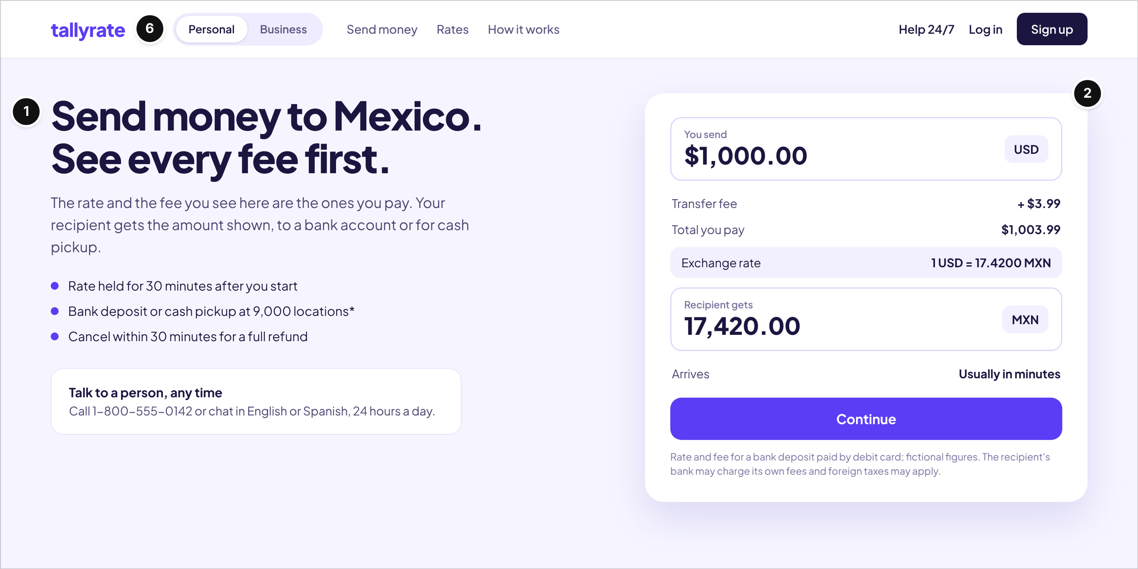
Tallyrate, international money transfer, send-money calculator page.
Who it serves and the question: Someone sending $1,000 to a relative in Mexico, asking "how much will arrive, and what am I paying for it?"
What works: The headline promises the one thing a sender cares about, seeing every fee first, and the copy under it says the quoted rate and fee are the ones you pay (mark 1). The calculator does the math in full: $1,000.00 sent, a $3.99 fee, $1,003.99 total, an exchange rate of 1 USD = 17.4200 MXN and 17,420.00 MXN to the recipient, with the arrival estimate and a note that the recipient's bank may charge its own fees (mark 2). A Personal and Business toggle sits in the header, and a human help line, open 24 hours a day in two languages, sits on the first screen rather than in a help center (mark 6).
Watch out: A calculator that shows only the exchange rate, or rounds the amount received, forces visitors to do the math themselves. If the rate is only held for 30 minutes, say so next to the button, not in the terms.
3. Harbor State Credit Union: Online Banking Sign-In
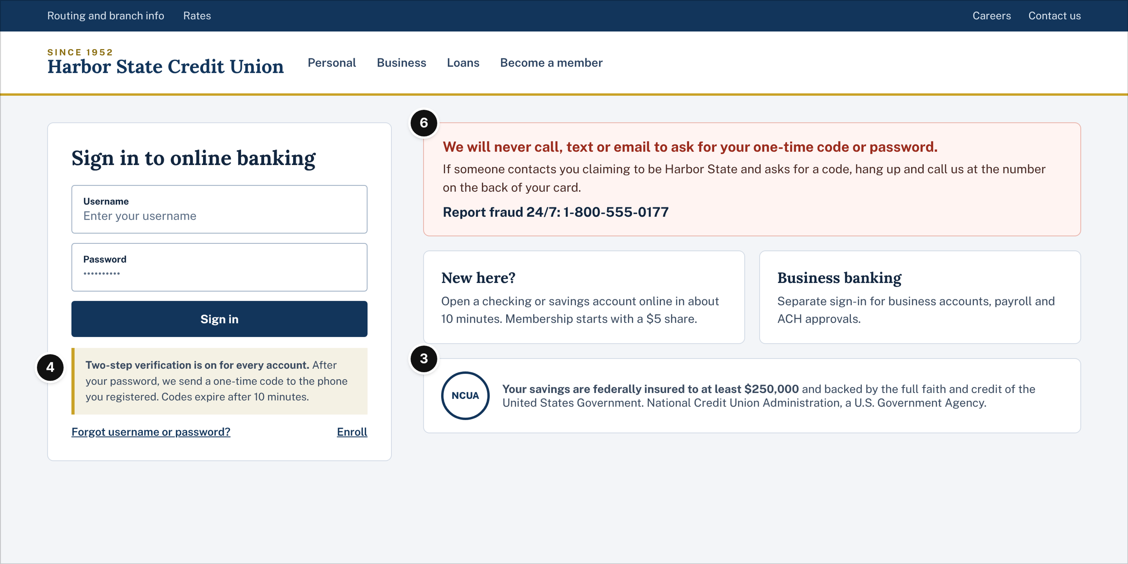
Harbor State Credit Union, community credit union, online banking sign-in page.
Who it serves and the question: An existing member signing in, and a member who just got a suspicious call, asking "is this the real site, and what do I do if someone asked for my code?"
What works: The two-step verification box under the sign-in button explains what happens next in one sentence: a one-time code goes to the registered phone and expires after 10 minutes (mark 4). The most prominent block on the page is the fraud notice, "We will never call, text or email to ask for your one-time code or password," with a 24/7 fraud line, and business members get their own sign-in route (mark 6). The NCUA insurance statement sits on the page itself, next to the account links, instead of being buried in the footer (mark 3).
Watch out: Sign-in pages tend to collect promotional banners for loans and cards. Every extra element competes with the fraud notice, so keep marketing off this page.
Business Finance and Payments
Finance leads and developers buy on evidence. They want to see the product, understand the controls and judge reliability before a sales call, and they often have to justify the choice to someone else. These two examples put the product itself on the first screen.
4. Ledgerline: Spend Management Homepage
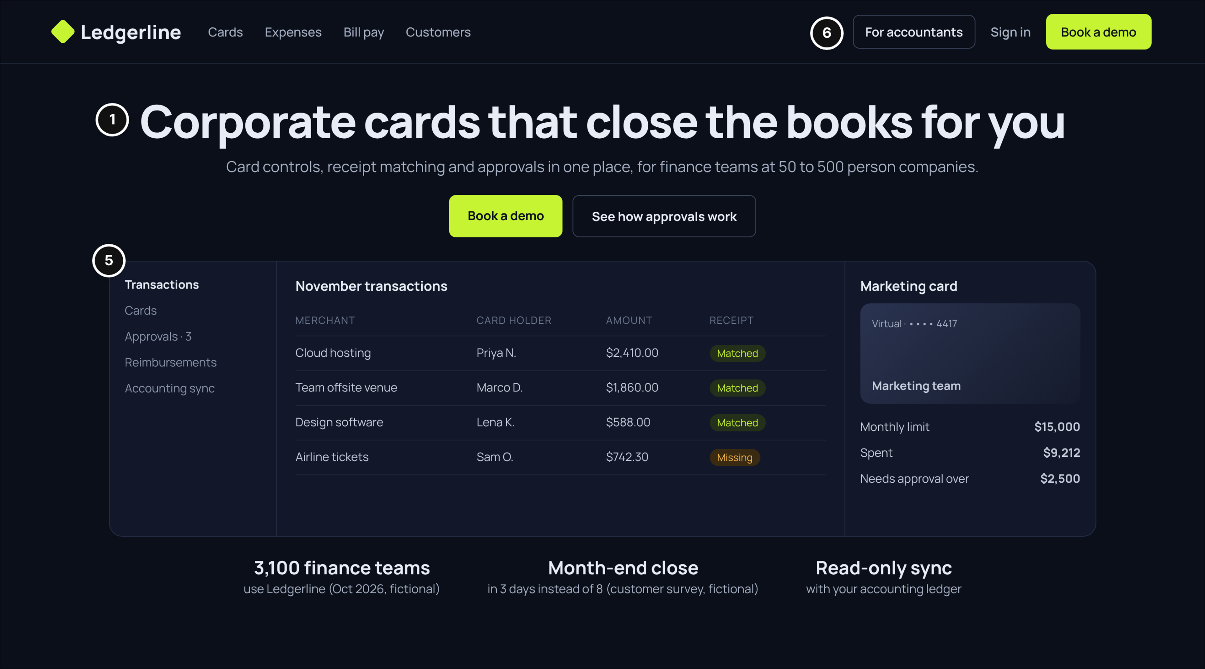
Ledgerline, corporate cards and spend management for mid-size companies, homepage.
Who it serves and the question: A controller or finance lead at a 50 to 500 person company, asking "will this actually shorten our month-end close, and how much control do I keep over who spends what?"
What works: The headline and subline name the job and the audience together, cards that close the books for finance teams at 50 to 500 person companies, with "Book a demo" and "See how approvals work" as the two actions (mark 1). The dashboard below is the real product: a transactions list with matched and missing receipts, and a card panel with a monthly limit and an approval threshold, which answers the control question without a word of copy (mark 5). "For accountants" is a separate route in the header, because the outside accountant is often a second buyer (mark 6).
Watch out: Figures like "3,100 finance teams" and "3 days instead of 8" only help if each one carries a date or a source, as they do here. Undated customer counts and "up to" savings claims read like marketing to a finance audience.
5. Railhook: Payments API Developer Homepage
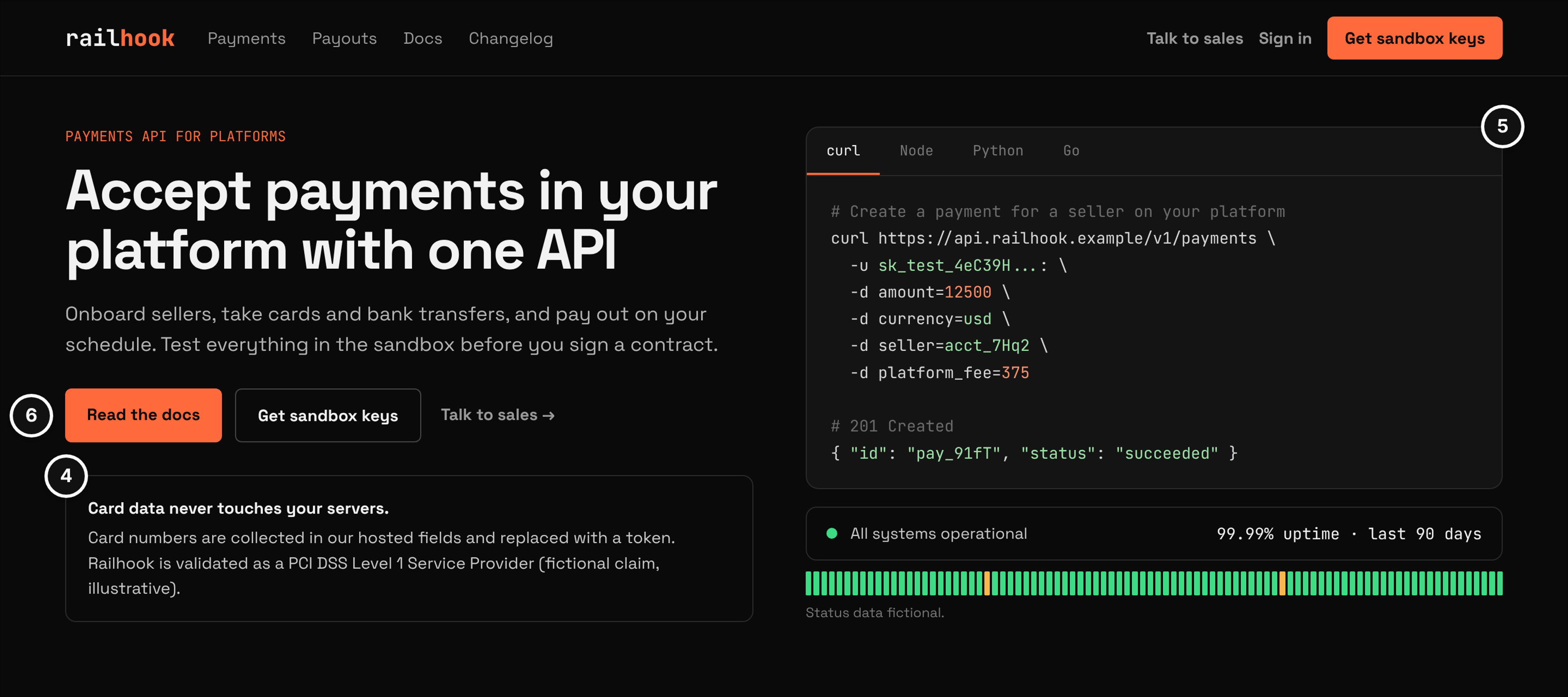
Railhook, payments API for platforms, developer homepage.
Who it serves and the question: A developer or technical founder at a marketplace or software platform, asking "how hard is the integration, how reliable is it, and what does it mean for our security scope?"
What works: "Read the docs" and "Get sandbox keys" sit next to "Talk to sales," so a developer can start without a form and a buyer can still reach a person (mark 6). The security box answers the scope question in two sentences: card numbers are collected in hosted fields and replaced with a token, and the PCI DSS validation level is stated as a claim, not shown as a logo (mark 4). The code sample and the 90-day status bar are the proof: a developer can see the request, the response and the uptime history before signing anything (mark 5).
Watch out: Developer pages often stop at the code and forget the person who approves the contract. A short link to security documentation and a named way to reach sales keep both readers on the same page.
Investing, Lending and Pay Later
Investing, borrowing and paying in installments all carry a cost that grows over time, so visitors look for the full cost, the risk and the rules that protect them. These three examples turn fees and terms into numbers a visitor can check.
6. Northbeam Invest: Fees Page
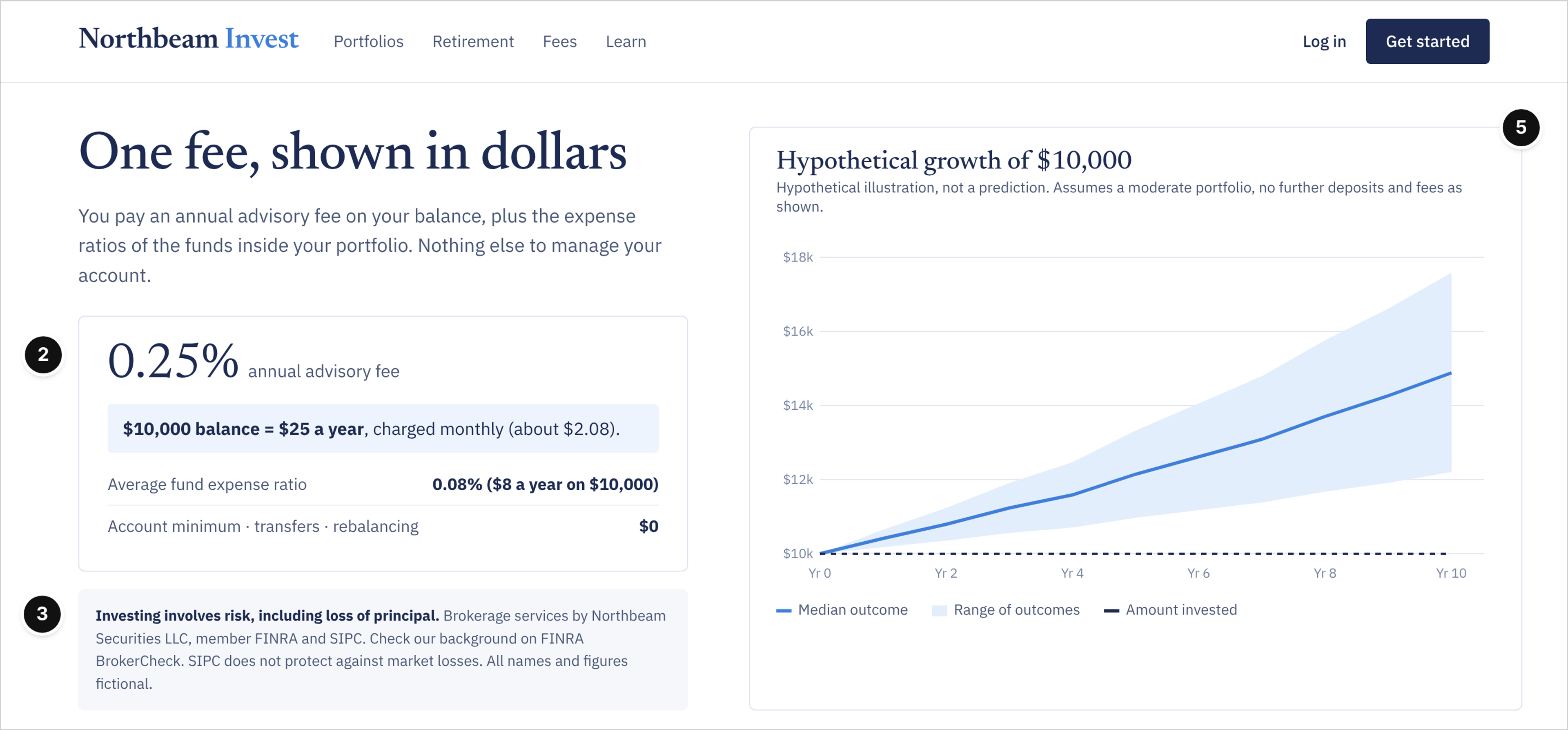
Northbeam Invest, automated investing, fees page.
Who it serves and the question: A first-time investor comparing automated investing options, asking "what will this cost me in dollars, and what am I protected against?"
What works: The 0.25% advisory fee is translated into dollars right away: a $10,000 balance costs $25 a year, and the fund expense ratios are listed on their own line, so the two costs are never blended (mark 2). The risk statement and the broker-dealer line, member FINRA and SIPC, with a pointer to BrokerCheck, sit directly under the fee box instead of at the bottom of the page, and they also say what SIPC does not cover (mark 3). The growth chart shows a range of outcomes and is labeled hypothetical in its own title, which makes it proof of how the product works rather than a promise (mark 5).
Watch out: A single smooth growth line with no range and no "hypothetical" label is the most common way investing pages overpromise. Show the range, or leave the chart out.
7. Clearwell Lending: Check-Your-Rate Page
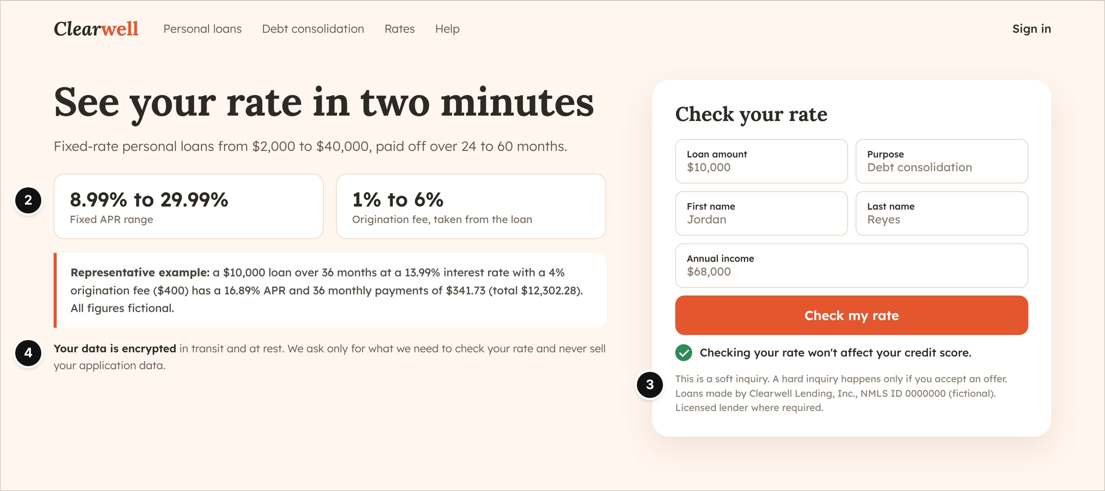
Clearwell Lending, personal loans, check-your-rate page.
Who it serves and the question: A borrower consolidating credit card debt, asking "what will this loan really cost, and will checking hurt my credit score?"
What works: The APR range (8.99% to 29.99%) and the origination fee range (1% to 6%) appear as two equal cards, and a representative example does the full math: a $10,000 loan over 36 months at 13.99% interest with a $400 origination fee has a 16.89% APR and 36 payments of $341.73 (mark 2). Under the button, the page explains in plain words that checking is a soft inquiry, that a hard inquiry happens only if an offer is accepted, and gives the lender's NMLS ID (mark 3). A one-line note on how application data is encrypted and that it is never sold sits beside the form, where the borrower is about to type their income (mark 4).
Watch out: Advertising only the lowest APR in the headline sets the wrong expectation for most applicants. The range and the representative example belong on the same screen as the lowest number.
8. Pocketsplit: Pay-Later Explainer
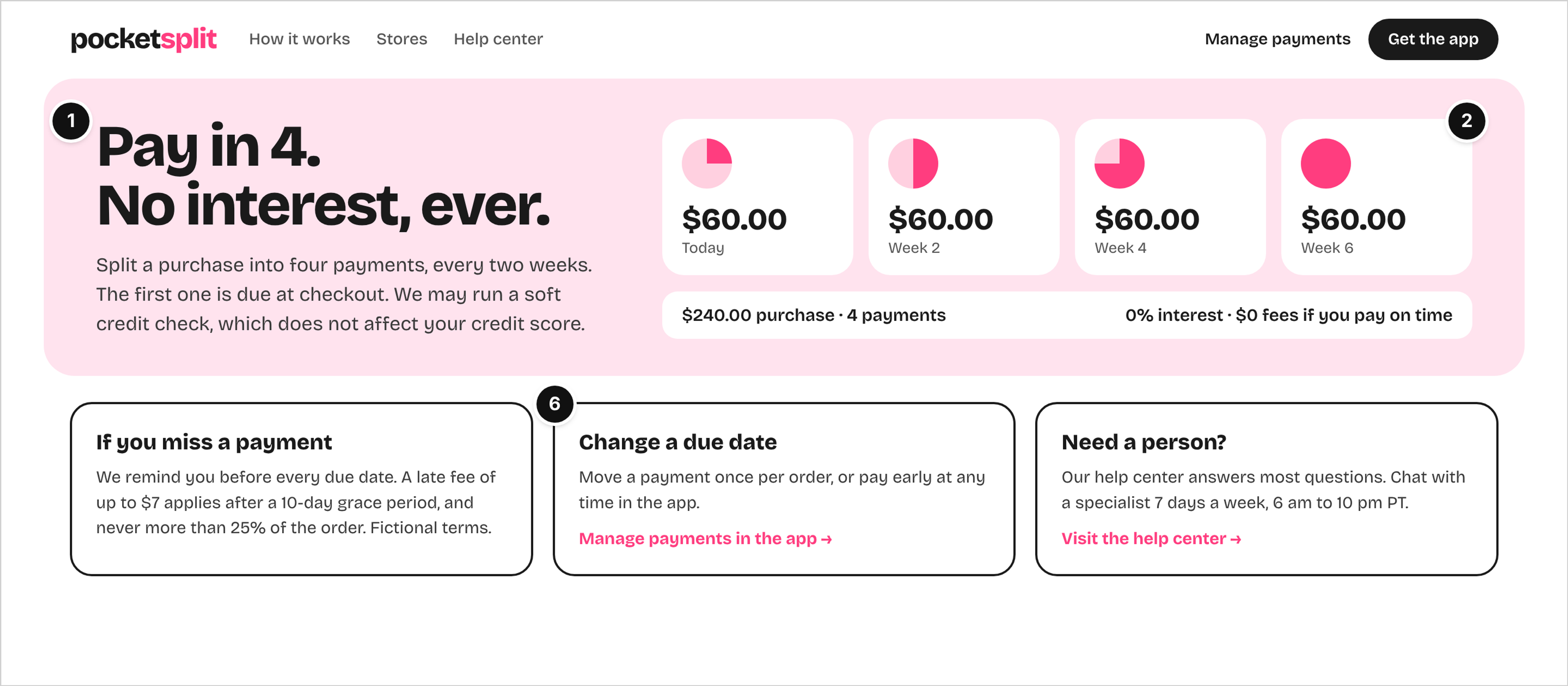
Pocketsplit, buy now, pay later, how it works page for shoppers.
Who it serves and the question: A shopper at checkout, asking "what exactly will I pay, when, and what happens if I am late?"
What works: The headline states the offer and the condition in six words, pay in 4 with no interest (mark 1). The schedule turns the offer into dates and dollars: a $240 purchase becomes four $60 payments, today and at weeks 2, 4 and 6, with "0% interest, $0 fees if you pay on time" right under it (mark 2). Below, the missed-payment rules give the late fee in numbers and a cap, and the shopper gets two clear routes, managing payments in the app or reaching a person through the help center (mark 6).
Watch out: The soft credit check note sits in the hero copy, where it is easy to skim past. A short line next to the checkout button would answer the credit question at the moment it matters.
What the Eight Examples Have in Common
The pattern across all eight is simple: answer the money question first, then show the product. Our count from the annotated images:
- Fees and rates in numbers (mark 2): 5 of 8 examples show a fee, rate or worked example on the first screen.
- Safe paths (mark 6): 5 of 8 separate audiences or put a human contact and a fraud warning where visitors will see them.
- Clear offer (mark 1): 4 of 8 state the product, the audience and one main action in the hero.
- Who holds the money (mark 3): 4 of 8, which is every consumer example that takes deposits, investments or loan applications, name the regulated entity next to the claim.
- Security, explained (mark 4) and real product proof (mark 5): 3 of 8 each: the sign-in, developer and lending pages explain security, and the spend management, developer and investing pages lead with proof.
So what makes a good fintech website? It tells a visitor what the product does and what it costs in plain numbers, names who stands behind the money, explains how accounts are protected, and shows the product working. Visual style matters less than placement: the same disclosure line builds trust next to the number it explains and does almost nothing in the footer.
One more pattern is worth naming. None of the pages that quote a price ask for personal information before showing it. Even the loan page, which needs income to price an offer, shows the APR range and a worked example before the form.
Where Regulation Shows Up on the Page
From a design point of view, regulation decides where certain facts have to sit, and the strongest pages treat those facts as part of the layout. The exact wording and placement must always come from the company's own legal and compliance team; the notes below only explain why the examples are built the way they are.
- Deposit insurance next to the account offer. The FDIC explains that deposit insurance covers $250,000 per depositor, per FDIC-insured bank, for each account ownership category, and that stocks, bonds, mutual funds and crypto assets are not covered. That is why Fernway names its partner bank next to the APY instead of implying it is a bank.
- The credit union sign on the site. The NCUA's share insurance page says federally insured credit unions are covered up to $250,000 and are required to display the official sign on their website, which is the line Harbor State places beside its account links.
- Broker-dealer facts next to the fee. SIPC's own explanation sets the protection limit at $500,000, including a $250,000 limit for cash, and states that SIPC does not protect against a decline in the value of securities. Investors can check a firm or adviser on FINRA BrokerCheck, which is why Northbeam points there from its fee box.
- Transfer math before payment. The CFPB's guide to sending money abroad says that before you pay, you see the exchange rate, the fees and taxes, and the amount that will be received. Tallyrate's calculator simply puts that same information on the marketing page.
- Card data and the payment page. Card payment flows fall under the standards published by the PCI Security Standards Council, including PCI DSS. Railhook states its validation level in words and explains tokenization, so a developer knows what stays out of their own systems.
How to Use These Examples With Your Designer
Treat the examples as a brief, not a mood board. A few practical steps:
- Sort references by product type, not by visual style. A lender and a payments API need different first screens even if they share a color palette.
- Ask for the inner pages your product needs: a calculator, a fees page, a rate check, a sign-in page or a how it works page. Galleries rarely show these, and they are where visitors decide.
- Check every number on a mockup for a date, a term and a source. Placeholder rates have a way of surviving into production.
- Design disclosure lines into the layout from the first wireframe, with real text from your compliance team, so they do not end up squeezed into the footer at launch.
- Never copy another company's page or disclosure text. Use the pattern and write your own words.
If you sell finance software to companies rather than consumers, compare these with SaaS product pages annotated mark by mark, which cover demo, trial and plan pages in more depth. For tools bought by CFOs and finance teams, where a controller, an IT lead and procurement all weigh in, the layouts for B2B sales with several decision makers show how to give each of them a path.
Where to Find More Real Examples
Inspiration galleries and roundups of fintech sites are easy to find, and they are useful for seeing visual range: dark and light themes, editorial and playful brands, product-first and story-first homepages. What they usually miss is everything below the hero. Fee math, disclosure placement, sign-in pages and rate checks rarely appear, and a screenshot carries no note on why a pattern works or what it trades away. The eight illustrated examples above are fictional. The live pages below show the same patterns on real public sites, and those pages change over time, so use them as a current reference rather than a fixed template.
When you look at real sites, read them the way a cautious customer would: find the number, find who holds the money, try to reach a person, and see how many clicks each takes. The sign-in page deserves special attention, because it is also the page attackers imitate. CISA's guidance on recognizing and reporting phishing is a useful reference when you write the fraud notice for your own sign-in page.
- Digital banking homepage: Ally Bank's banking page lists an APY next to each product with an as-of date, such as savings at 3.2% "correct as of 11/12/26," and notes that variable rates may change after the account is opened. Ally Bank is identified as a Member FDIC.
- Send-money calculator: Wise's send-money page puts a calculator on the first screen with the exchange rate, the fee and an arrival estimate, and compares what a 30,000 USD to EUR transfer costs by funding method, using the mid-market rate and showing fees up front.
- Credit union sign-in and security: Navy Federal Credit Union's Security Center explains 2-step verification, describes phishing attempts by email, telephone, text and social media, and states that Navy Federal is insured by NCUA.
- Spend management homepage: Mercury's homepage shows virtual cards, receipt matching, spend controls and approval flows, offers a product demo, and states that Mercury is a fintech company, not an FDIC-insured bank, with banking services provided through Choice Financial Group and Column N.A., Members FDIC.
- Payments API developer homepage: Stripe's documentation homepage opens with guides and examples, a way to load test API keys, and a sample payment request a developer can try without filling in a sales form.
- Investing fees page: Betterment's pricing page states the automated investing fee as $5 a month or 0.25% a year, depending on balance and recurring deposits, and names Betterment Securities as an SEC-registered broker-dealer and member of FINRA/SIPC.
- Check-your-rate page: Upgrade's personal loans page lets you check a rate with a soft inquiry, with a hard inquiry only if you accept an offer, walks through a $10,000 loan at 16.28% APR over 36 months with a 5% origination fee, and lists an APR range of 7.74% to 35.99% plus Upgrade's NMLS ID.
- Pay-later explainer: Afterpay's how-it-works page describes Pay in 4 as four interest-free installments generally over six weeks, with the first payment upfront, no late fees if you pay on time, and a cap on late payments.
FAQ
What are good examples of fintech websites?
Good examples depend on the product type. A strong transfer site shows a working calculator with the fee, the rate and the amount received. A strong banking site names its partner bank next to its rates. A strong business finance site shows its real dashboard, and a strong lending site gives a representative APR example before the application form.
What should a fintech homepage include?
A one-line offer that names the product and the audience, one main action, the key number with its date and terms, a plain statement of who holds the money, a short security explanation, a view of the real product and clear routes for personal, business or developer visitors, plus a way to reach a person.
Should a fintech website show fees and rates up front?
In our eight examples, the pages that earn trust fastest put the number and a worked example on the first screen, with the date and conditions beside it. Hiding the fee until sign-up makes visitors assume the worst. Which numbers you can advertise and how is a question for your compliance team.
How is a fintech website different from a bank website?
Many fintech companies are not banks and work with a partner bank, so the site has to say that clearly and name the bank. Fintech sites also tend to focus on one product and one main action, while a bank or credit union site has to serve many account types, existing customers signing in and people in branches.
Conclusion
The eight examples share one habit: they answer the money question before they ask for anything. Put the number on the first screen, say who holds the money next to the claim, explain security in a sentence, show the product working and give every visitor a safe way forward. Start with the page where your customers decide, whether that is a calculator, a fees page or a sign-in screen, and design it around those answers before you work on the visual style.