Healthcare website examples worth copying put the patient's main task first, show who gives the care, and answer cost and safety questions up front. The eight fictional examples below, from a regional health system to an independent pharmacy, are annotated against that idea so you can see where each page does its job.
If you already know you want a team to build your site, start with web design teams that specialize in clinics and health systems. If you're still working out what the site should do, read on: this page stays on the examples. They are design patterns, not legal or clinical guidance.
Two numbers from my review of these eight pages shape the article. Four of the eight are inner pages, not homepages, because patients rarely act on a homepage: they book from a directory, decide on a procedure page and refill from a refill page. And six of the eight answer the cost or coverage question on the page, which is the question most practice sites still push to the phone.
How to Read These Examples
Every example carries numbered marks from one six-mark rubric. Each mark is a question a patient, a caregiver or a referring clinician needs answered before they act, and each example earns three of them.
As Head of Design at Top Website Agencies, I write the portfolio assessments behind our rankings, and before that I led design teams at Copy.ai, Around, HackerRank and AWS. This rubric is how I read a shipped healthcare page, written down. It's the same lens behind our reviews of web design teams and the sites they have launched, where portfolio work is judged on live client sites rather than mockups.
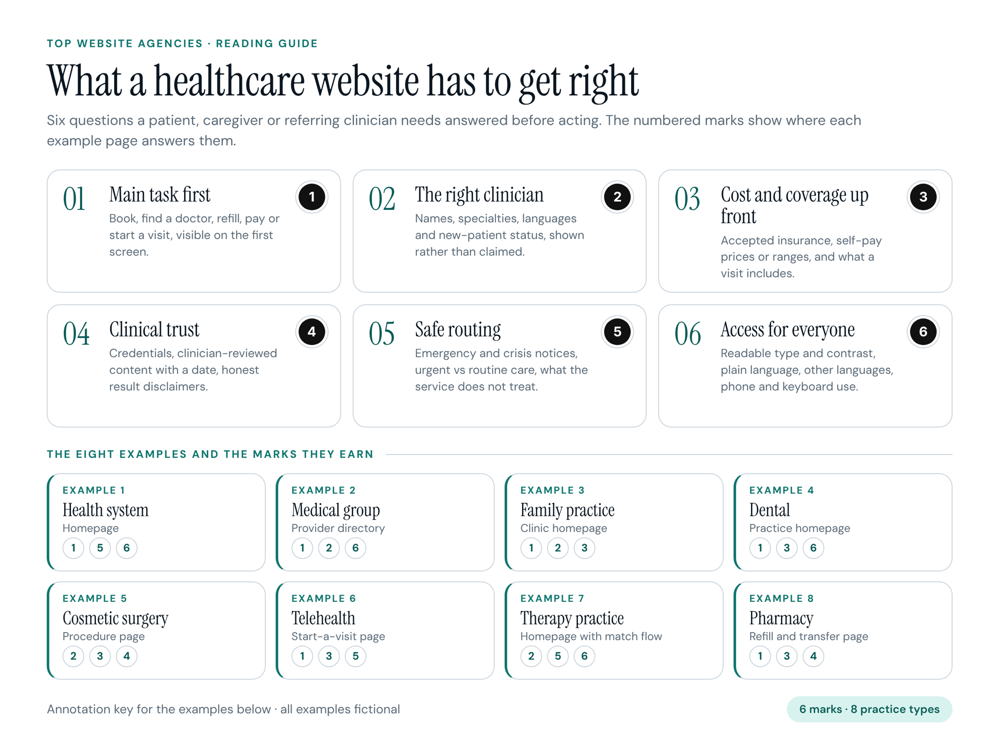
The six marks:
- 1. Main task first. The two or three things most visitors came to do (book, find a doctor, refill, pay a bill, start a visit) are visible on the first screen, without a menu.
- 2. The right clinician. The page shows who provides the care: names, specialties, languages and whether they accept new patients. Shown, not claimed.
- 3. Cost and coverage up front. Accepted insurance, self-pay prices or ranges, and what a visit includes, in plain words.
- 4. Clinical trust. Credentials, content reviewed by a clinician with a date, real facilities, and honest disclaimers about results.
- 5. Safe routing. What the site is not for: emergency and crisis notices, urgent versus routine care, and what the service does not treat.
- 6. Access for everyone. Readable type and contrast, plain language, other languages, large tap targets on a phone and full keyboard use.
The Eight Examples at a Glance
- 1. Harborline Health: regional health system, homepage, marks 1, 5, 6.
- 2. Cedar Ridge Medical Group: multispecialty group, find-a-doctor results page, marks 1, 2, 6.
- 3. Willowmere Family Practice: independent family medicine clinic, homepage, marks 1, 2, 3.
- 4. Brightwater Dental: family dental practice, homepage, marks 1, 3, 6.
- 5. Arlo Ridge Plastic Surgery: cosmetic surgery practice, procedure page, marks 2, 3, 4.
- 6. Kestrel Virtual Care: telehealth service, start-a-visit page, marks 1, 3, 5.
- 7. Quietfield Counseling: group therapy practice, homepage, marks 2, 5, 6.
- 8. Pillwise Pharmacy: independent pharmacy with delivery, refill and transfer page, marks 1, 3, 4.
All eight organizations, people, plans, prices and wait times are invented for this article, and every image is labeled as an illustrative example.
Hospitals and Health Systems
A health system site serves the widest audience of any healthcare website: new patients, existing patients, caregivers, visitors, job candidates and referring clinicians, often in more than one language. The job of the homepage and the directory is routing: get each visitor to the right door in one or two steps.
1. Harborline Health: Health System Homepage
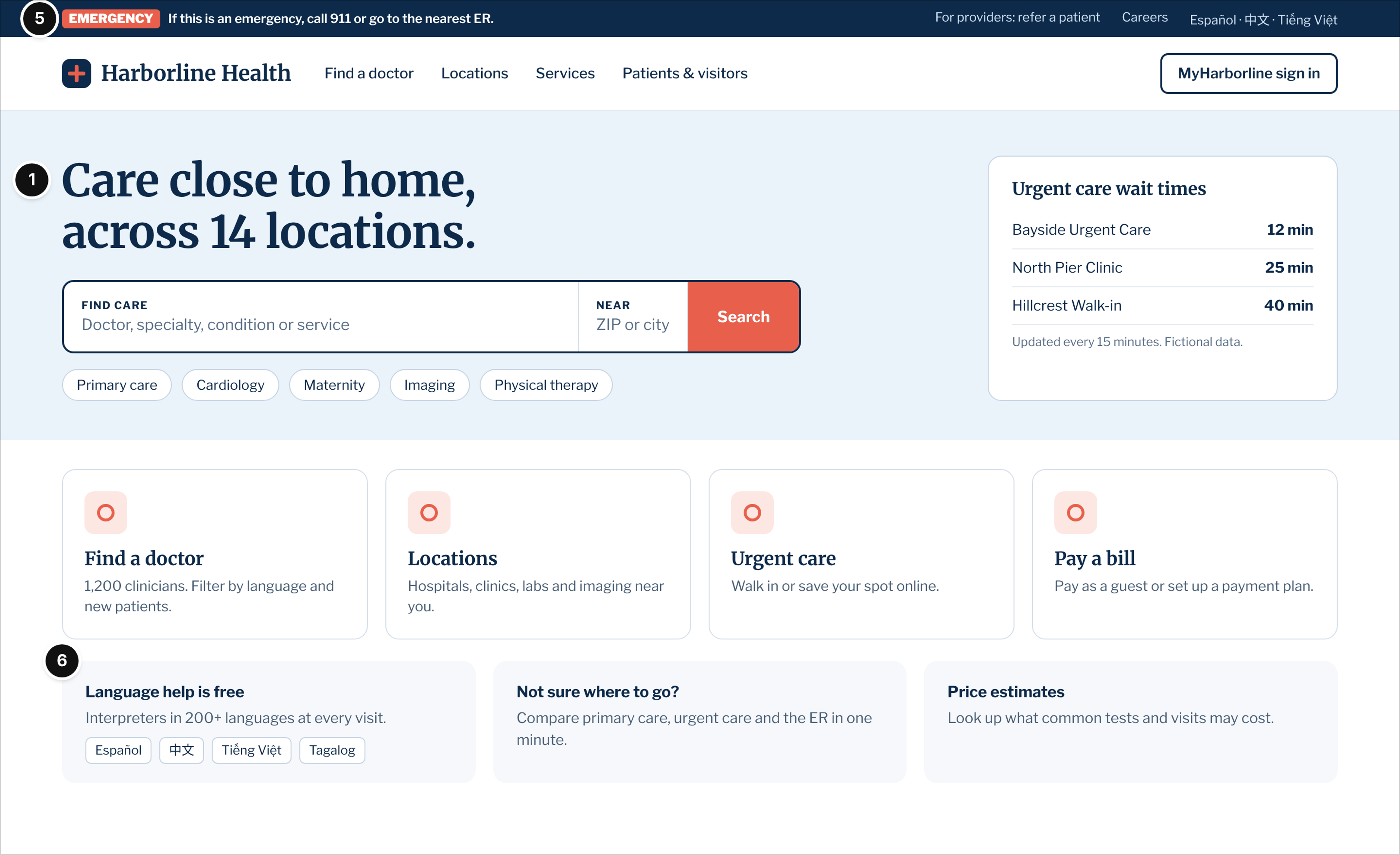
Fictional organization: Harborline Health, a regional health system with 14 locations, homepage.
Who it serves and the question: Mostly existing patients and caregivers who want to find care nearby, check a wait time, pay a bill or sign in to the patient portal. Some visitors are in a hurry because something is wrong today.
What works: The hero is a single "Find care" search for a doctor, specialty, condition or service plus a ZIP code, with common specialties as one-tap shortcuts, and four task tiles (find a doctor, locations, urgent care, pay a bill) directly below it (mark 1). An emergency line sits above everything ("If this is an emergency, call 911 or go to the nearest ER"), so nobody books an appointment for something that can't wait (mark 5). Language help gets its own card with languages written in their own scripts, and the main navigation is short enough to work with a keyboard and on a phone (mark 6). A small "For providers: refer a patient" link in the utility bar keeps clinician traffic out of the patient path.
Watch out: Live wait times build trust only if they are current. Label the update interval, as this page does, and remove the widget for locations that can't feed it reliably.
2. Cedar Ridge Medical Group: Find-a-Doctor Results
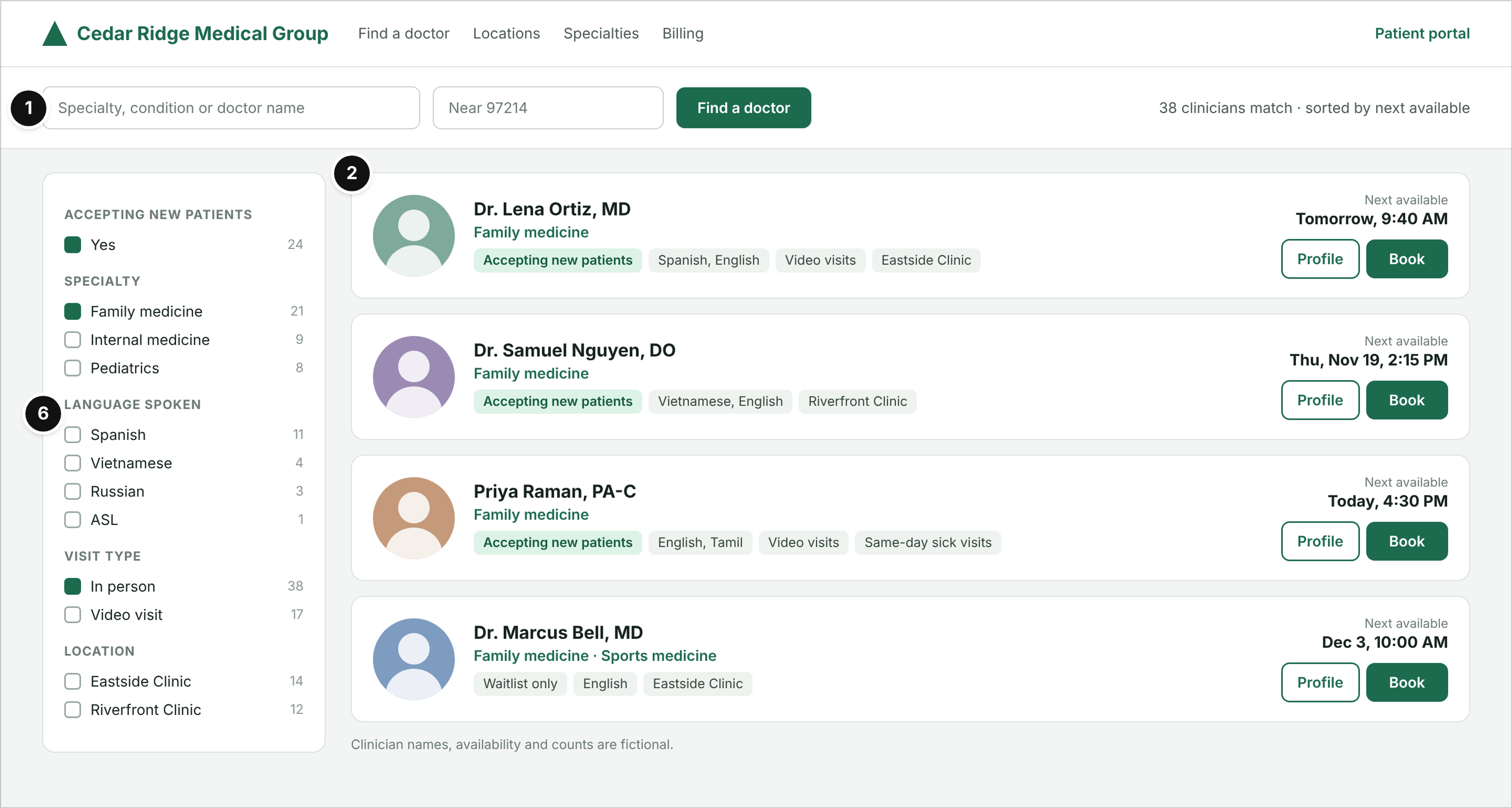
Fictional organization: Cedar Ridge Medical Group, a multispecialty group, provider directory results page.
Who it serves and the question: New patients choosing a primary care clinician, and patients referred to a specialist. Their question is "Who can see me, soon, in a language I speak, near me?"
What works: The search bar stays at the top with the result count and the sort order ("sorted by next available"), so the patient sees the answer to the timing question before reading a single bio (mark 1). Each card shows the clinician's name and credential, specialty, languages, location, whether they accept new patients and the next open slot, next to a Book button (mark 2). Filters cover the things patients actually filter on (accepting new patients, language including ASL, visit type, location), with counts, so nobody hits an empty result page (mark 6).
Watch out: Directory data goes stale fast. A clinician marked "accepting new patients" who isn't costs more trust than a missing filter, so the directory needs an owner and a refresh routine, not only a design.
Clinics and Private Practices
Smaller practices win on proximity and people. Visitors want to know three things quickly: are you open, do you take my insurance, and who will I see. Dental and cosmetic practices add a fourth question: what will this cost me if insurance doesn't cover it?
3. Willowmere Family Practice: Clinic Homepage
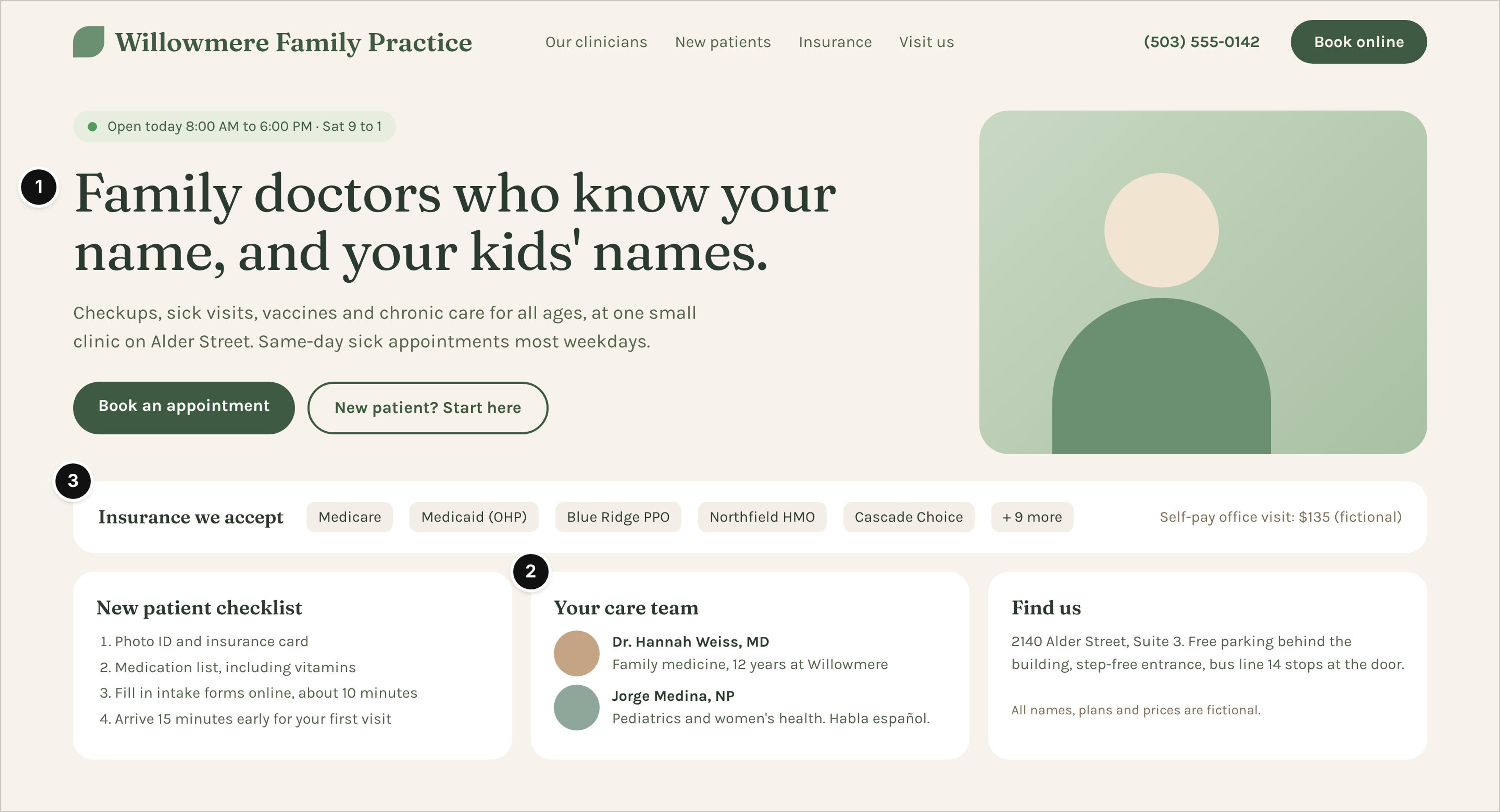
Fictional organization: Willowmere Family Practice, an independent family medicine clinic, homepage.
Who it serves and the question: Local families looking for a primary care home, and parents with a sick child who need a same-day visit.
What works: Today's hours sit in a status pill above the headline, and "Book an appointment" and "New patient? Start here" are the only two buttons in the hero (mark 1). The care team card puts names, credentials and one human detail on the homepage, including which clinician speaks Spanish (mark 2). The insurance strip lists accepted plans by name and shows the self-pay office visit price on the same line (mark 3), which answers the most common phone question before it's asked. The new-patient checklist and the parking and step-free entrance note do quiet work for first-time and older patients.
Watch out: Plan lists change at every contract cycle. Show the date the list was last checked, and link to a fuller list instead of letting "+ 9 more" go out of date.
4. Brightwater Dental: Dental Practice Homepage
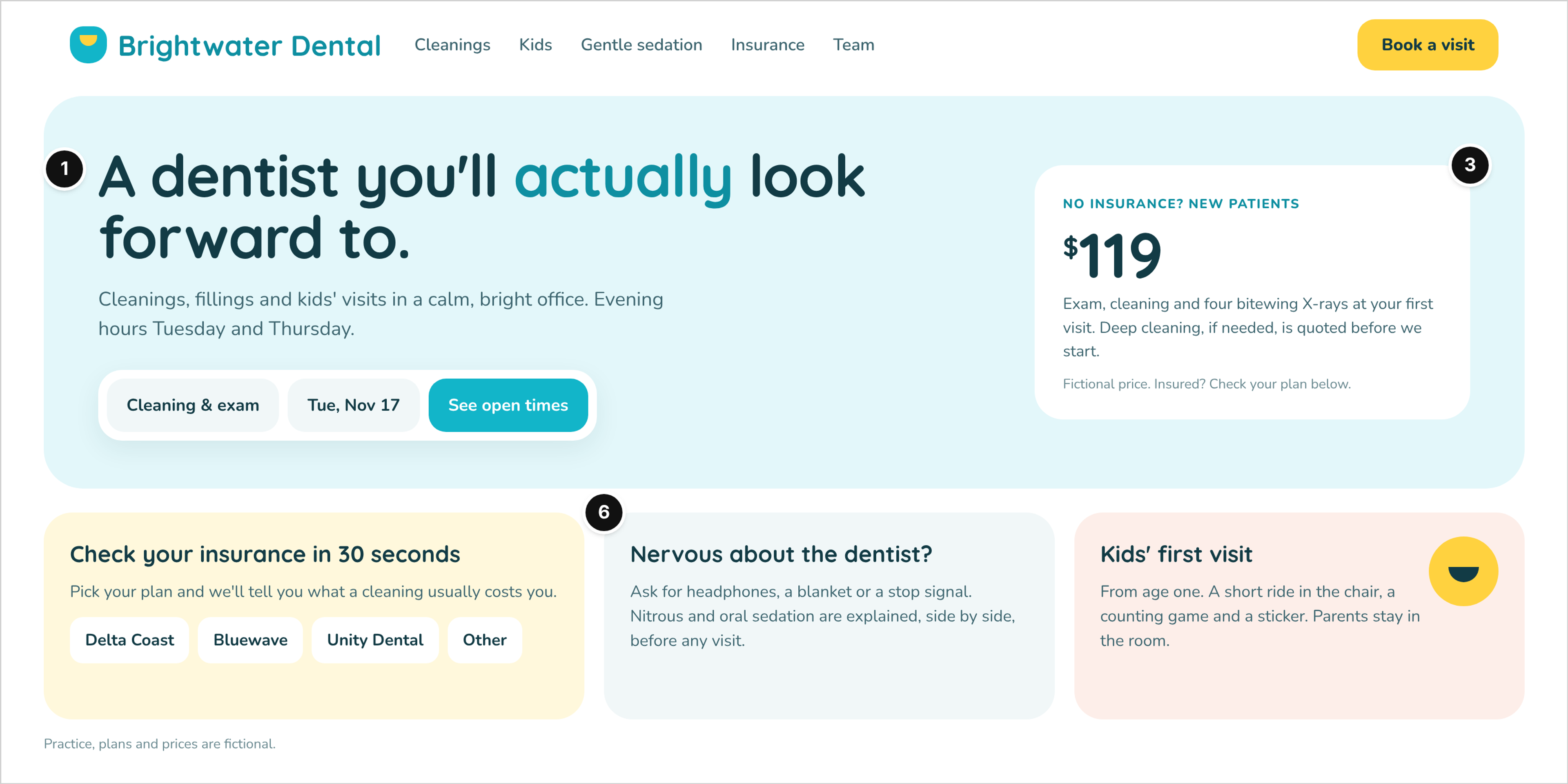
Fictional organization: Brightwater Dental, a family dental practice, homepage.
Who it serves and the question: Adults who have put off the dentist, and parents booking a child's first visit. The questions are cost, comfort and when.
What works: The booking widget lives inside the hero: pick the visit type and a date, then "See open times" (mark 1). The new-patient offer shows one self-pay price (fictional) and spells out what it includes and what would be quoted separately, so the number reads as honest rather than as bait (mark 3). Anxiety gets its own card with specific comfort options and a side-by-side explanation of sedation choices, and the type is large, rounded and high in contrast on pale backgrounds (mark 6).
Watch out: A friendly tone can slide into cuteness. Keep the clinical facts (who does the cleaning, what the X-rays are for) as plain and visible as the warm copy.
5. Arlo Ridge Plastic Surgery: Procedure Page
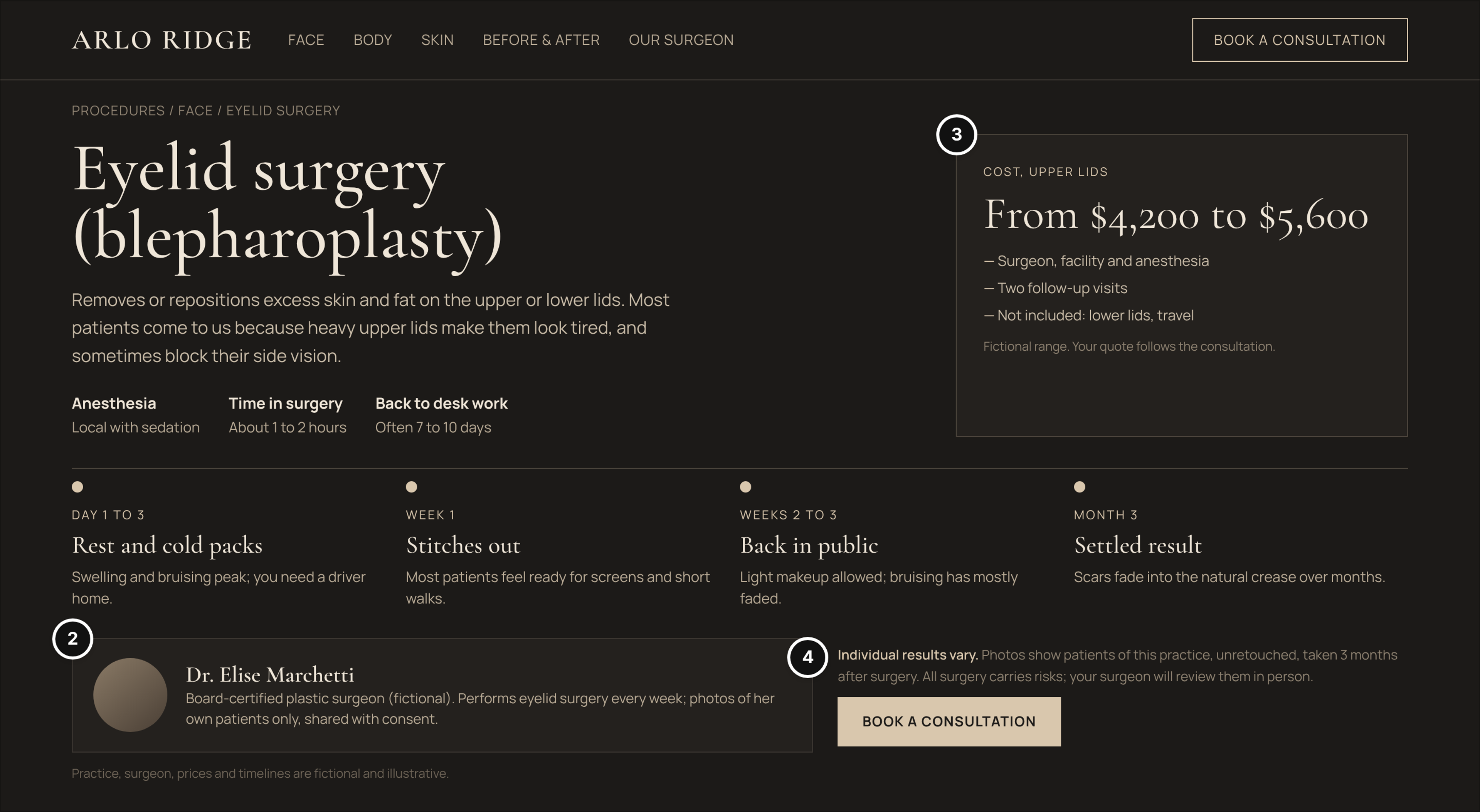
Fictional organization: Arlo Ridge Plastic Surgery, a cosmetic surgery practice, eyelid surgery procedure page.
Who it serves and the question: People researching an elective procedure, often for weeks, before they book a consultation. They want to know whether it fits their problem, what recovery looks like, who operates and roughly what it costs.
What works: The surgeon block names one surgeon, with a (fictional) board certification and a clear statement that before-and-after photos show only her own patients, shared with consent (mark 2). The price card gives a range for one specific procedure, lists what it includes and what it doesn't, and says the final quote follows the consultation (mark 3). The recovery timeline by week, the "individual results vary" note and the line that photos are unretouched and taken at three months set expectations honestly (mark 4). The dark, editorial look fits an elective, considered purchase without hiding the facts.
Watch out: Elective practices are tempted to lead with results galleries. Without the timeline, the risks note and the price range next to them, those photos raise expectations the consultation then has to correct.
Telehealth, Mental Health and Pharmacy
These sites replace a front desk with a screen, so the page has to do the triage a receptionist would do: what this service can help with, what it can't, what it costs and what happens next.
6. Kestrel Virtual Care: Start-a-Visit Page
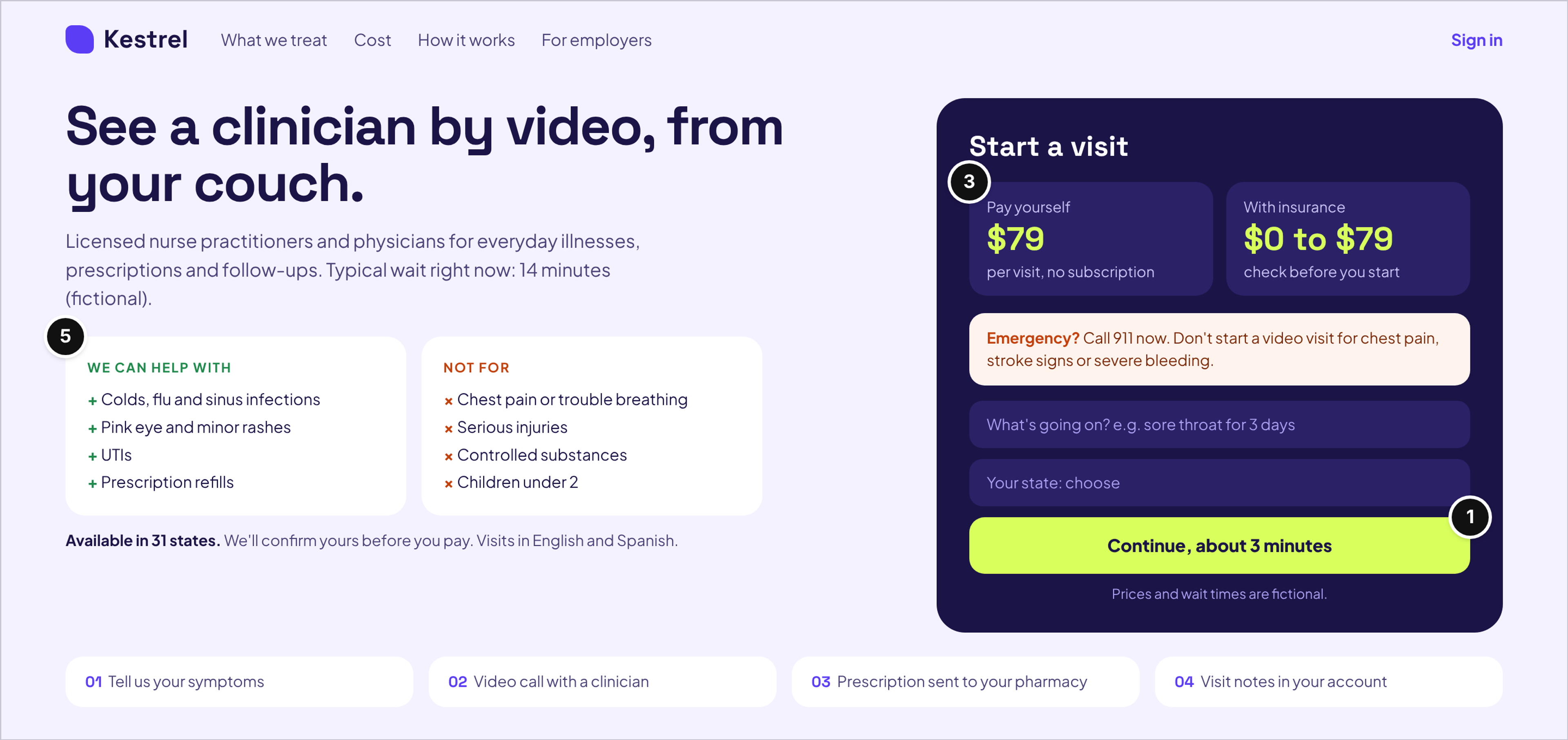
Fictional organization: Kestrel Virtual Care, a telehealth service, start-a-visit page.
Who it serves and the question: Someone feeling unwell right now who wants to know whether a video visit is right for them, what it costs and how long they'll wait.
What works: An emergency notice sits directly above the form, inside the start card, telling visitors to call 911 instead of starting a visit for chest pain, stroke signs or severe bleeding (mark 5). Two plain lists, "We can help with" and "Not for", do the triage before anyone types a symptom. Both prices (self-pay per visit and the insurance range) sit at the top of the card (mark 3), and the button states the time it takes to continue ("about 3 minutes"), with the current wait in the intro copy (mark 1). Four numbered steps under the fold explain what happens after the call.
Watch out: The "Not for" list only protects people if it is visible before payment. Moving it into terms or an FAQ turns a safety feature into fine print.
7. Quietfield Counseling: Therapy Practice Homepage
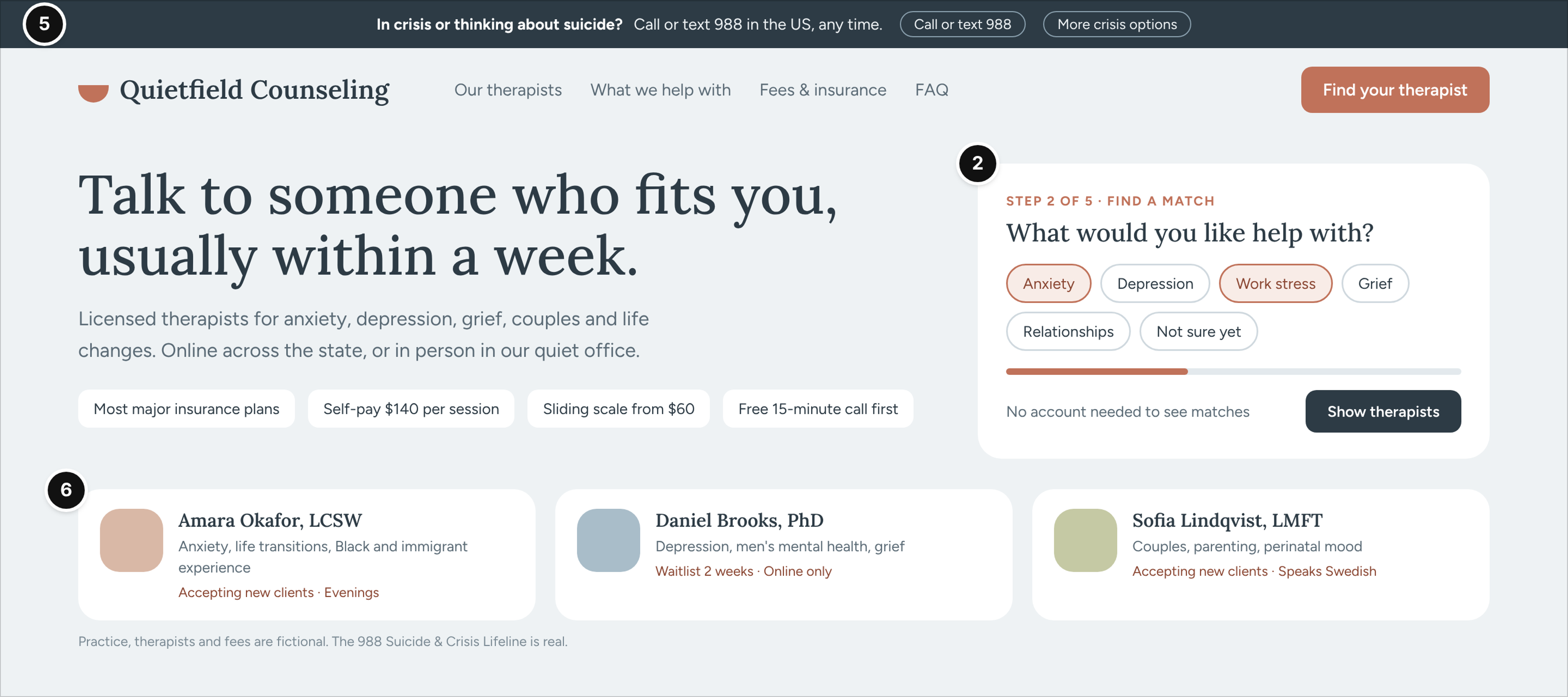
Fictional organization: Quietfield Counseling, a group therapy practice, homepage.
Who it serves and the question: Adults and couples looking for a therapist, often after a long time deciding to look. They need to find someone who fits, at a cost they can manage, without pressure.
What works: A crisis banner stays at the top of every page and points to the 988 Suicide & Crisis Lifeline, which people in the US can call, text or chat (mark 5). The match flow asks one gentle question at a time, says "No account needed to see matches", and leads to therapists shown with credentials, focus areas, availability and languages (mark 2). Fees, the sliding scale and the free first call sit as plain chips in the hero, and the calm palette, serif headings and generous spacing keep the page easy to read on a bad day (mark 6).
Watch out: Urgency tactics ("only 2 spots left") and pop-ups feel hostile in mental health. If availability is limited, say so plainly with the expected wait.
8. Pillwise Pharmacy: Refill and Transfer Page
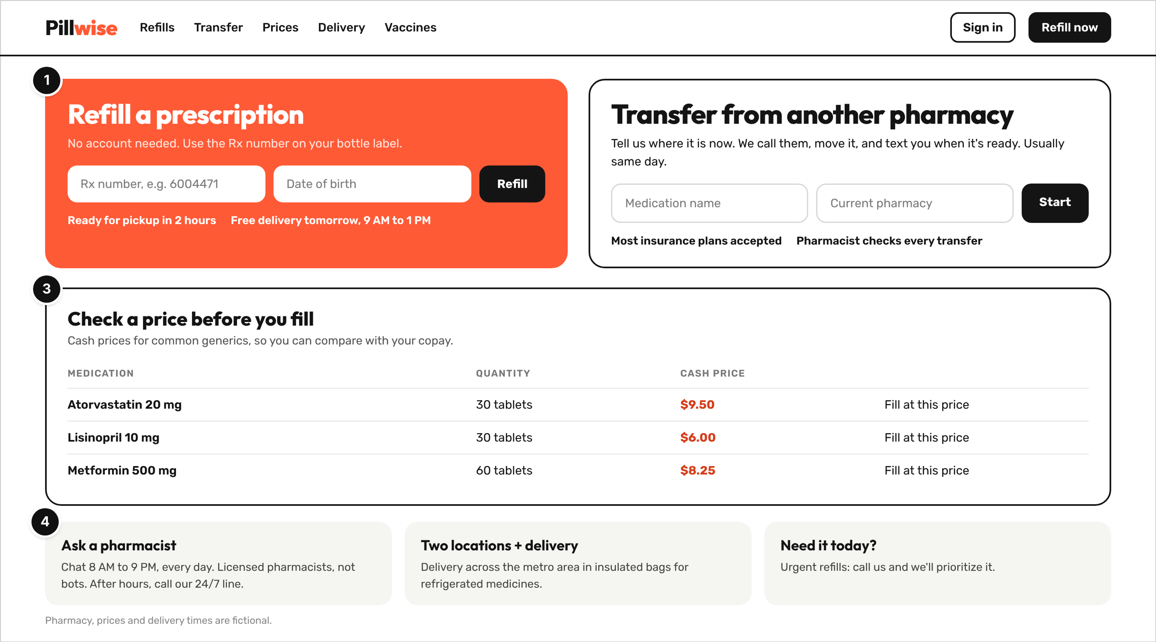
Fictional organization: Pillwise Pharmacy, an independent pharmacy with delivery, refill and transfer page.
Who it serves and the question: Existing customers refilling a prescription, and people thinking about moving their prescriptions from another pharmacy.
What works: Two equal panels split the two jobs, refill by Rx number and transfer from another pharmacy, and the refill panel says "No account needed" (mark 1). A cash price list for common generics lets people compare with their copay before they fill (mark 3). The "Ask a pharmacist" card names who answers (licensed pharmacists), the chat hours and the after-hours line, and the transfer panel states that a pharmacist checks every transfer (mark 4).
Watch out: Cash prices change. Date the list or pull it from the pharmacy system, because a stale price at the counter undoes the trust the page built.
Patterns for Provider Audiences
Healthcare sites also serve people who are not patients: referring clinicians, job candidates and partners. The strongest pattern is separation. Harborline's "For providers: refer a patient" link in example 1 is small on purpose, so it never competes with the patient path, but it leads to a page built for clinicians.
- Referral page: what each specialty accepts, how to send a referral, a direct phone line for clinician questions and the expected time to first appointment.
- Clinician directory data: the same names, credentials, specialties, languages and locations patients see in example 2, kept in one source, so referring offices and patients read the same facts.
- Careers pages: roles grouped by team and location, shift patterns and the interview steps, written for nurses and staff rather than for patients.
What the Eight Examples Have in Common
A good healthcare website combines clinical authority with human warmth: it shows real clinicians and honest facts, uses clear navigation built around patient tasks, and treats accessibility as a default. Across these eight examples, five patterns repeat.
- One main task before anything else. All eight put a booking, search, start or refill action on the first screen, and none asks for an account before showing options.
- Clinicians as the proof. Four of the eight name the people who provide care (examples 2, 3, 5 and 7) instead of claiming "compassionate, expert care".
- Cost and coverage in plain words. Six of the eight show a price, a range or the accepted plans on the page (examples 3 to 8). The two that don't, the health system and the directory, still keep price estimates or billing one click from the main path.
- Safety routing near the action. Three of the eight carry an emergency or crisis notice (examples 1, 6 and 7), and the telehealth page places it directly above the main button.
- Access as a default. Five of the eight surface language options or multilingual clinicians on the page (examples 1, 2, 3, 6 and 7), and all eight keep the main action large and easy to tap.
So what makes a good healthcare website? Clinical authority, so visitors can see who stands behind the care. Human-centered design, so the page answers the questions patients actually have, in their words. And clear navigation that works for everyone, including people using a screen reader, a phone or a second language.
How to Make a Healthcare Website That Works for Your Practice Type
Start from your practice type and the one feature most patients use, then design the rest of the site around it. The pattern changes with the practice:
- Health system: a "find care" search, location pages and a portal sign-in, with emergency routing on every page.
- Multispecialty group: a provider directory with filters for new patients, language and visit type.
- Family or primary care practice: hours, online booking, accepted insurance and the care team on the homepage.
- Dental or cosmetic practice: procedure pages with what's included, a price or range, and a recovery or visit timeline.
- Telehealth: a start-a-visit page with "can help with" and "not for" lists, prices and states served.
- Mental health practice: a gentle match flow, fees and a crisis link that never disappears.
- Pharmacy: refill and transfer flows that work without an account, plus price lookups.
Two habits matter for every practice type. Write medical content in plain language and have a clinician review it, with the review date shown on the page. The AHRQ Health Literacy Universal Precautions Toolkit is built on the idea of structuring health information so that everyone can understand and use it, which is a good brief for a website, too. Then test the main task with real patients, including older adults and people who use a screen reader, before launch.
Compliance, accessibility law and budget belong in the brief from day one; this page doesn't cover them, but our guide to what HIPAA, accessibility rules and budget mean for a healthcare build does.
How to Use These Examples With Your Designer
Examples help most when they turn into specific requests, not a mood board. A few ways to use them:
- Build a reference board by task, not by look. Save one example per patient task (book, find a doctor, start a visit, refill) and note the mark it demonstrates.
- Ask for the inner pages your practice type needs. A health system needs the directory and location pages designed as carefully as the homepage; a cosmetic practice needs the procedure template; a telehealth service needs the start-a-visit page.
- Judge concepts on the main task, the cost answer and the safety routing before you react to colors and photography. Ask where each mark lives on the page.
- Never copy another site. Use the pattern, write your own content, and photograph your own people and rooms.
If you run a digital health company that sells software to clinics, the buyer journey looks more like a product site, so also look at how SaaS product sites lay out demos and trials. Early-stage health startups can compare their stage with startup sites annotated by funding stage.
Where to Find More Real Examples
Inspiration galleries and "best healthcare websites" roundups are useful for range: dozens of real hospital, clinic, therapy and dental homepages, usually with a one-line note on style. What they rarely show is the inner pages where patients act, the cost answer, the safety routing, or a note on why a pattern works.
When you collect real examples, capture the full page on a phone as well as the desktop view, note which of the six marks it earns, and check whether the page still works with the keyboard alone. For accessibility, the W3C's overview of the WCAG 2 standard (versions 2.0, 2.1 and 2.2) is the reference behind most audits, so note whether an example's text contrast, focus states and tap targets would hold up against it. For readable medical writing, MedlinePlus from the National Library of Medicine is a public health information resource for patients and families worth studying for tone and structure.
FAQ
What are good examples of healthcare websites?
Good examples match the practice type. A strong health system site leads with a "find care" search and routes emergencies; a strong clinic site shows hours, booking, insurance and the care team; a strong telehealth site says what it treats and what it doesn't before you pay. Judge any example by whether the main task, the clinicians, the cost answer and the safety routing are visible without digging.
What should a medical practice website include?
At minimum: hours and location, online booking or a clear booking phone line, accepted insurance plans, the clinicians with credentials and languages, a new-patient section, a patient portal link if you have one, and an emergency notice. Add procedure or service pages with plain-language descriptions, reviewed by a clinician, with a date.
Should a small practice show prices on its website?
Showing at least a self-pay price for common visits, or a range for elective procedures with what it includes, answers the question most new patients have. Six of the eight examples here do it. Hospitals in the US also have their own federal price transparency requirements from CMS, which ask for a consumer-friendly display of shoppable services.
How is a telehealth website different from a clinic website?
A clinic website gets people to a building; a telehealth website is the front desk. It has to triage on the page (what the service can and can't help with), show prices and where it's available before the visit starts, and keep an emergency notice next to the start button.
Conclusion
The healthcare website examples above look nothing alike, from a navy health system homepage to a dark cosmetic procedure page and a bright pharmacy refill page, but they make the same decisions. Each one puts the patient's main task first, shows who provides the care, answers cost and coverage in plain words, routes emergencies away from the booking path and stays readable for everyone. Use the six marks to judge your current site and any concept your designer shows you, and ask for the inner pages your practice type depends on, not just a new homepage.