The startup website examples worth studying prove one thing their funding stage needs: be understood, be believed, be chosen, then own the category. The ten fictional examples below are annotated against that idea, stage by stage, so you can see what each page has to prove and exactly where it does it.
If you already know you want someone to build your site, start with web design teams for founders who just closed a round. If you're still working out what the site should do, read on: this page stays on the examples.
Two numbers from my review of these ten pages shape the article. Seven of the ten are page types that popular startup galleries rarely show, from a waitlist to a press and investor page. And nine of the ten are not software companies, because a startup site has to explain a cargo bike or a satellite as clearly as an app.
How to Read These Examples
Every example below carries numbered marks from one six-mark rubric, and each funding stage adds one job to the site while keeping the earlier ones. Read the stage first, then check which marks the page earns.
I've led design at software startups, and as Head of Design at Top Website Agencies I write the portfolio assessments behind our rankings. This rubric is how I read a shipped page, written down. It's the same lens I apply to live client sites in the portfolios on our homepage, where we compare web design studios side by side.
The stage key:
- Pre-seed and pre-launch: be understood. Typical site: a waitlist page or a single founder page.
- Seed: be believed. Typical site: one page or a short site with the product shown working.
- Series A: be chosen, and hire. Typical site: product, proof and careers pages, plus launches in public.
- Series B and later: own the category. Typical site: a rebrand homepage, a newsroom, investor and press pages.
The six marks:
- 1 One-line claim: what it is, who it's for and why now, readable in about five seconds.
- 2 The stage's next step: one action that fits the stage (join the waitlist, reserve, download, sign up, book), with the friction removed.
- 3 Founders and team: who is building it and why they can, shown through backgrounds, research, backers or pilots rather than claimed.
- 4 Proof for the stage: early signal before launch, customers and numbers after launch, scale and third-party proof later.
- 5 Hiring and investor readiness: careers, a press kit, a fact sheet, investor and media contacts.
- 6 Category ownership: a point of view, its own vocabulary and a brand system that holds across pages.
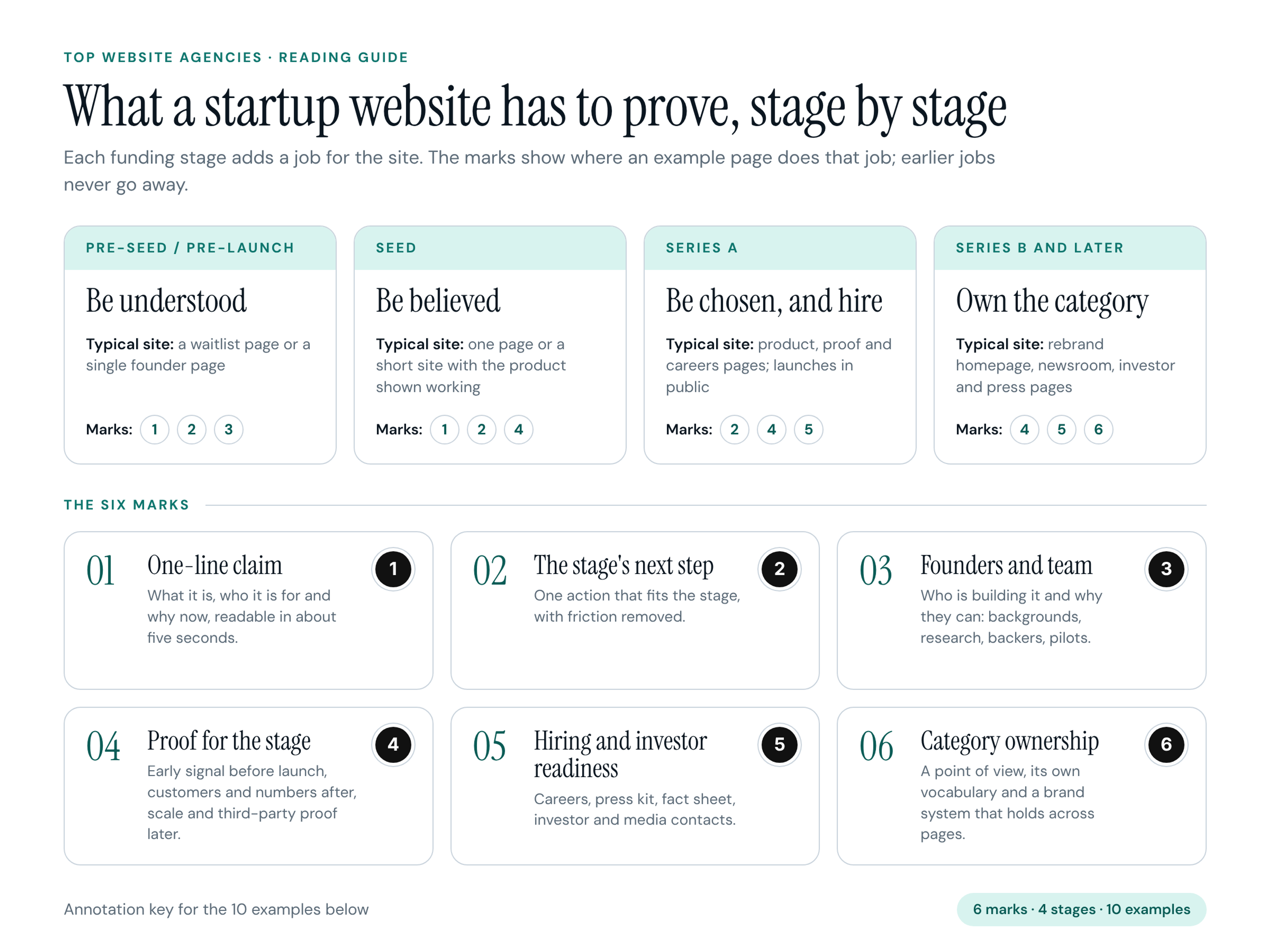
The marks on each stage card are the ones that stage leans on most, not a checklist. Each page carries three marks, only where it really does that job.
How the examples were made: every startup, person, backer, outlet, bank and number below is fictional. We built each page from scratch to show one pattern, gave each its own palette and type, and labeled claim-like numbers as fictional on the image. None of it is a benchmark.
The Ten Examples at a Glance
The ten examples cover four funding stages and ten different page types, and only one of them is a software product.
- Example 1: Gridmoth, home energy monitor (climate hardware), pre-launch, waitlist page, marks 1, 2, 3.
- Example 2: Ottervane, kids' reading tutor (edtech), pre-seed, founder letter, marks 1, 3, 6.
- Example 3: Cinderglass, wildfire detection satellites (deep tech), pre-seed, how-it-works explainer, marks 1, 3, 4.
- Example 4: Jarrowly, shared savings app (consumer fintech), seed, one-page site, marks 1, 2, 4.
- Example 5: Cobblerun, family cargo bike (consumer hardware), seed, pre-order page, marks 2, 3, 4.
- Example 6: Reelquarry, podcast clip maker (creator software), seed, launch week page, marks 2, 4, 5.
- Example 7: Ovenlot, commercial kitchen rentals (marketplace), Series A, two-sided homepage, marks 1, 2, 4.
- Example 8: Furrowbit, weeding robot (ag robotics), Series A, careers page, marks 3, 5, 6.
- Example 9: Lumbrel, at-home blood testing (consumer health), Series B, rebrand homepage, marks 1, 4, 6.
- Example 10: Basaltry, carbon removal (climate), Series B, press and investor page, marks 3, 4, 5.
Proof (mark 4) appears on seven of the ten pages, because every stage needs a reason to believe, only a different one. Hiring and investor readiness (mark 5) appears three times and never before seed: a pre-launch press kit answers a question nobody has asked yet.
Pre-Seed and Pre-Launch Examples
Before launch, a startup site has one job: make a stranger understand what you're building and why you're the people to build it, in under a minute. The page types that carry it are a waitlist page, a founder letter, or an explainer when the technology itself is the open question.
1. Gridmoth: Home Energy Monitor Waitlist Page
Fictional startup: Gridmoth, a clip-on home energy monitor (climate consumer hardware). Stage: pre-launch. Page type: waitlist page.
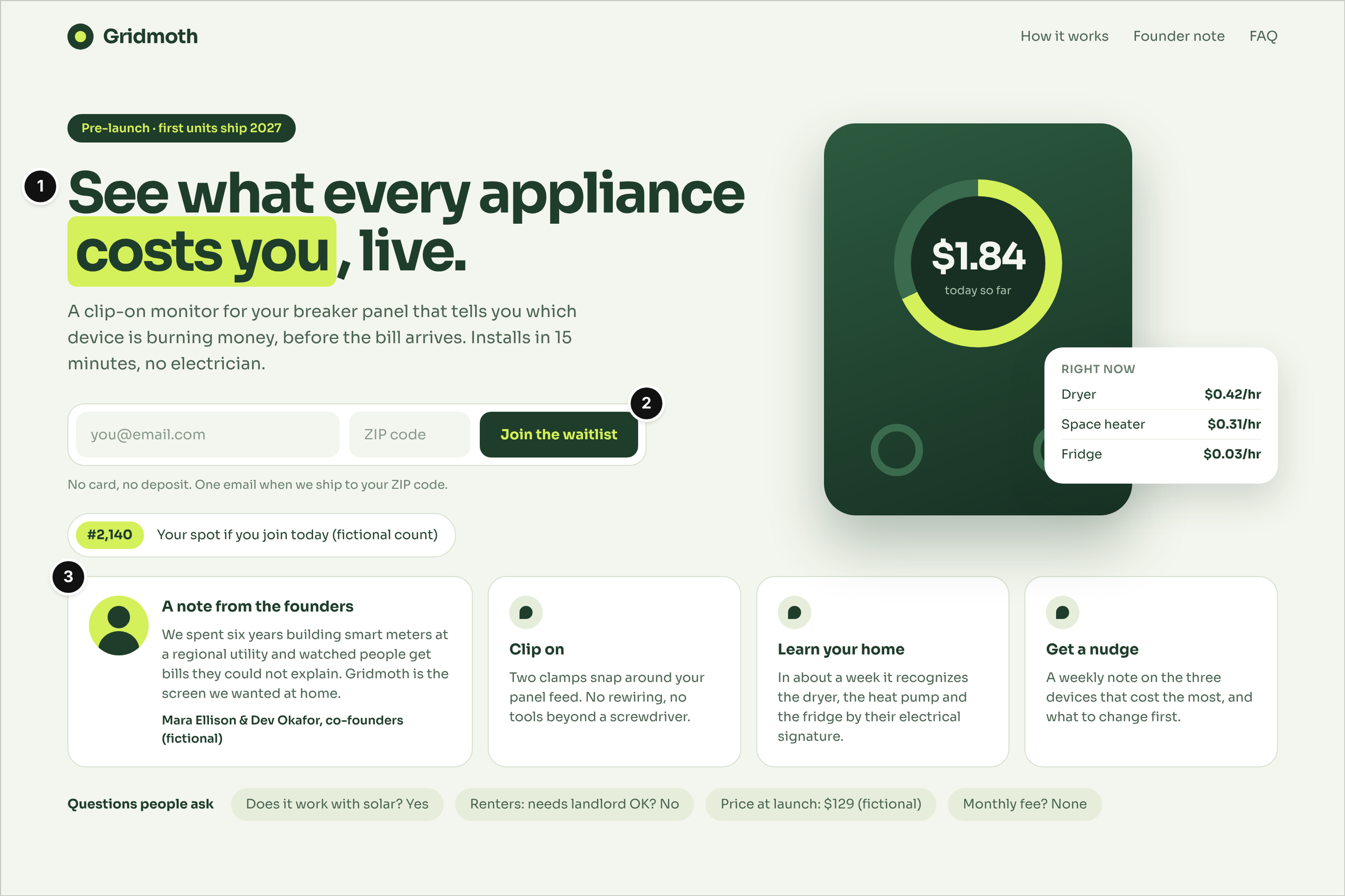
Who it serves and the question: A homeowner after a surprising electric bill, asking: what is this, will it work in my house, and what does joining cost me?
What works: The headline says what the product does, "See what every appliance costs you, live," and the subhead adds the install effort: 15 minutes, no electrician (mark 1). The waitlist asks for an email and a ZIP code only, and the line under it removes the risk: no card, no deposit, one email when it ships to your ZIP (mark 2). The founder note below gives the reason to trust a device that doesn't exist yet: six years building smart meters at a utility (mark 3).
Watch out: The waitlist position counter (#2,140, fictional) works only while it's true. A counter that never moves reads as fake on the second visit.
2. Ottervane: Reading Tutor Founder Letter
Fictional startup: Ottervane, a reading tutor app that listens while kids read aloud (edtech). Stage: pre-seed. Page type: founder letter.
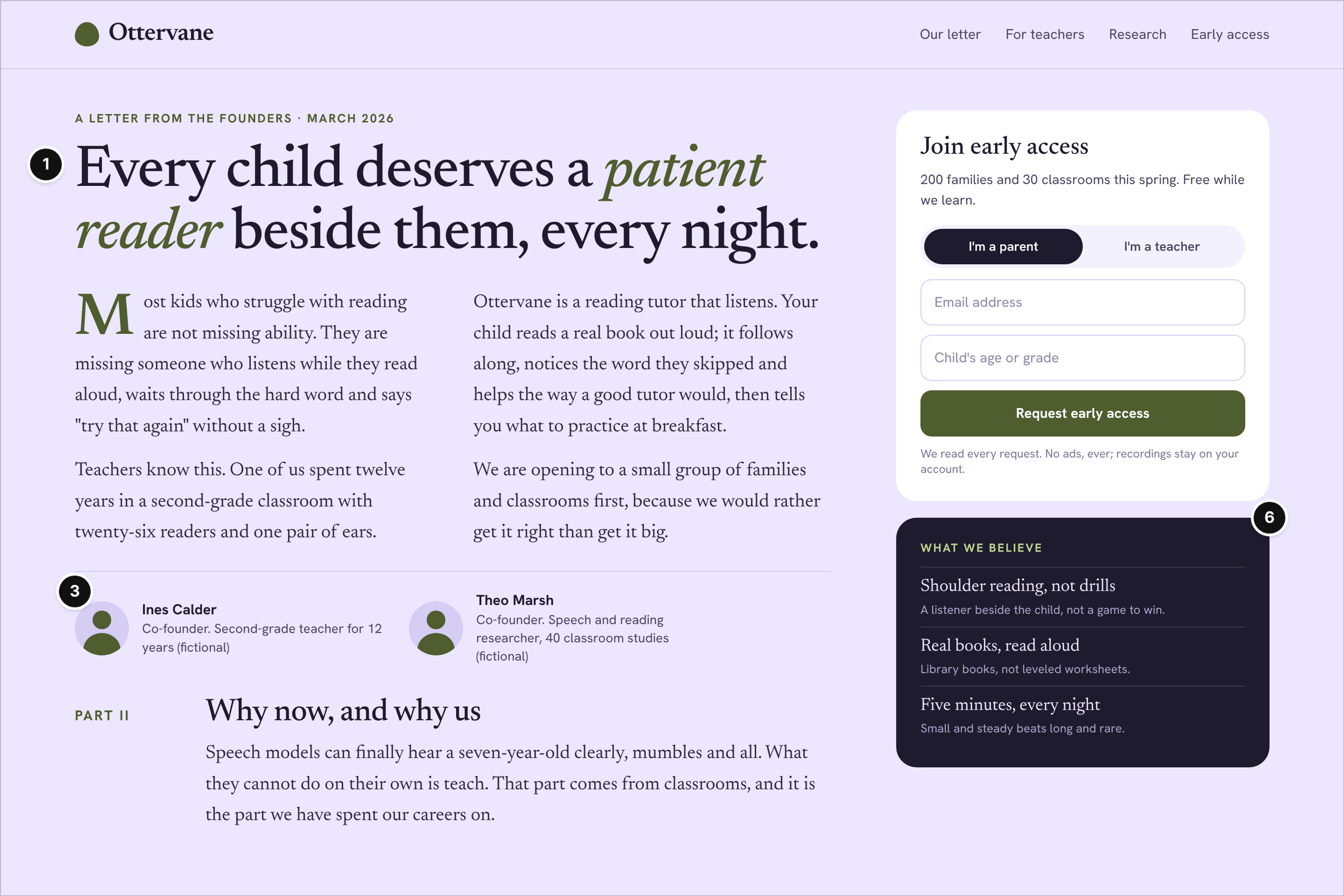
Who it serves and the question: A parent of a struggling reader or a second-grade teacher, asking: do these people understand how children learn to read?
What works: The headline is a belief rather than a feature, "Every child deserves a patient reader beside them, every night," and the letter defines the product early in its second column: a reading tutor that listens (mark 1). The two founders sit under the letter with the backgrounds this audience cares about, a second-grade teacher of 12 years and a speech and reading researcher (mark 3). The dark "What we believe" panel turns the letter into three short principles, such as "real books, read aloud," the start of a vocabulary the company can own (mark 6).
Watch out: A letter is slow to scan, and a cold visitor has to reach the second column to learn what the product is. On a phone, keep that sentence and the early-access form near the top.
3. Cinderglass: Wildfire Detection Explainer
Fictional startup: Cinderglass, wildfire detection from small satellites (deep tech, lab spinout). Stage: pre-seed. Page type: how-it-works explainer.
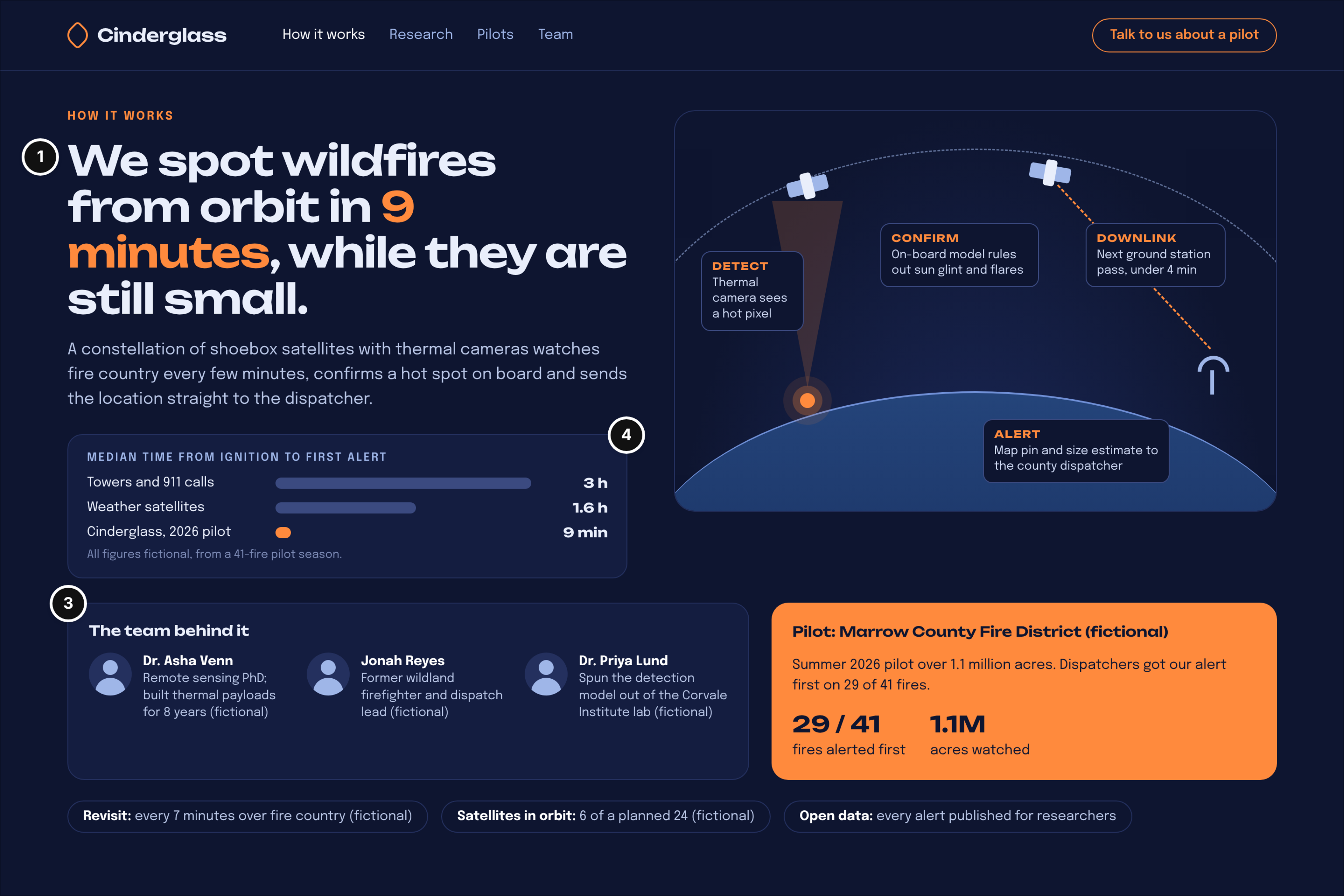
Who it serves and the question: A county fire chief deciding whether to take a pilot call, asking: does this work, and is it faster than what we have?
What works: The headline puts the whole claim and its number in one line: wildfires spotted from orbit in 9 minutes, while they're still small (mark 1). The bar chart under it compares median time to first alert with the two methods a dispatcher already relies on, towers and 911 calls at 3 hours and weather satellites at 1.6 hours, all labeled as fictional pilot figures, and the county pilot card backs it with 29 of 41 fires alerted first (mark 4). The team card answers "can these people build it" with a remote sensing PhD, a former wildland firefighter and the researcher who spun the model out of a lab (mark 3).
Watch out: Explainers drift into the science and lose the buyer. This diagram works because its four plain steps end at the dispatcher; if yours needs a glossary, simplify it.
Seed-Stage Examples
At seed, a startup site has to be believed: the product exists, it works, and real people want it. The page types that carry that are a one-page site with the product shown working, a pre-order page, or a launch page that proves the team ships.
4. Jarrowly: Shared Savings One-Page Site
Fictional startup: Jarrowly, a shared savings app for couples and roommates (consumer fintech). Stage: seed. Page type: one-page site.
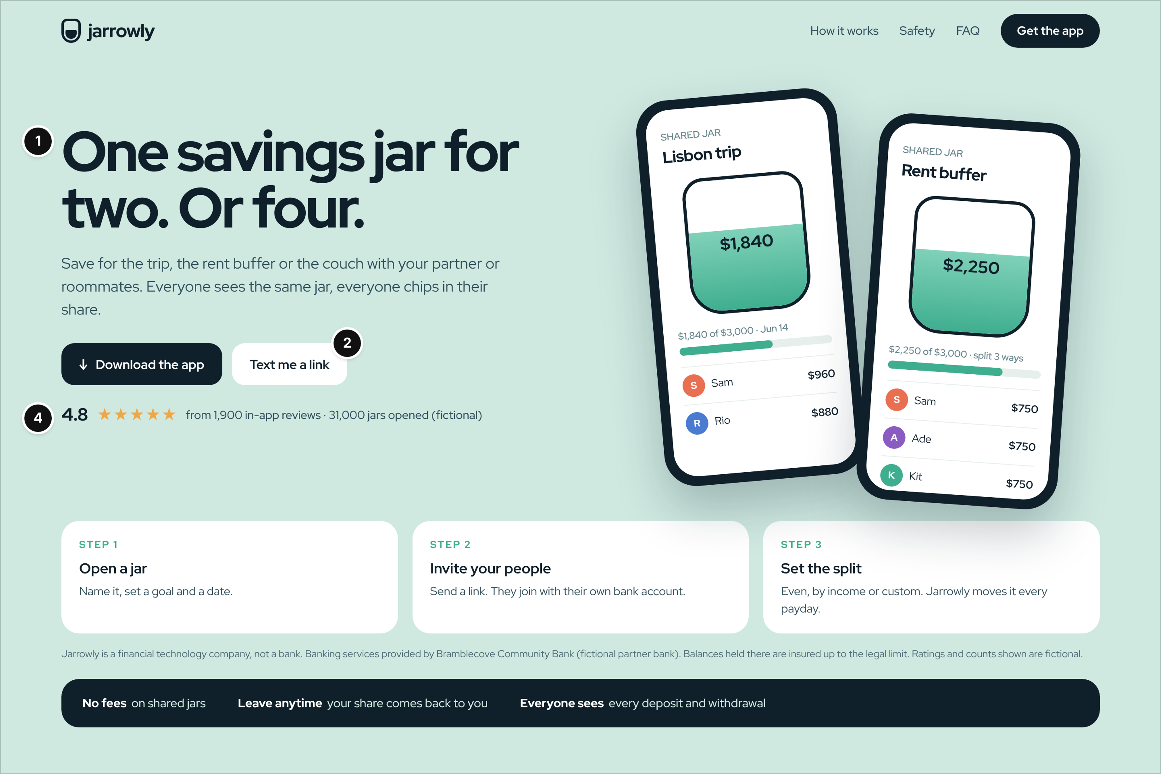
Who it serves and the question: Partners or roommates saving for the same thing, asking: how does a shared jar work, and who holds the money?
What works: The headline is six words, "One savings jar for two. Or four." The phones beside it show the idea working with plausible numbers: a Lisbon trip jar at $1,840 of $3,000 and a rent buffer split three ways (mark 1). The two buttons are one action in two forms, download now or text a link to your phone, which suits a visitor reading on a laptop (mark 2). The rating sits directly under the buttons and names its source and count, 1,900 in-app reviews and 31,000 jars opened, labeled fictional here (mark 4).
Watch out: Money products live or die on the small print. The disclosure under the steps (not a bank; a named partner bank holds the balances) is what a cautious visitor looks for, so never bury it in the footer.
5. Cobblerun: Cargo Bike Pre-Order Page
Fictional startup: Cobblerun, an electric cargo bike for families (consumer hardware). Stage: seed. Page type: pre-order page.
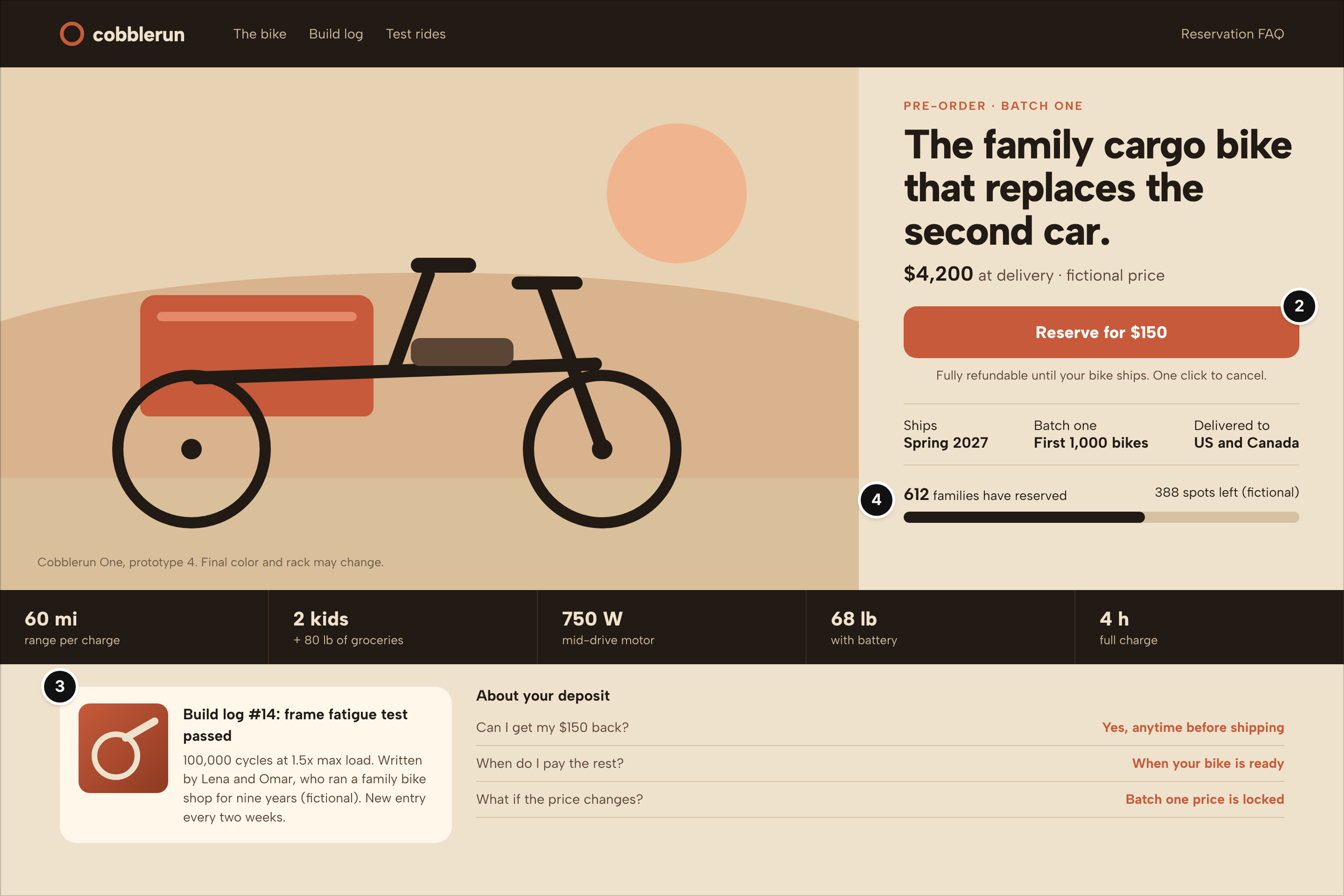
Who it serves and the question: A parent weighing whether a bike could replace the second car, asking: what do I risk with a deposit, and when does it arrive?
What works: There is one button, "Reserve for $150," with the refund terms directly under it: fully refundable until the bike ships, one click to cancel (mark 2). The reservation bar shows 612 families reserved and 388 spots left in batch one, labeled fictional, which is the honest seed-stage version of social proof (mark 4). The build log card gives the founders a voice and a test result, a frame fatigue test passed at 100,000 cycles, written by two people who ran a family bike shop for nine years (mark 3).
Watch out: Pre-order pages make promises hardware startups struggle to keep. State the ship window and batch size and label the prototype ("final color and rack may change"), as this page does, so a delay doesn't feel like a broken promise.
6. Reelquarry: Podcast Clip Maker Launch Week Page
Fictional startup: Reelquarry, an AI clip maker for podcasters (creator tools, the one software example). Stage: seed. Page type: launch week page.
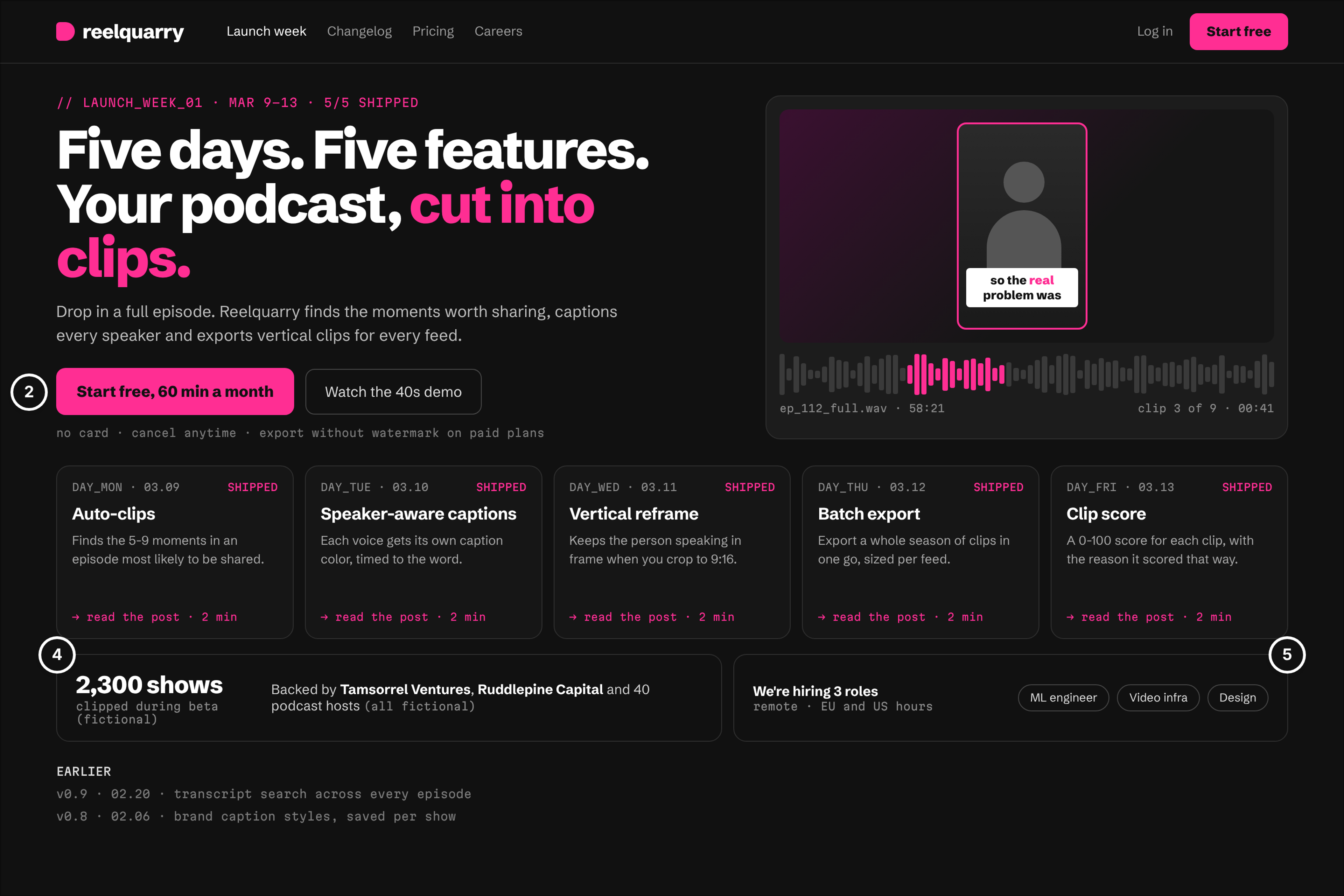
Who it serves and the question: A podcaster who cuts clips by hand, and an investor checking whether the team ships. Both ask: is this real, and improving fast?
What works: The five day cards are the format's proof: one feature a day, each marked shipped, beside a demo frame showing a clip found in an episode's waveform. The sign-up asks for nothing scary, "Start free, 60 min a month," with no card and cancel anytime underneath, and the 40-second demo is the only alternative (mark 2). Proof and readiness share one row: 2,300 shows clipped during beta and a backers line on the left (mark 4), three open roles with remote hours on the right (mark 5).
Watch out: A launch week page is a moment, not a homepage. When the week ends, fold the day cards into the changelog, or the site looks frozen in March.
Series A Examples
At Series A, the site has to win against the alternatives and help the company hire. The pages that carry it are a homepage that serves every visitor type, proof pages and a careers page that competes for engineers.
7. Ovenlot: Kitchen Marketplace Homepage
Fictional startup: Ovenlot, a marketplace that rents licensed commercial kitchens by the hour (two-sided marketplace). Stage: Series A. Page type: two-sided homepage.
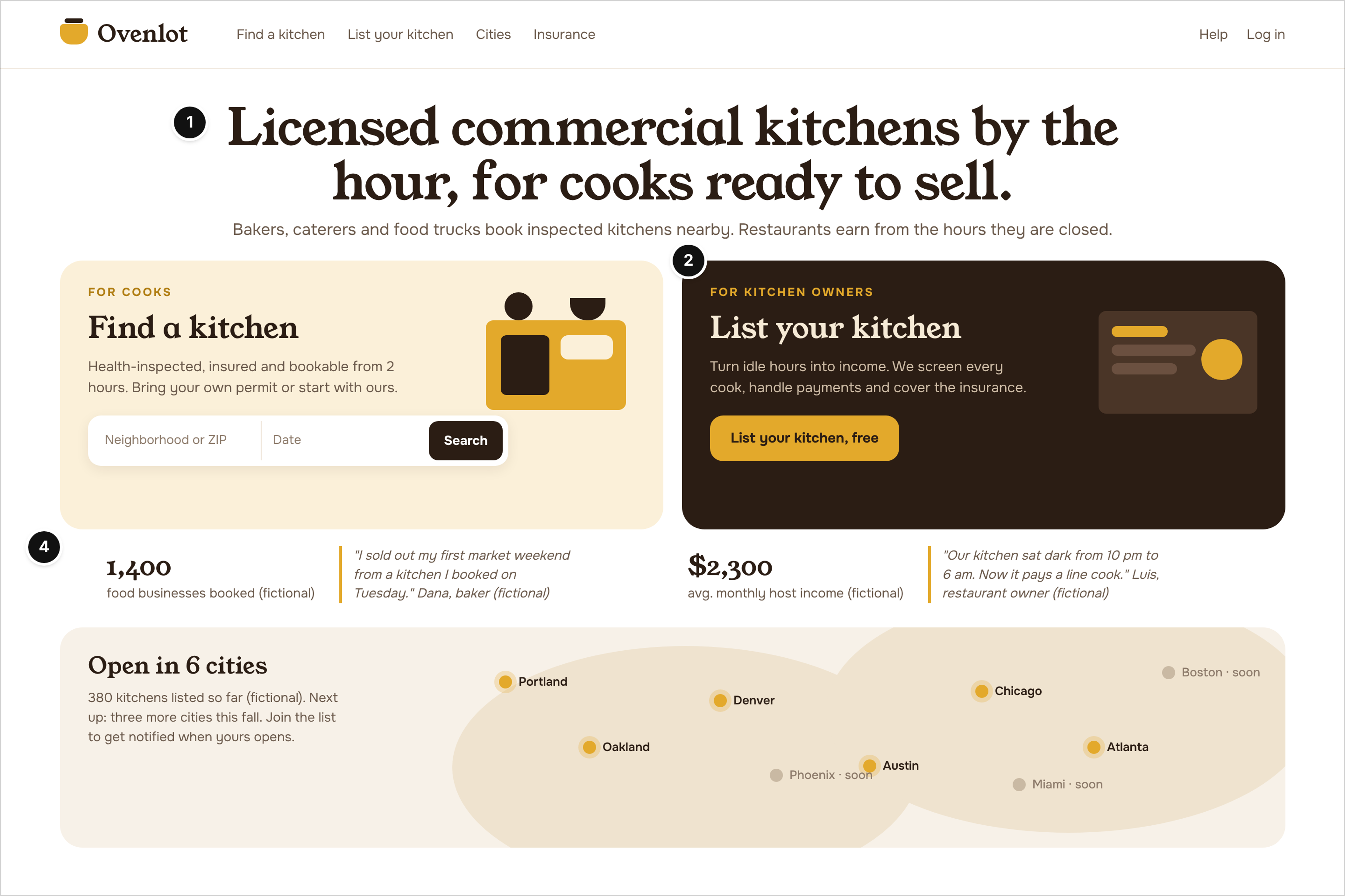
Who it serves and the question: A baker who needs a licensed kitchen and a restaurant owner with idle hours. Each asks: is this for me, and what if something goes wrong?
What works: The headline names the product, the unit and the user, "Licensed commercial kitchens by the hour, for cooks ready to sell," and the subhead names the other side (mark 1). Below it the page splits into two equal paths in opposite colors, a kitchen search for cooks and a "List your kitchen, free" button for owners, so neither side has to read the other's pitch (mark 2). Each path gets its own proof underneath: bookings and a baker's quote for cooks, average host income and a restaurant owner's quote for owners (mark 4).
Watch out: Split heroes fail when one side is the afterthought. Give both paths equal weight, and keep the map honest by marking unlaunched cities "soon," as this one does.
8. Furrowbit: Farm Robotics Careers Page
Fictional startup: Furrowbit, an autonomous weeding robot for vegetable farms (ag robotics). Stage: Series A. Page type: careers page.
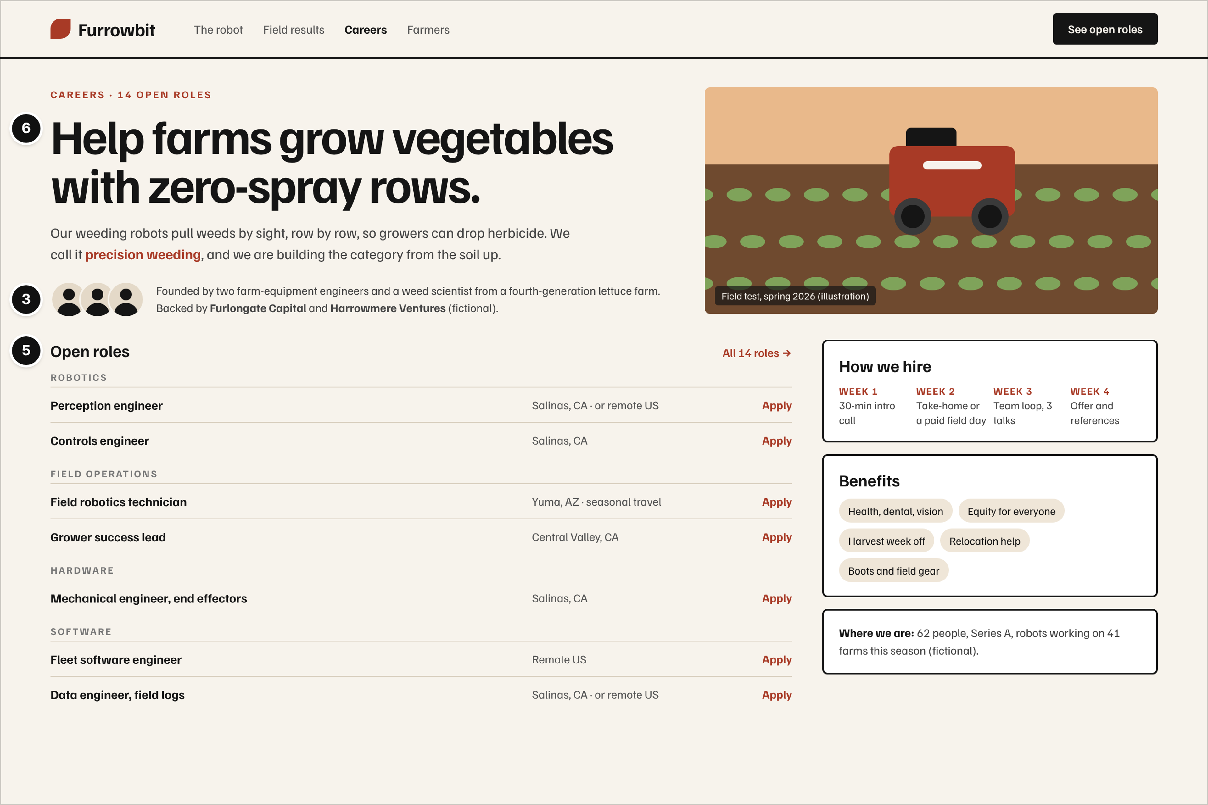
Who it serves and the question: A robotics engineer who could work almost anywhere, asking: is this mission worth a riskier job, and what does hiring look like?
What works: The headline is a mission, not a job ad, "Help farms grow vegetables with zero-spray rows," and the subhead names the category the company is building, precision weeding (mark 6). One line under it shows who founded the company (two farm-equipment engineers and a weed scientist from a fourth-generation lettuce farm) and who backs it (mark 3). The roles are grouped by team with a location on every row, and the side column answers the next questions in order: a four-week interview plan that includes a paid field day, benefits, and where the company stands today (mark 5).
Watch out: Careers pages go stale fastest. A header that says 14 open roles when half are filled costs trust with exactly the people you want, so review the list weekly.
Series B and Later Examples
After a Series B, the site has to own a category: a point of view, its own words and a brand that holds across every page. The pages that carry it are a rebrand homepage, a newsroom and a press and investor page.
9. Lumbrel: Home Blood Testing Rebrand Homepage
Fictional startup: Lumbrel, at-home blood testing with clinician review (consumer health). Stage: Series B. Page type: rebrand homepage.
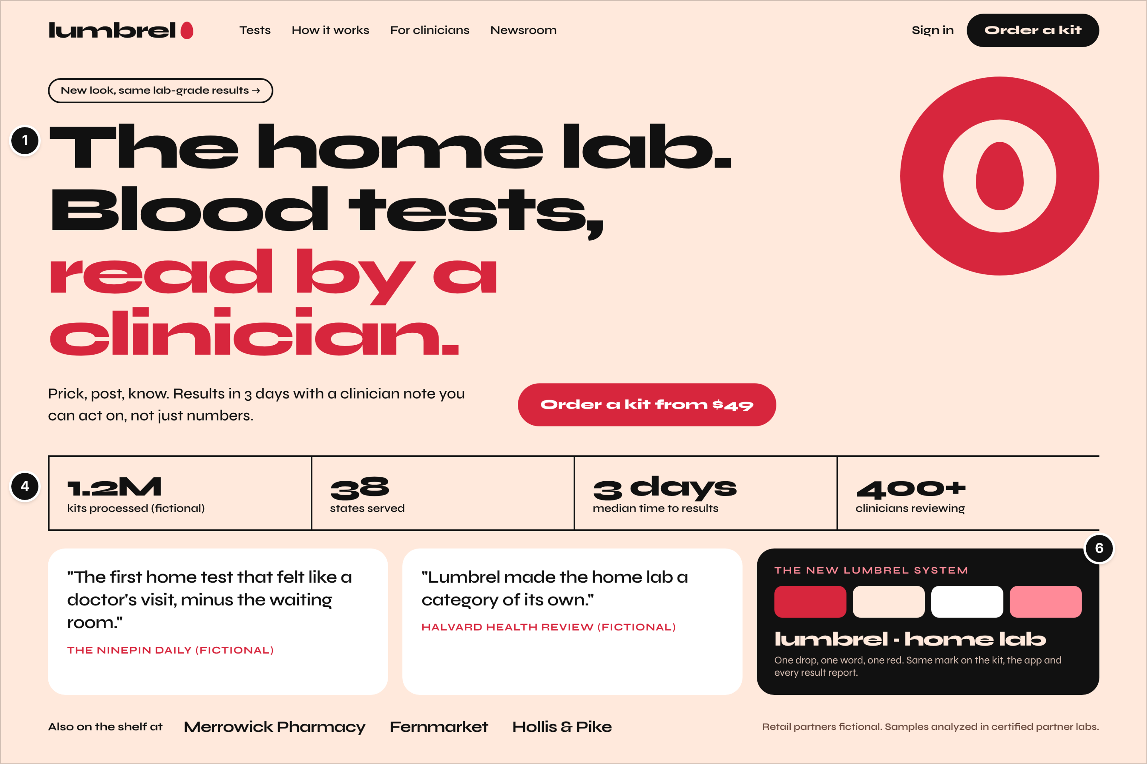
Who it serves and the question: A buyer comparing home tests, or a journalist covering the new round, asking: is this the company that defines home testing, and can I trust it?
What works: The headline claims a category in three words, "The home lab," then says what makes it different: blood tests read by a clinician (mark 1). A ruled stat strip turns scale into proof (1.2 million kits processed, 38 states, three days to results), with press quotes and retail partners beneath, all fictional (mark 4). The brand panel explains the new system in one sentence, "one drop, one word, one red," and promises the same mark on the kit, the app and every result report (mark 6).
Watch out: A rebrand can confuse returning customers. The "New look, same lab-grade results" pill above the headline handles it in five words; skip it and support gets the question.
10. Basaltry: Carbon Removal Press and Investor Page
Fictional startup: Basaltry, carbon removal by enhanced rock weathering (climate). Stage: Series B. Page type: press and investor page.
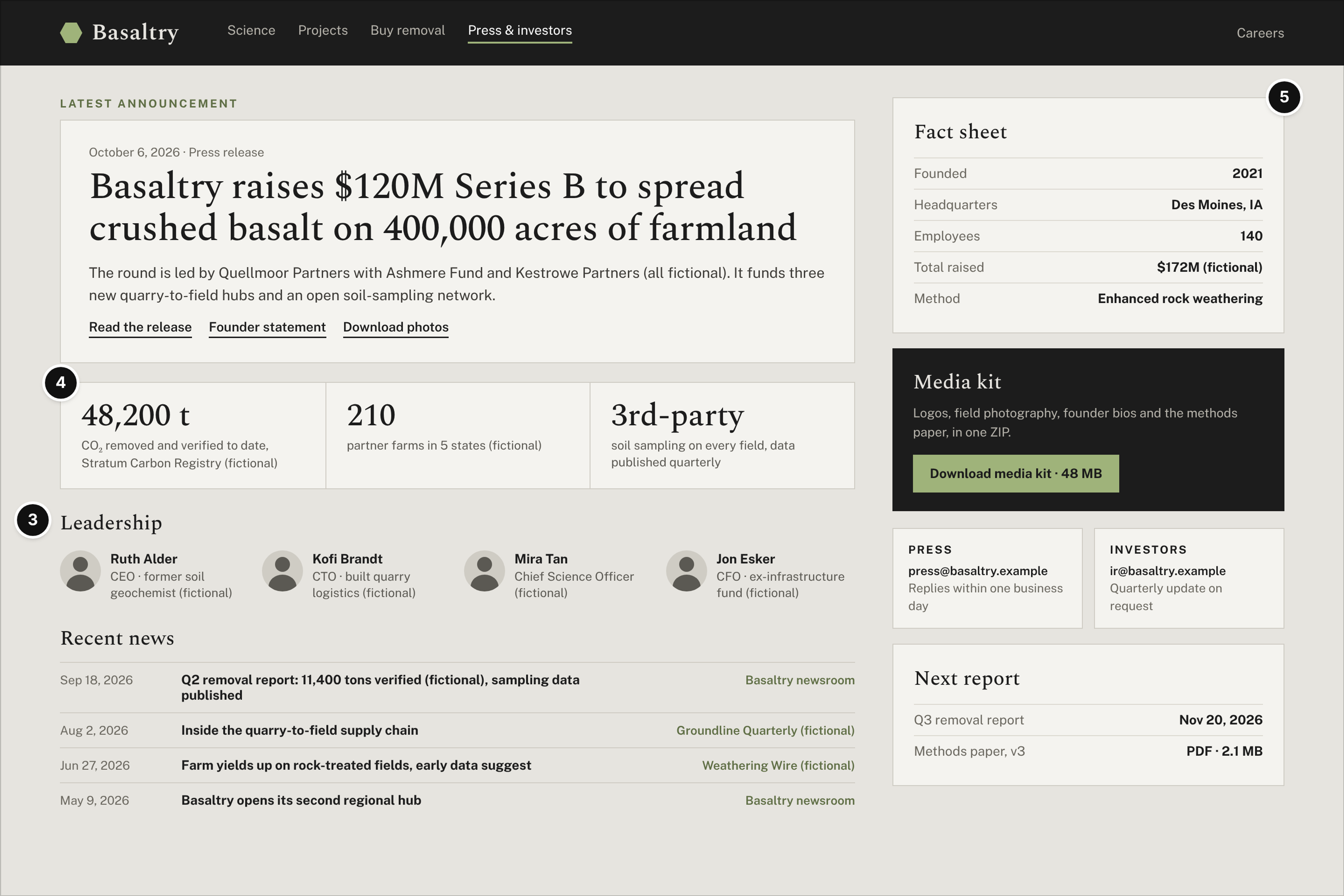
Who it serves and the question: A reporter on deadline and an investor doing diligence, asking: what's the news, which facts are verified, and who do I contact?
What works: The latest announcement leads with the round, the lead investor and what the money funds. The verified figure, 48,200 tons removed, names its fictional registry, and the note beside it says how the claim is checked: third-party soil sampling on every field, published quarterly (mark 4). The leadership row gives each executive's relevant background (mark 3), and the right column hands a reporter everything in one place: a fact sheet, a 48 MB media kit, and separate press and investor contacts with response times (mark 5).
Watch out: Press pages rot quietly, and a stale fact sheet gets quoted in print. Date the next report, as this page does, and update the facts with every announcement.
What the Ten Examples Have in Common
Across all four stages, the ten examples share five patterns: one claim before anything else, one next step that fits the stage, proof that grows with the company, founders shown early, and a brand that can scale.
- One claim before anything else. Six of the ten lead with a claim a visitor could repeat after five seconds. The other four are pages people reach with context already: a pre-order, a launch week, a careers page and a press page.
- One next step per stage. Join, reserve, download, start free, list, apply, order. Each page asks for one action that fits the stage and puts the friction remover (no card, refundable, free to list) right under it.
- Proof that grows with the company. A waitlist position and a pilot before launch; reviews and reservations at seed; both sides' numbers at Series A; scale, press and verified tons later. Proof that runs ahead of the stage reads as borrowed.
- Founders shown early. All three pre-seed pages show real backgrounds, and the team returns on the careers and press pages, because candidates and reporters ask what early customers ask.
- A brand that scales. Ottervane's three principles, Furrowbit's "precision weeding" and Lumbrel's one-red system are the same move at different sizes: a point of view, then words, then a visual system.
So what makes a good startup website? In plain words: instant clarity, the product shown working and a site sized to the stage. Instant clarity means a visitor can say what you do after five seconds. Showing the product working means a demo, the live product or real product shots, like the shared jar or the clip found in a waveform, instead of abstract art. Sized to the stage means one excellent waitlist page beats a dozen thin ones.
What to Put on Your First Startup Website
Your first startup website needs only the pages your stage can fill with something true: at pre-launch that's one page with the claim, the next step, the founders and a contact.
- Pre-launch: one page with the one-line claim, a single next step (waitlist or early access), the founders and a contact.
- Seed: add the product shown working, proof you actually have, and a simple about page.
- Series A: add careers, launch notes or a changelog, and press basics (a short fact sheet and a contact).
- Series B and later: add a newsroom and investor and press pages.
Leave out logo strips of customers you don't have, stock photos, pages with nothing to say yet and metrics you can't keep current. Each one makes a young company look less credible. Deciding who should build it at your stage is a separate question; the page list stays the same whoever builds it.
How to Use These Examples With Your Designer
Use the examples as a brief, not a mood board: pick the page types your stage needs, then judge every reference by its proof and its next step.
- Build a reference board with notes. For each saved page, write which marks it earns. "Put our pilot proof next to the claim, like this" is easier to act on than "make it feel like this."
- Ask for the pages beyond the homepage. For a seed hardware startup, the pre-order page matters as much as the homepage; at Series A, so does the careers page.
- Judge proof and the next step, not the visuals. Colors are easy to change. A wrong next step needs a rethink, not a reskin.
- Never copy. Take the decision (one button with the refund line under it), not the layout or the words.
If you're building a software product, pair this with ten annotated SaaS pages, from plans to signup. If you sell to other businesses, the B2B site examples built for long sales cycles cover the pages buying committees read.
Where to Find More Real Examples
Inspiration galleries and annotated roundups are the easiest place to see live startup sites, but almost everything they collect is a homepage.
Galleries show hundreds of sites with little comment; roundups pick six to forty and add a note on each. Both are good for visual range. What they miss is the rest of the site: waitlists, pre-orders, launch pages, careers, and press and investor pages rarely appear, and none say what each stage has to prove. When you study a real startup's site, click past the hero into those pages.
FAQ
What are good examples of startup websites?
The ones that prove what their stage needs. At pre-launch, look for a one-line claim and an easy waitlist; at seed, the product shown working with traceable proof; at Series A, a path for each visitor and a real careers page; later, a category claim, scale proof and press pages.
How many pages does a startup website need?
Fewer than most founders expect. A pre-launch startup can run on one page, and a seed startup usually needs three to five. Add pages when there's something true to put on them, like open roles or a funding announcement.
Should a pre-launch startup build a full site or just a waitlist page?
A waitlist page is usually enough. It forces the one-line claim, one next step and the founders, which is all a pre-launch visitor needs. Add a founder letter or an explainer only if the product needs a story or the technology needs explaining.
When should a startup redesign its website?
When the company changes, not on a schedule: a new round that changes what the site must prove, a pivot that makes the claim wrong, or a new audience the current pages don't serve.
Conclusion
A startup website doesn't need to look like a big company's site; it needs to prove the one thing its stage needs. Pick your stage, mark the pages you already have against the six marks, and fix the weakest mark first. It's usually a missing claim, a second next step competing with the first, or proof the company hasn't earned yet.