Good homepage design examples share a hero that says what you offer and for whom, proof beside the claim, and one clear next step. That is the standard I use here, and it is written for a buyer: you will judge pages someone else built, so you need a fast way to check them. On November 21, 2026, I checked the live Google results for "homepage design examples" (one signed-out capture from San Francisco). The first eight organic results split into four galleries and four listicles, with site builders and platforms holding most of the spots, and none of them scores proof or the step after the click. This article does both.
If you are hiring a studio for a new homepage or a redesign, our five-factor ranking of web design studios ranks 54 of them on one vetting score. If you sell to other businesses, the B2B web design studios we have scored are a natural place to start your shortlist. Either way, the checks below work on any studio's past homepages.
How to Read These Homepage Design Examples
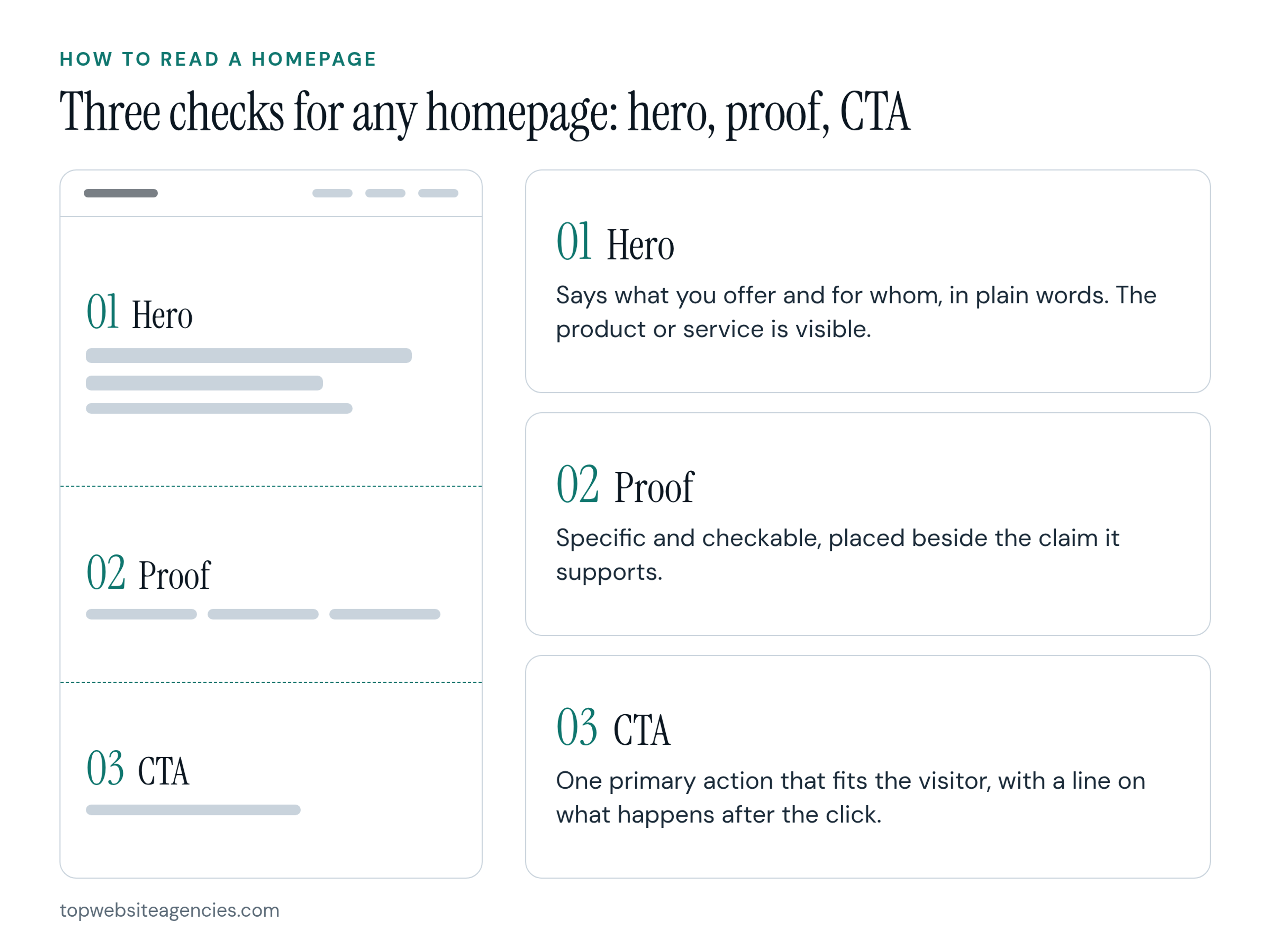
Judge every homepage with three questions: what does the hero say, what proof sits next to it, and what is the one next step? If a page cannot answer all three in its first screen or so, the design is doing less than it looks like.
- Hero question: Does it say what the product or service is and who it is for, in plain words, with the thing itself visible when possible?
- Proof question: Is the proof specific, checkable and placed beside the claim it supports?
- CTA question: Is there one primary action that fits the visitor, with a line that says what happens next or removes a fear?
Google's AI Overview, which I read the same day, groups homepages by layout: "Classic Hero + CTA", "Full-Screen / Full-Width Hero", "Card-Based Grid", "Z-Pattern or F-Pattern Flow" and "Asymmetric or Nested Sections". Those labels describe shape, not whether a page convinces anyone. That is why each example below is annotated by hero, proof and CTA.
There is research behind keeping a first impression simple, with limits. In 2012, Tuch et al. published a study on first impressions of websites in the International Journal of Human-Computer Studies. They found that visual complexity (VC) and prototypicality (PT, how typical a site looks for its type) affected people's aesthetics ratings within the first 50 milliseconds of seeing a page. Their summary: "Overall, websites with low VC and high PT were perceived as highly appealing." In plain words, pages that looked simple and familiar were rated as appealing. The study measured perceived aesthetics, not clicks, sign-ups or sales, so I read it as support for a clear, conventional first screen, not as proof that such a hero converts better.
Attention data points the same way, with a caveat about scope. In 2014, Tony Haile of Chartbeat wrote in the TIME article What You Think You Know About the Web Is Wrong that Chartbeat "looked at deep user behavior across 2 billion visits across the web over the course of a month" and that "a stunning 55% spent fewer than 15 seconds actively on a page". In the same 2014 article, Haile wrote that "66% of attention on a normal media page is spent below the fold." That last figure is about media pages, not homepages in general, so I do not use it to argue about your page. I use the 55% figure as a reminder to put the main claim and one proof item where a short visit will meet them.
Next step: before you read the examples, write your own hero line, one proof item and one CTA for your homepage in three sentences, then compare them as you go.
8 Annotated Homepage Design Examples
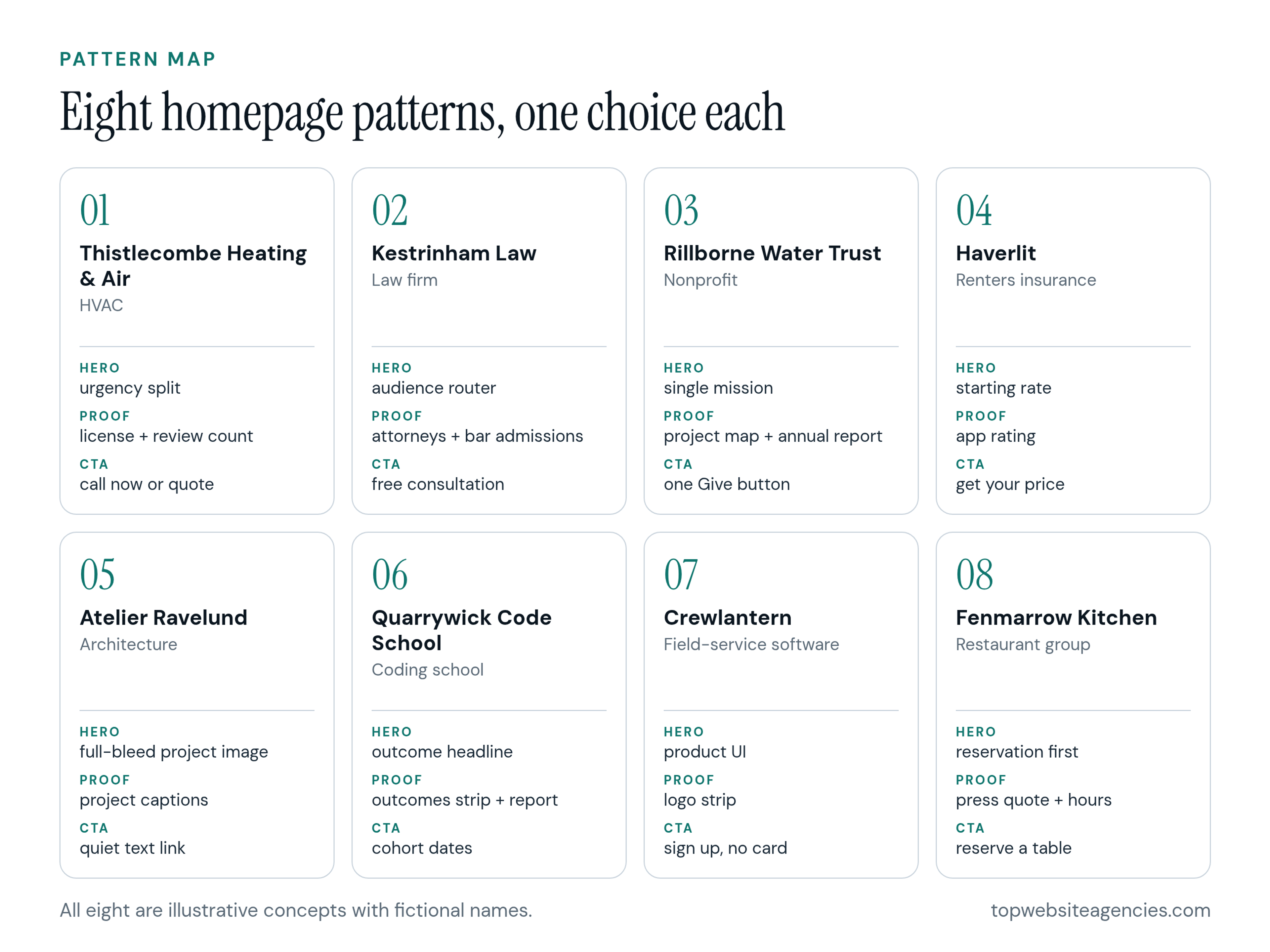
Each example pairs an industry with one pattern, then runs the three checks. Every example is an illustrative concept we designed, and the names, numbers and quotes in them are fictional. To avoid repeating ourselves, they differ from the SaaS homepages we annotated earlier and the homepages for startups at each funding stage. The rest of our annotated pages are listed in the full index of our annotated website examples.
1. Thistlecombe Heating & Air: HVAC Homepage With an Urgency Split
A homeowner with a dead furnace at 2 AM and someone planning a summer install are different visitors. This concept sorts them in the hero.
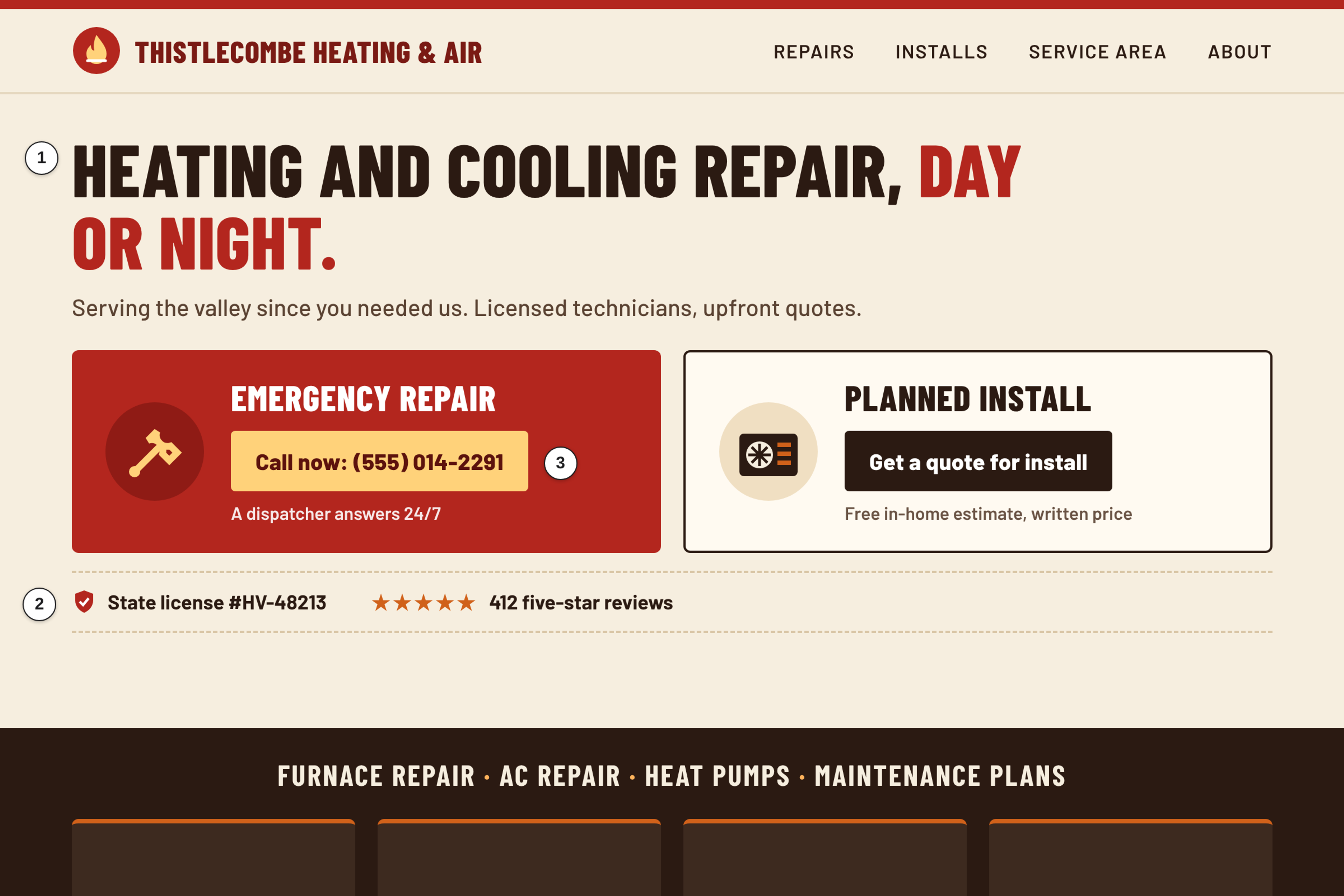
Hero: The screen splits into "Emergency Repair" and "Get a quote for install", with a 24/7 phone number visible in the first screen.
Proof: The state license number and a review summary sit beside the two buttons. The mockup shows 412 five-star reviews.
CTA: Two paths, one per timeline: call now, or request a quote. The mockup's call button says a dispatcher answers.
Watch out: Two primary actions need a clear visual order, or neither button wins. Check how the split stacks on a phone.
2. Kestrinham Law: Legal Practice Homepage With an Audience Router
People looking for a lawyer often do not know their case type yet, but they know whether they are an individual or a business.
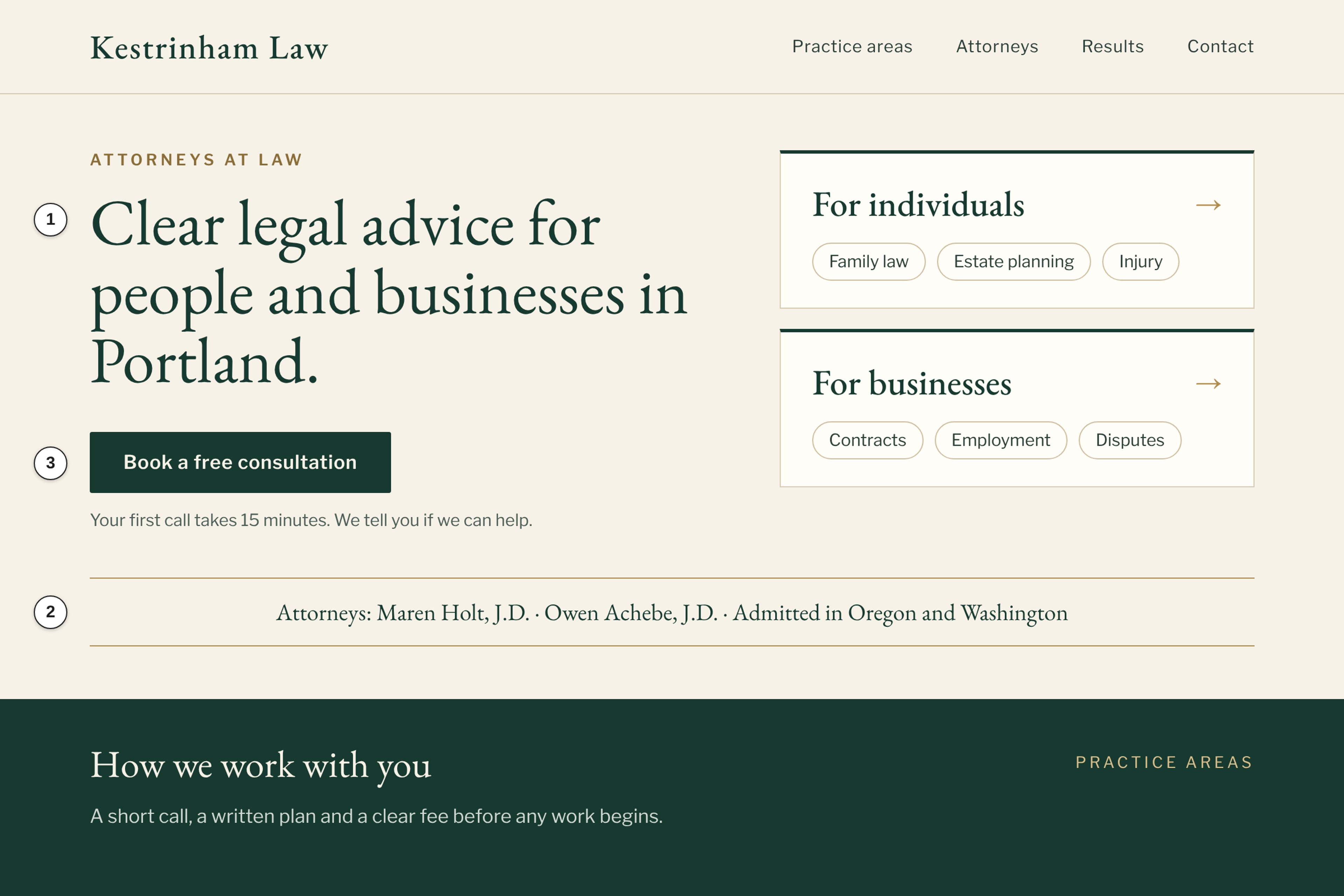
Hero: A plain headline names the practice, followed by a two-way choice: "For individuals" or "For businesses".
Proof: Attorney names and bar admissions sit in one line under the hero, below the practice areas.
CTA: "Book a free consultation", with microcopy saying the first call takes 15 minutes in the mockup.
Watch out: Routing too early can hide the main promise if visitors click before they read. Check your state bar's advertising rules before you publish results.
3. Rillborne Water Trust: Nonprofit Homepage With a Single-Mission Hero
Donors arrive ready to give but short on patience for jargon. They want to see where the money goes.
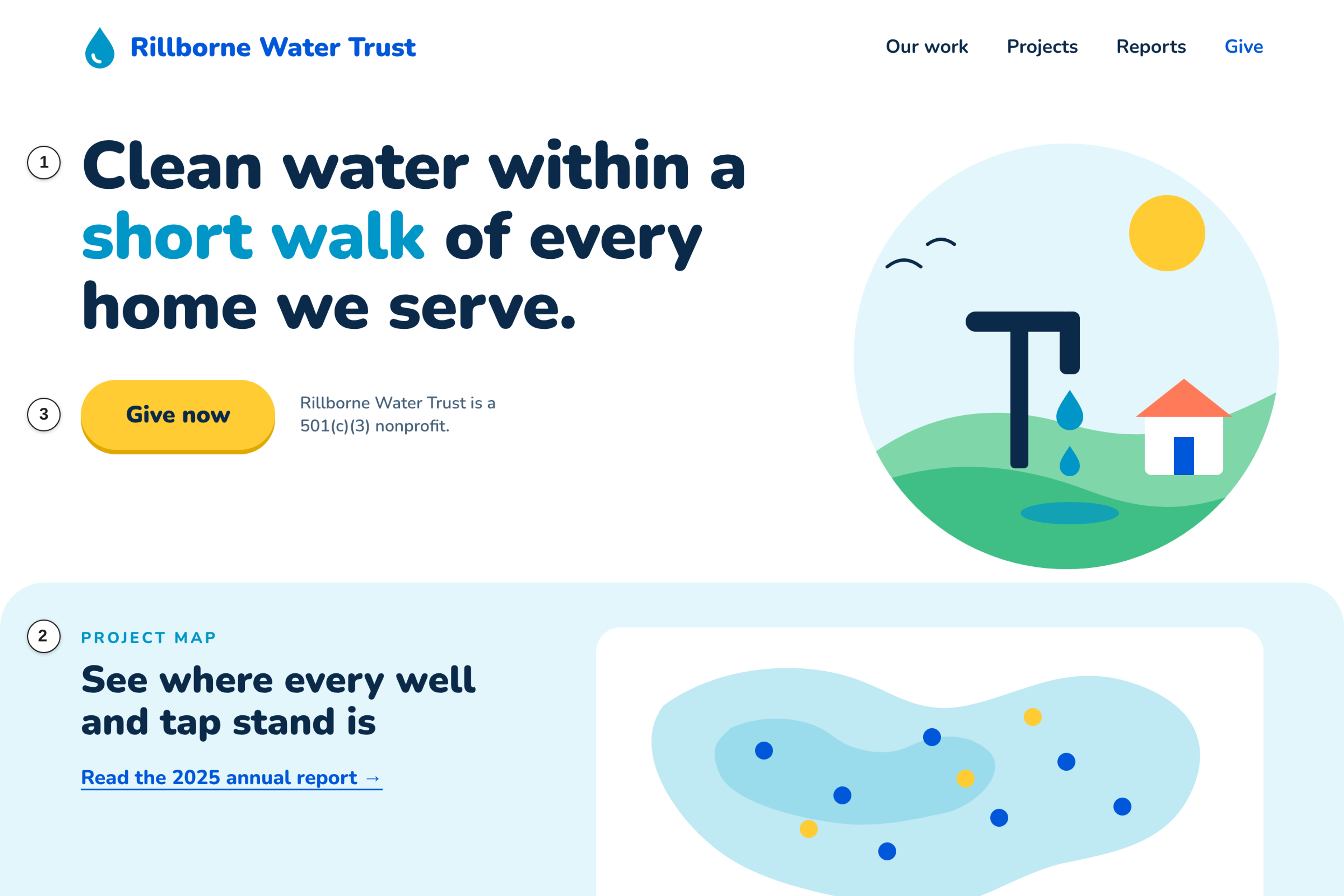
Hero: One mission sentence about clean water access, with no menu of campaigns.
Proof: A project map and a link to the 2025 annual report, as shown in the mockup. The 501(c)(3) status sits near the donate path.
CTA: A single "Give now" button.
Watch out: A one-mission hero leaves no room for secondary programs. Give them a quiet link lower down instead of a second headline.
4. Haverlit: Renters Insurance Homepage With a Starting Rate
Renters compare monthly cost first. This concept puts a number in the hero instead of behind a questionnaire.
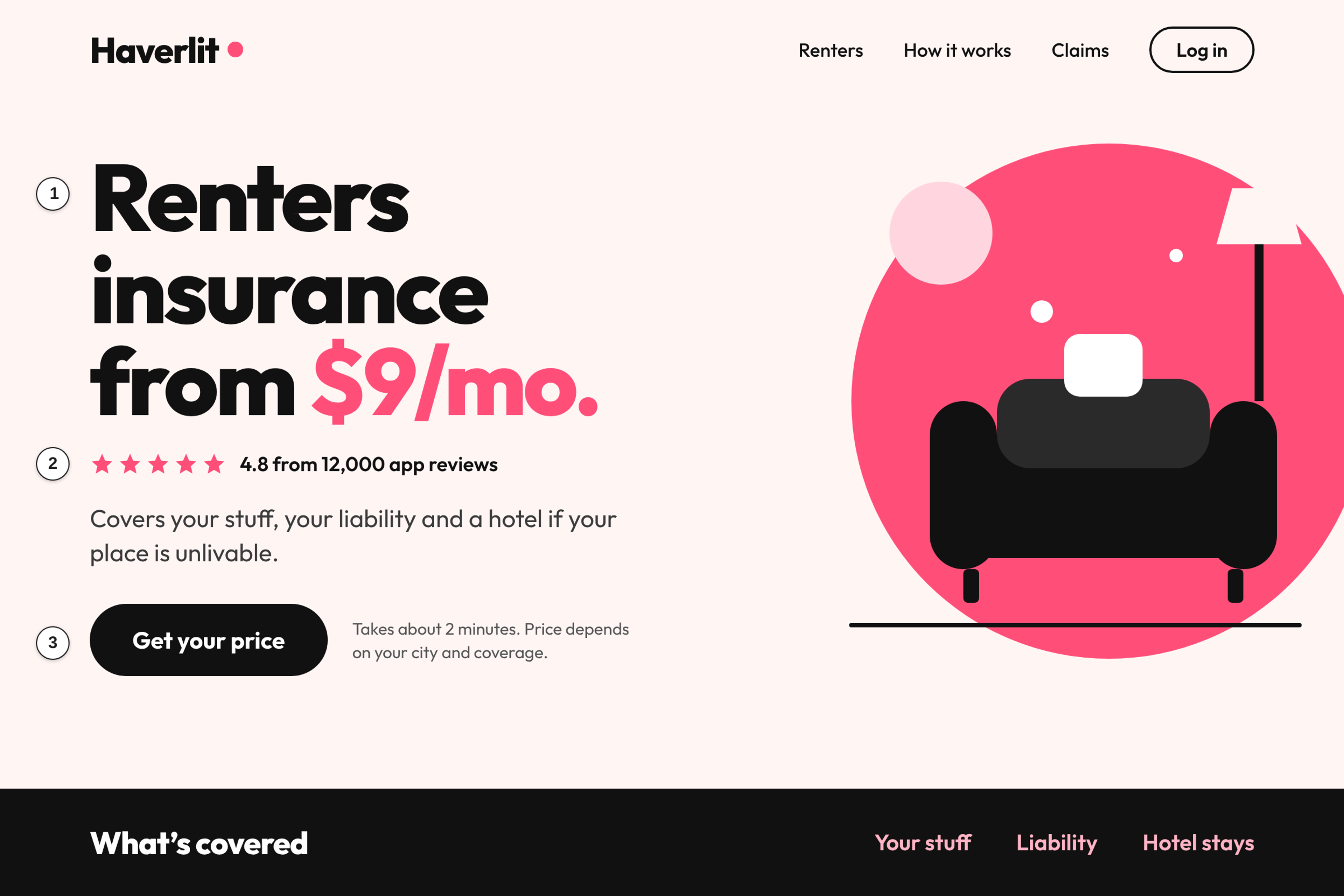
Hero: It leads with "from $9/mo" and one line of coverage detail.
Proof: An app store rating sits right under the starting rate. The mockup shows 4.8 from 12,000 reviews.
CTA: "Get your price", with a small note that the quote takes two minutes.
Watch out: A low "from" rate can sour the visitor if the final quote lands far above it. Say plainly what moves the price.
5. Atelier Ravelund: Architecture Studio Homepage With a Full-Bleed Project Image
Buyers of architecture judge by completed work, so the image carries the claim.
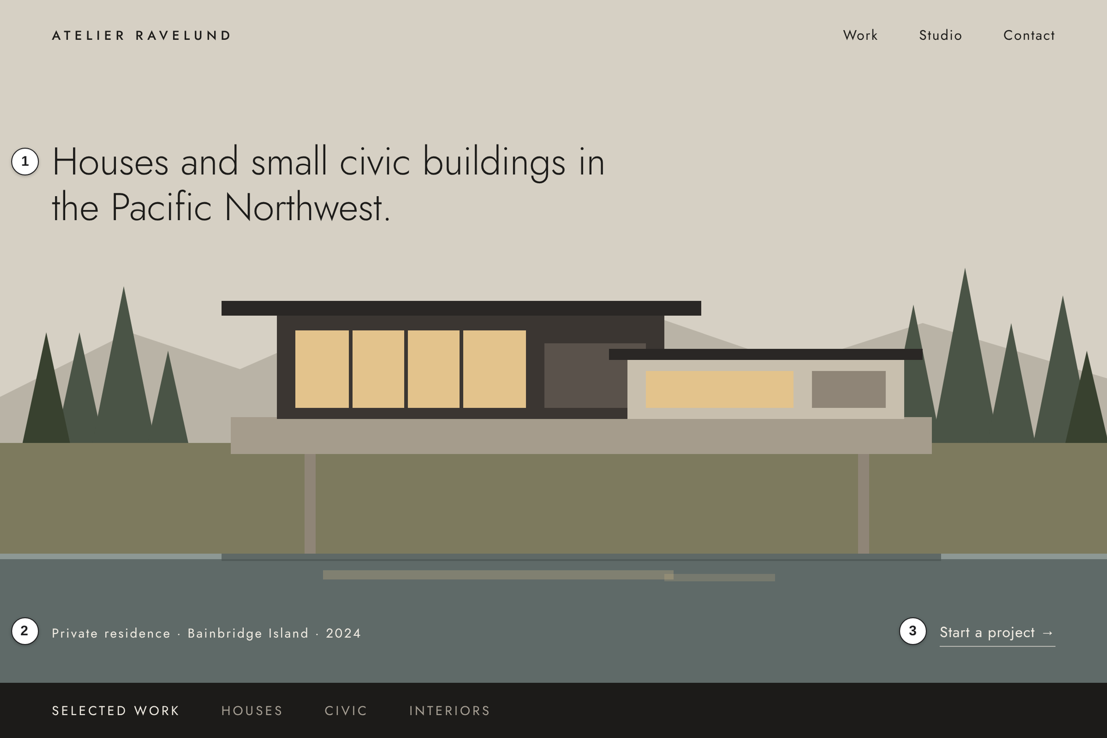
Hero: A full-bleed image of a finished modern home and one line naming the studio's focus.
Proof: A project caption over the image gives the project type, location and completion year.
CTA: A quiet "Start a project" text link in the corner.
Watch out: A full-screen image can hide what you do if the photo has no context, and a corner link is easy to miss. Check legibility on every photo you rotate in.
6. Quarrywick Code School: Online Coding School Homepage With an Outcome Headline
Students are buying a career change, not a curriculum, so the hero leads with the outcome.
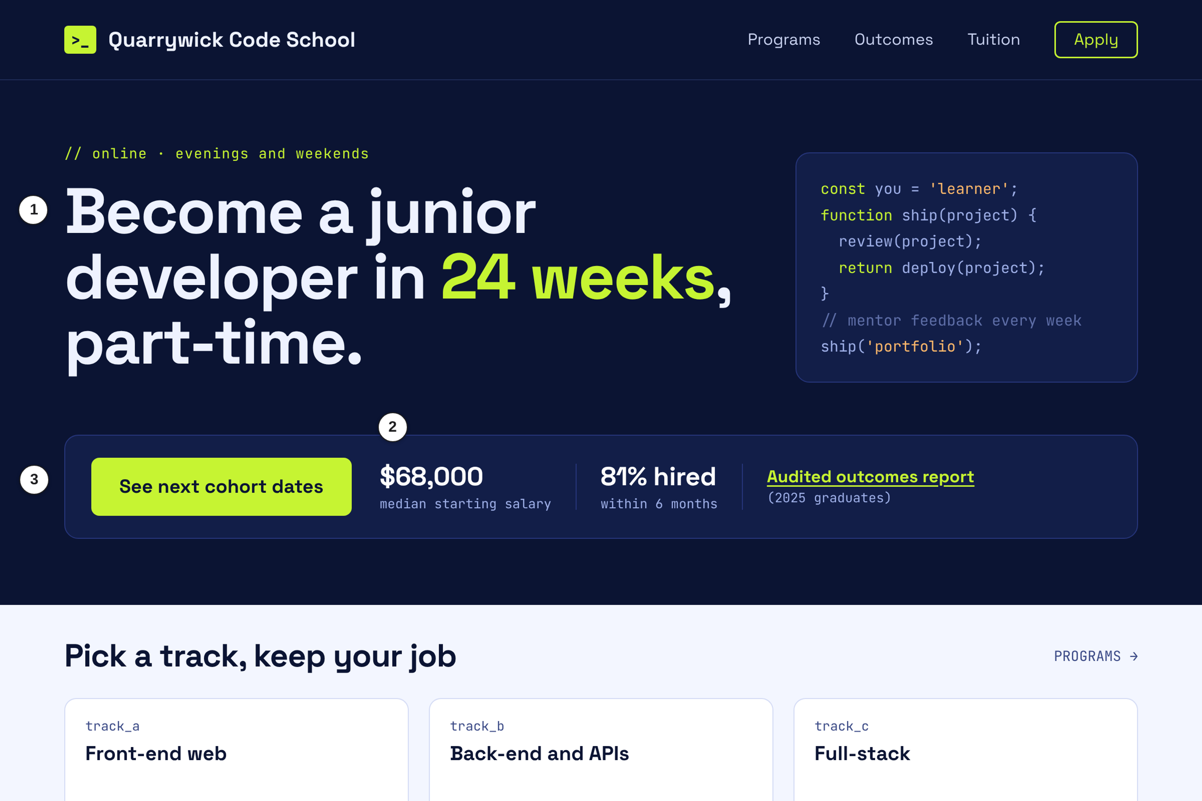
Hero: A bold headline states the outcome students are buying. In the mockup, it is becoming a junior developer in 24 weeks, part-time.
Proof: A strip next to the main button shows the median starting salary and the hiring rate, and links to the audited outcomes report.
CTA: "See next cohort dates", which asks for a specific commitment.
Watch out: Outcome claims go stale and carry legal risk. Date them, keep the method one click away, and have someone check the rules.
7. Crewlantern: Field-Scheduling Software Homepage With the Product UI
Operations managers want to know whether their field team could use the tool. A screenshot answers faster than a sentence.
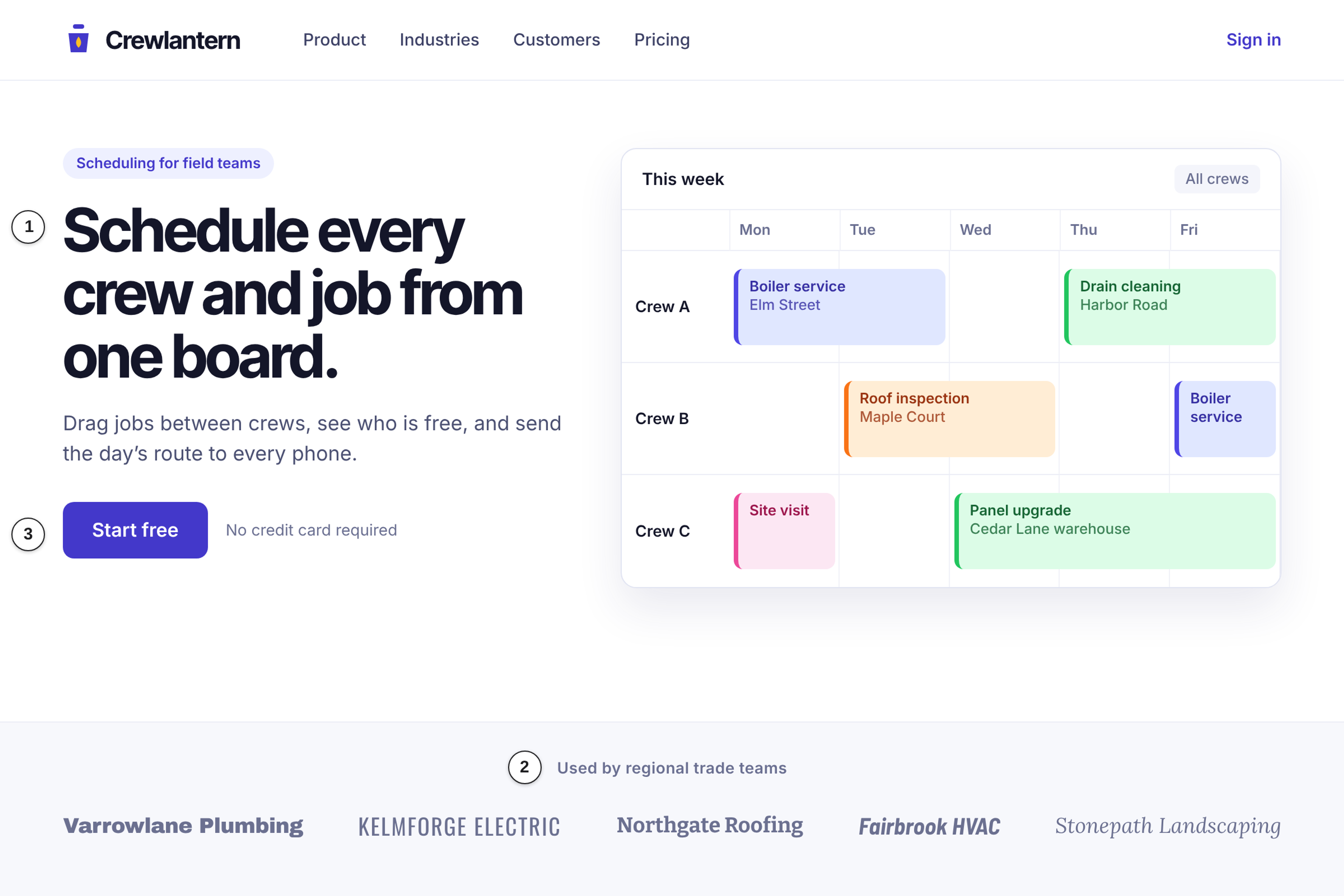
Hero: A high-fidelity view of the scheduling dashboard with an active team calendar, under a short headline naming the job.
Proof: A logo strip of regional trade brands (fictional in the mockup).
CTA: A primary sign-up button with a one-line note under it saying no card is needed.
Watch out: Dense dashboard screenshots turn into clutter on a phone. Crop to one view for mobile.
8. Fenmarrow Kitchen: Restaurant Group Homepage With a Reservation-First Hero
Diners mostly want to book a table or see the menu, and this concept lets them do the first without hunting.
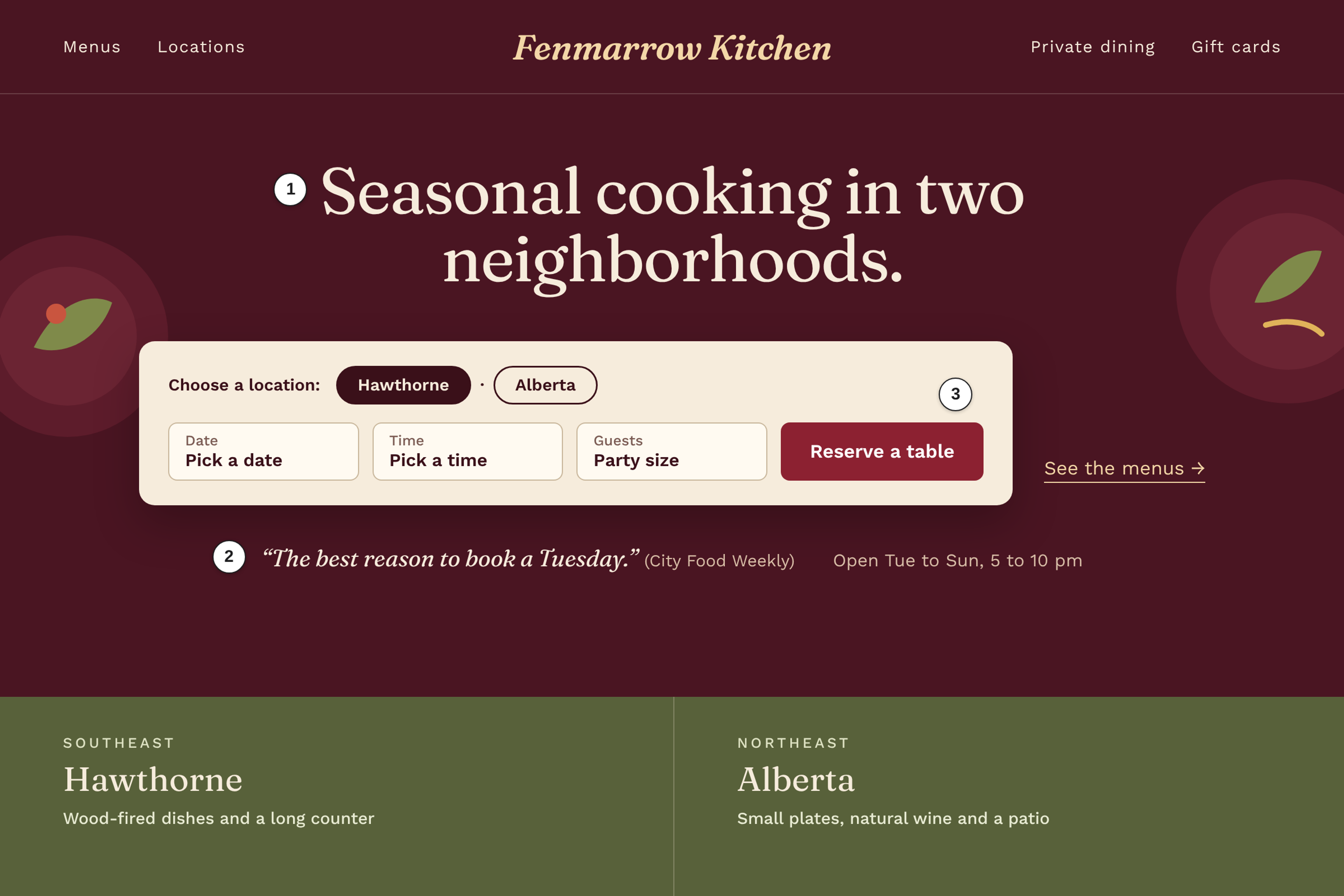
Hero: A reservation widget sits front and center and asks for a location before a time.
Proof: A short press quote from a food publication, with opening hours listed right below the widget.
CTA: "Reserve a table", placed ahead of any brand storytelling.
Watch out: Forcing a location first slows visitors who only want to browse the menu. Keep a visible menu link beside the widget.
What the eight patterns have in common
Each concept makes one choice early. The hero either names the offer or sorts the visitor. The proof is a checkable fact (a license, a rating count, a report, a map) placed next to the action it supports. The CTA is one action, or two only when the visitor's urgency really splits. Each Watch out is the cost of that choice. Next step: pick the example closest to your business and write its Watch out down as a risk for your own page.
What Six Live Homepages Do Right Now
On November 21, 2026, I read six live homepages and held each against the same three questions. Pages change, so treat this as a dated snapshot, not a permanent description.
Basecamp's homepage opens with "The famously straightforward, easiest-to-use project management platform." Then comes a wall of real use cases as hero tiles, such as "Managing a website redesign", "Planning a product launch" and "Running customer support", with about 30 more. The CTA is "Try Basecamp free", with "Check out more example projects" as the secondary link. Further down, a founder-voice letter carries the proof line "nearly a million people, teams, companies, and non-profits worldwide rely on it daily". That is Basecamp's own claim, and I did not verify it.
Linear's homepage uses the product as the hero. The H1 reads "The product development system for teams and agents", with the subline "Purpose-built for planning and building products. Designed for the AI era." The hero shows a working product view: an issue called "Faster app launch" with activity, labels and a draft PR. A logo band headed "Powering the companies building the future" follows.
When I read Calendly's homepage, the hero was built around signing up. The H1 is "All the work around meetings, handled." and the subline names the jobs: "From AI-powered scheduling to automated meeting recaps and follow-ups". The CTA row offers "Sign up with Google", "Sign up with Microsoft" and "Sign up with email", and "No credit card required" sat directly under the buttons. Below that is one band per product (Scheduling, a Callie AI assistant marked "Beta", Notetaker marked "New", Payments marked "New"), each with "Learn more".
charity: water's homepage is the plainest of the six. The H1 is "Bring clean and safe water to every person on the planet" and the hero has one button, "GIVE TODAY". Trust facts sit close by in the page text: "Other Ways to Give" (check, stock, international) and "charity: water is a 501 (c)(3)", along with its EIN and a donation processing address.
On November 21, 2026, Lemonade's homepage put the price on the first scroll. The H1 is "Forget everything you know about insurance", the subline is "Instant everything. Incredible prices. Big heart." and the CTA is "Check our Prices". The next band shows a starting price per product, among them "Renters From $5/mo" and "Homeowners From $25/mo". Right after comes "The (Almost) 5 Star Insurance Company", with "Lemonade has earned 4.9 stars in the App store" and customer posts. That rating is Lemonade's statement, and I did not check the app store.
Headspace's homepage showed a seasonal offer on November 21, 2026, so expect it to differ when you visit. The hero said "50% off a year of Headspace" with the CTA "Get 50% off", and the terms sat right under the button: "50% off your first year, then your subscription automatically renews at full price." plus "Cancel anytime". The next band asks "What kind of headspace are you looking for?" and offers goals such as "Stress less", "Sleep soundly" and "Manage anxiety". Lower down, a separate employer band reads "Trusted by thousands of employers, health plans, and partners globally" with "Request a demo".
I also read our own homepage against the same questions. Its hero says what we publish (a ranking of 54 web design studios by one five-factor vetting score), and the page has two CTAs, "Find your agency match" and "View the rankings". Those two CTAs split visitors by intent (get matched, or browse the list), the same trade-off as the Thistlecombe concept, so they need a clear visual order.
Next step: open two of these pages and answer the three questions yourself before you read any studio's case study.
How to Design a Good Homepage
A good homepage limits choices and puts credibility where the visitor is already looking. Check your draft against four lines:
- The hero says what you offer and for whom.
- The product or service is visible, or the next-best proof of it is.
- A specific, checkable proof item sits beside each main claim.
- One primary CTA fits the visitor's intent and says what happens after the click.
For trust, the Stanford Guidelines for Web Credibility (2002) list 10 guidelines "based on three years of research that included over 4,500 people". Four of them map straight onto a homepage:
- "Show that there's a real organization behind your site."
- "Make it easy to contact you."
- "Use restraint with any promotional content (e.g., ads, offers)."
- "Avoid errors of all types, no matter how small they seem."
Under its guideline "Design your site so it looks professional (or is appropriate for your purpose).", the Stanford page comments, "We find that people quickly evaluate a site by visual design alone."
Simple homepage design is mostly subtraction: fewer sections, one primary CTA and a hero you can read in one pass. The Tuch et al. (2012) finding above supports a simple, familiar look as appealing, with the caveat that it concerns perceived appeal. Every extra button competes with the main one.
Next step: cut your draft to one primary CTA, then write down what each remaining section is for.
How to Use These Examples When You Hire a Web Design Studio
Turn the three questions into requirements, then ask each studio to show where its past homepages meet them. That makes proposals easier to compare.
Put the requirements in homepage notes inside your web design brief: the hero must say what you offer and for whom, each claim needs a named proof item, and the page gets one primary CTA with a stated next step. When a studio sends live URLs, read them the way I read the six above and ask:
- What does the hero say on this live homepage, and who is it for?
- Where does the proof sit relative to the claim?
- Where does the primary CTA lead, and what happens next?
- Which decisions were the studio's, and which came from the client's brief?
Check delivery too. The Portfolio & Code Quality factor in our methodology carries a 30% weight on the page as of November 2026 and reads: "We inspect live sites for visual layout precision, mobile responsiveness, semantic HTML efficiency, page speed performance (LCP < 2.5s), and WCAG 2.1 AA accessibility compliance." You can run the same kind of review on a studio's past work.
After launch, decide how you will judge the page. Our guide on how to measure a homepage's conversion rate covers it. I have no conversion data for any of the live pages above, so I make no claim about how well they perform.
Next step: ask each shortlisted studio for three live homepage URLs and run the three questions before the first call.
Frequently Asked Questions
What is the best example of a homepage design?
There is no single best example, because the right homepage depends on who visits and what you want them to do. The best one for you passes three checks: the hero says what you offer and for whom, specific proof sits beside the claim, and there is one clear next step. Of the six I read on November 21, 2026, charity: water is the easiest to check against all three: one H1, one "GIVE TODAY" button and trust facts close by. Lemonade shows a starting price on the first scroll with rating proof right after. That makes them easy to judge, not winners.
What are some examples of simple homepage design?
Simple means few choices and one obvious action. charity: water's live page, with one mission and one button, is one. Among our illustrative concepts, Rillborne Water Trust (one mission, one "Give now" button) and Atelier Ravelund (one image, one quiet link) are the simplest. Tuch et al. (2012) measured perceived appeal, not conversion, so simple is a good first impression, not a guaranteed result.
How to design a good homepage?
Start with the visitor's most likely intent, write a hero for it, place one proof item beside it and give one primary CTA. Add the credibility basics from the Stanford guidelines, such as a real organization behind the site and an easy way to contact you. Cut anything that competes with the main action, then read the draft on a phone against the three checks.
What are the 7 C's of website design?
The 7 C's are Rayport and Jaworski's framework, as cited by Lee and Benbasat in the International Journal of Electronic Commerce (2004). The seven design elements of a customer interface are context, content, community, customization, communication, connection, and commerce. Treat it as a checklist, not a rule that every homepage needs all seven.
Conclusion
A homepage is judged fast, and the three checks (hero, proof, CTA) tell you quickly whether a design earns that glance. Use the eight concepts to see the patterns and their costs, the six live pages as a dated snapshot, and the checks as the standard for your brief and for every studio's past work. Next step: go to our five-factor ranking of web design studios, shortlist two or three, and run the three checks on the homepages they have shipped.