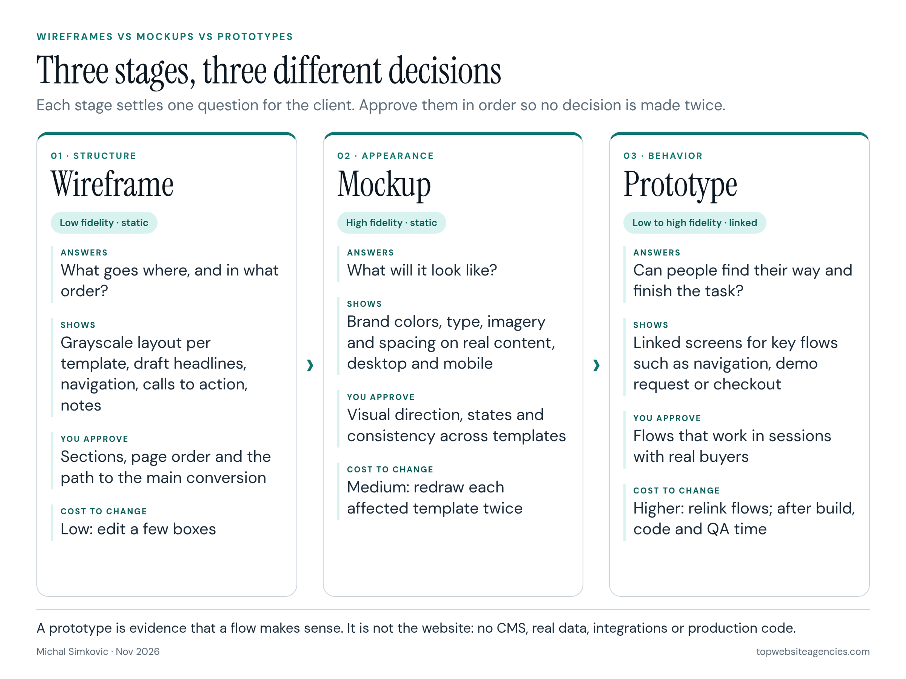
Wireframes, mockups and prototypes are three levels of the same design work, and each one answers a different question. A wireframe is a plain layout that settles what goes on each page and in what order. A mockup is a static, full-color picture of how a page will look. A prototype is a clickable version that shows how people move through the site. If you are paying for a new website, the useful skill is not drawing any of them; it is knowing what to approve at each step so you are not paying to make the same decision twice.
That is the angle of this guide: the buyer's side of the table. If you are still choosing who will do the work, our list of web design agencies for startups is one place to begin. Whichever team you shortlist, the rest of this guide will help you judge their design reviews before the first one happens.
Every design partner names these stages a little differently, and proposals often bundle them into one line such as "UX and UI design." When you compare teams in our curated index of website design teams, ask each one to show a wireframe, a mockup and a prototype from a past project and to explain what the client approved at each point. The answers tell you more about how a project will run than any portfolio hero image.
The Short Answer: Wireframe vs Mockup vs Prototype
Here is the side-by-side answer to the comparison query. Each row covers wireframe, mockup and prototype for one buyer question: what it shows, fidelity, interactivity, who approves and when it sits in the project.
What it shows
- Wireframe: Structure only: which sections exist, their order, navigation and the main call to action, without visual design.
- Mockup: The finished look of that approved structure: brand colors, typography, imagery, icons and spacing on a static screen.
- Prototype: How people move through linked screens: menus, forms, toggles and the path to a conversion.
Fidelity
- Wireframe: Low. Grayscale boxes, real or draft headlines, no brand styling.
- Mockup: High. Looks like the page you expect to launch, still a picture.
- Prototype: Low to high. Can be a clickable wireframe or a near-final simulation built from mockups.
Interactivity
- Wireframe: Static. Nothing is clickable unless you later turn it into a low-fidelity prototype.
- Mockup: Static. Hover and form states may be drawn as separate frames, but you cannot walk a flow.
- Prototype: Interactive. Linked screens you click or tap through, from a rough path to a tested flow.
Who approves
- Wireframe: The owner of the message and conversion path (usually marketing or product), focused on structure and priority, not colors.
- Mockup: Brand and marketing together: does it feel like the company, and is it readable on desktop and mobile?
- Prototype: Stakeholders plus at least a few people who match your buyers, focused on whether the flow works without help.
When in the project
- Wireframe: After the sitemap and content plan, before visual design starts.
- Mockup: After wireframes are signed off, before development builds the templates.
- Prototype: After the screens for a key flow exist (from wireframes or mockups), before that flow is coded.
The order matters because each stage gets more expensive to change. Moving a section on a wireframe takes minutes. Moving it after mockups exist means redrawing every affected template on desktop and mobile. Moving it after development means design, front-end, CMS and QA time. You approve structure while it is cheap, then build detail on top of decisions that are already locked.
Wireframes: Settle Structure Before Style
A wireframe is a blueprint for a page template. Good wireframes for a marketing site are grayscale on purpose, so the review stays on content priority, navigation, the path to the main call to action and what each section has to prove. Most teams make them in Figma; some still sketch on paper first.
What you should see in a wireframe review:
- One wireframe per template, not per page. A 30-page site usually has 6 to 10 templates (home, product or service page, case study, blog post, about, contact). Ask for the template map first.
- Real or draft copy for the main messages. Lorem ipsum hides the hardest problem, which is whether your message fits the space. Headlines, section titles and calls to action should be close to final.
- Desktop and mobile order. Mobile is where section order really shows, because everything stacks. Ask to see the mobile sequence for the home page at least.
- Annotations. Short notes that explain what a block does, where data comes from (CMS, form, integration) and which parts are reusable.
What to leave out of the review: colors, fonts and photos. If someone on your side keeps saying "it looks boring," remind them that the next stage exists for exactly that. Wireframe feedback should sound like "pricing needs to be one click from the home page" or "the case study proof should come before the feature list."
The wireframe stage is also where your site map and content plan meet. If you want to see where it sits among the other phases, our full web design process from discovery to launch walks through the steps before and after it.
Mockups: Settle the Look on Real Content
A mockup takes an approved wireframe and applies the visual design: your brand colors, type scale, imagery, icons, spacing and the look of buttons and forms. It is still a picture. Nothing is clickable, but it should look exactly like the page you expect to launch.
This is the stage clients enjoy most and also the one where reviews drift. Keep the review on a few questions:
- Does it carry the approved structure? Section order and calls to action should match the signed-off wireframes. If they changed, ask why before you discuss colors.
- Is it built on real content? A mockup with perfect two-line headlines will break when your real four-line headline arrives. Ask for the longest real headline and a real customer logo row.
- Are mobile versions included? Approving desktop only is the most common gap. Ask for mobile mockups of every template, or at least the home page and your highest-traffic template.
- Are the states shown? Hover, error and success states for forms, the open mobile menu and empty states for things like blog filters.
- Is it consistent? Buttons, headings and cards should repeat the same styles across templates. Those reusable pieces later become the components your developer builds once.
You do not need to buy design software to review any of this. Figma's plans and pricing page notes that on paid plans others can view and comment on files without buying extra seats, so ask your design partner to share view and comment access to the live file rather than sending flattened PDFs. Comments pinned to the exact element save a surprising amount of back and forth.
Prototypes: Test How It Behaves Before Code
A prototype links screens together so you can click or tap through a flow: open the menu, go to pricing, start a demo request, see the confirmation. It can be built from wireframes (a low-fidelity prototype) or from mockups (high-fidelity), and some teams build prototypes in code.
The UK government's service manual puts the purpose plainly in its guide to making prototypes: make them to explore, share and test different designs before you commit to building anything. The same guide adds a point buyers should remember: prototype code does not have to meet production standards and should not just be copied into the live product. A prototype that feels finished is still not your website.
Where a prototype earns its cost on a marketing website:
- Navigation with many options, such as mega menus or product lines that overlap.
- Lead and signup flows, including multi-step forms and what happens after submission.
- Pricing pages with toggles, calculators or plan comparisons.
- Ecommerce paths from product page to cart to checkout.
A prototype is most useful when real people try it. Digital.gov's guide on how to conduct a usability test recommends one participant per session, participants who actually do the task the site supports rather than friends or colleagues of the team, and observers who stay quiet during the session. For a website buyer, that means your sales team clicking through the demo flow is a review, not a test. Ask your design partner to run a handful of sessions with people who match your buyers.
Where Buyers Mix Them Up
Three confusions come up again and again in design reviews. Each one costs time.
Wireframe vs mockup
A wireframe is about structure, a mockup is about appearance. The mistake is approving mockups while still changing structure, which turns every visual round into a layout round. If you find yourself moving sections during mockup review, pause and update the wireframe first. It is faster, even though it feels like a step back.
Mockup vs prototype
A mockup is a single static picture; a prototype is a set of linked screens. A deck of beautiful mockups can hide a broken flow, for example a demo form that never shows what happens after "Submit." If a flow matters to revenue, ask to click it, not just look at it.
Prototype vs the real site
A clickable prototype does not include your CMS, real performance, analytics, accessibility testing on real devices or integrations with your CRM. Treat it as evidence that a flow makes sense, not as proof the build will work. The split between who designs and who builds explains which person turns the approved design into working pages.
Which Stages Does Your Project Need?
Not every project needs all three at full depth. Match the depth to the risk.
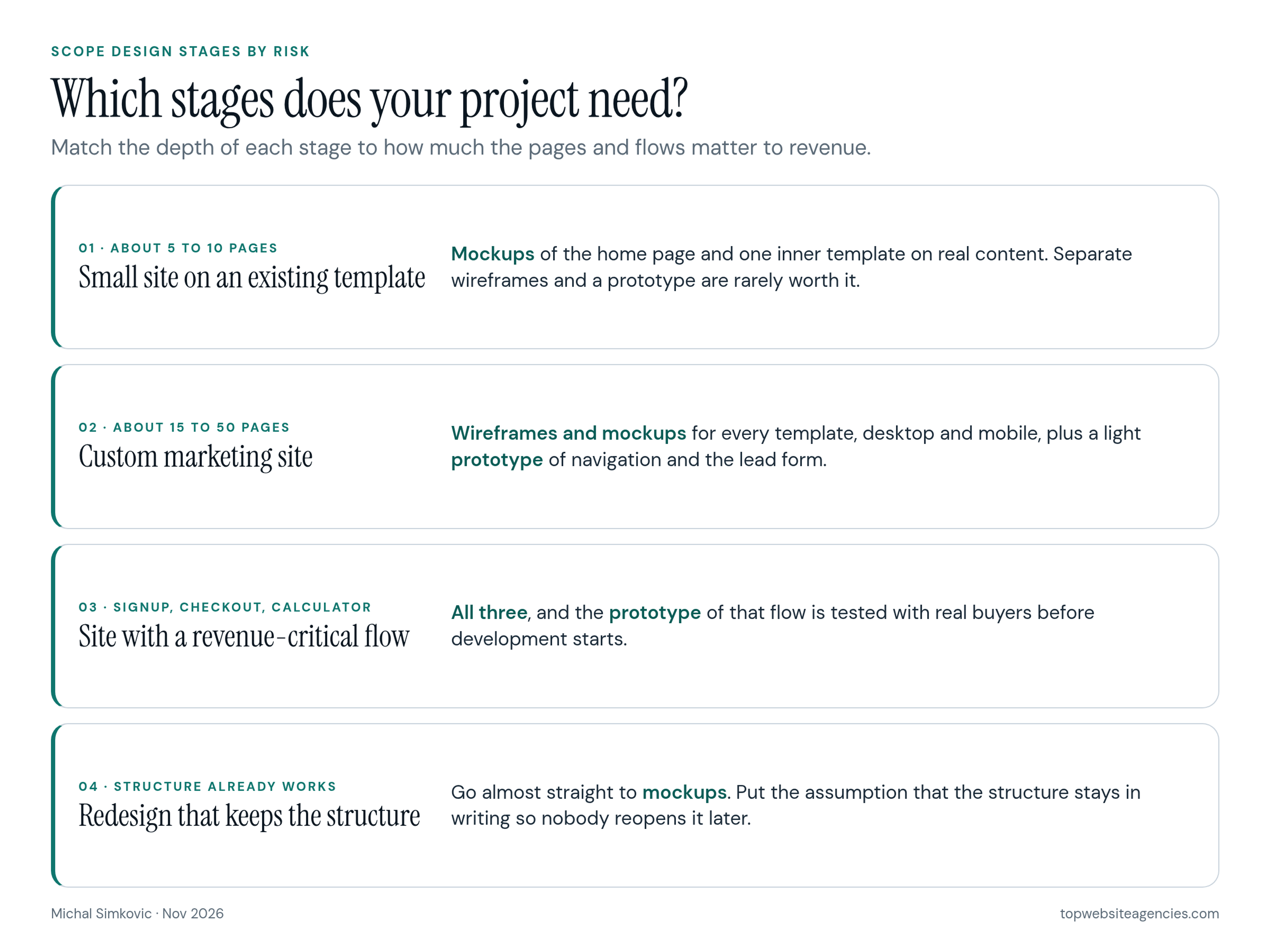
- Small site on an existing theme or template (about 5 to 10 pages): skip separate wireframes. Ask for mockups of the home page and one inner template, built on your real content. A prototype is rarely worth it.
- Custom marketing site (about 15 to 50 pages): wireframes for every template, mockups for every template on desktop and mobile, and a light prototype of the main navigation and the lead form.
- Site with a revenue-critical flow (signup, checkout, quote calculator, partner portal): all three, and the prototype of that flow gets tested with real users before development starts.
- Redesign that keeps the current structure: if analytics and sales feedback say the structure works, you can go almost straight to mockups. Ask the team to state that assumption in writing so nobody reopens it later.
A practical rule: the more money a single page or flow brings in, the more it deserves a prototype. The more pages share one template, the more the wireframe for that template matters.
Worked Example: A 30-Page Marketing Site
Here is a hypothetical project to show how the three stages translate into hours and dollars. The numbers are planning assumptions chosen to make the math visible, not market quotes. Use the method, then swap in the hours and rate from your own proposals.
The site: a 30-page marketing site for a software company with 7 templates (home, product, solution, pricing, case study, blog post, contact). The team works at an assumed blended rate of $150 per hour.
- Wireframes, about 30 hours (about $4,500 at that assumed rate; estimate, not a quote). About 3 hours per template on desktop and mobile order for 7 templates (21 hours), plus two revision rounds (about 9 hours).
- Mockups, about 64 hours (about $9,600 at that assumed rate; estimate, not a quote). About 6 hours per template for desktop and mobile (42 hours), about 10 hours to set up the type scale, colors and shared components, and two revision rounds (about 12 hours).
- Prototype, about 24 hours (about $3,600 at that assumed rate; estimate, not a quote). About 14 hours to link the navigation, pricing toggle and demo request flow, about 4 hours to recruit and schedule participants, and about 6 hours for three sessions plus notes.
Total: about 118 hours, or roughly $17,700 in this hypothetical example. Mockups take just over half of the design budget, which is normal: they are where every template gets drawn twice, once per screen size. The prototype is the smallest line, and it is the one most often cut. In this example, cutting it saves about $3,600 but leaves the demo request flow, the page that produces leads, untested before it is built.
Two things move these numbers most in real proposals: the number of templates (not pages) and the number of revision rounds. If two proposals differ a lot in price, compare those two figures first. For how this stage fits a full schedule, see how long each phase of a website project takes.
What to Check Before You Approve Each Stage
Use these questions at the end of each review. If the answer to any of them is "no," the stage is not ready for sign-off.
Before approving wireframes
- Does every template on the template map have a wireframe, including mobile order for the key ones?
- Are the main headlines and calls to action written, not placeholders?
- Can you trace the path from the home page to your main conversion in two or three clicks?
- Have sales, product or whoever owns the message reviewed the structure, not just marketing?
Before approving mockups
- Do the mockups match the approved wireframes, with any changes explained?
- Are desktop and mobile versions included for every template in scope?
- Do the mockups use your longest real headlines, real logos and real images (or clearly marked placeholders with an owner and a date)?
- Are hover, error, success and open-menu states shown?
- Do repeated elements use the same styles across templates?
Before approving a prototype
- Can you click through every flow listed in the SOW without dead ends?
- Has someone outside the project team tried it, ideally people who match your buyers?
- Is there a short written summary of what testing found and what changed because of it?
How to Write Them Into Your Scope
Most disputes about design stages come from vague scope, not bad design. Your statement of work should state, for each stage, which templates are covered, which screen sizes, how many revision rounds and what counts as approval. For the rest of the contract terms, see where revision rounds and acceptance belong in your SOW.
Sample wording you can adapt:
- Wireframes: "Grayscale wireframes for the 7 templates listed in Appendix A, desktop and mobile order, with annotations. Includes two rounds of consolidated client feedback. Approval is a written sign-off by the named client approver."
- Mockups: "High-fidelity mockups of the same 7 templates at desktop and mobile widths, using approved copy, including interactive states for navigation and forms. Includes two rounds of consolidated feedback. Structural changes to approved wireframes after sign-off are handled as a change request."
- Prototype: "Clickable prototype of the main navigation, pricing page and demo request flow, plus three moderated sessions with participants recruited to match the client's buyer profile and a written summary of findings."
- Files and access: "Client receives view and comment access to working design files during the project and ownership of the final design files at project close."
"Consolidated feedback" is the phrase that saves the most time. It means one person on your side collects comments from everyone and sends one list per round, so the design team is not reconciling five conflicting opinions.
Red Flags in a Proposal
- Mockups for the home page only, with inner pages "designed in development." Inner templates are where most of your pages live.
- No mobile designs until the build stage.
- Unlimited revisions. It sounds generous, but it usually means nobody has defined what approval is, and the schedule pays for it.
- A prototype that is never tested with anyone outside the project, then counted as validation.
- No access to the working files until final payment, which makes review by comments impossible.
Frequently Asked Questions (FAQ)
Do I always need wireframes, mockups and a prototype?
No. Small sites built on an existing template can go almost straight to mockups. Custom marketing sites usually need wireframes and mockups for every template. A tested prototype is worth it whenever a flow such as signup, checkout or a quote form directly produces revenue.
What is the main difference between a wireframe and a mockup?
A wireframe shows structure in grayscale: what sections exist and in what order. A mockup shows the finished look of that structure with your brand, typography and images. Approve the wireframe first so mockup reviews can focus on appearance.
Is a prototype the same as a beta version of the site?
No. A prototype simulates screens and flows, usually in a design tool, without your real CMS, data or integrations. A beta or staging site is the real build running on a test address. Some code prototypes look very close to the real thing, but they are still not meant to go live.
Can AI design tools replace wireframes?
They can produce layout drafts faster, which is useful. They do not replace the decisions a wireframe review exists for: what each page must say, in what order and for whom. Whatever tool produced the draft, someone on your side still has to approve the structure.
Who owns the design files?
Whatever the contract says. Ask for view and comment access during the project and ownership of the final design files at handoff, and write both into the SOW so the next team you hire can start from them.
How long does each stage take?
It depends mostly on the number of templates and review rounds. As a rough estimate only (not a schedule quote), wireframes for a mid-size marketing site often take a couple of weeks including reviews, mockups a few weeks, and a tested prototype one to two weeks. Your own response time on feedback is usually the biggest variable.
Conclusion
Wireframes, mockups and prototypes are not three versions of the same picture. They are three decisions, made in order: structure, then appearance, then behavior. Approve each one on its own terms, scope them by template and by risk, and write the revision rounds and approval steps into your contract. If you are comparing design partners, ask each one to walk you through a past project stage by stage; the teams that can explain what their client signed off and why are usually the ones that will run your project the same way.